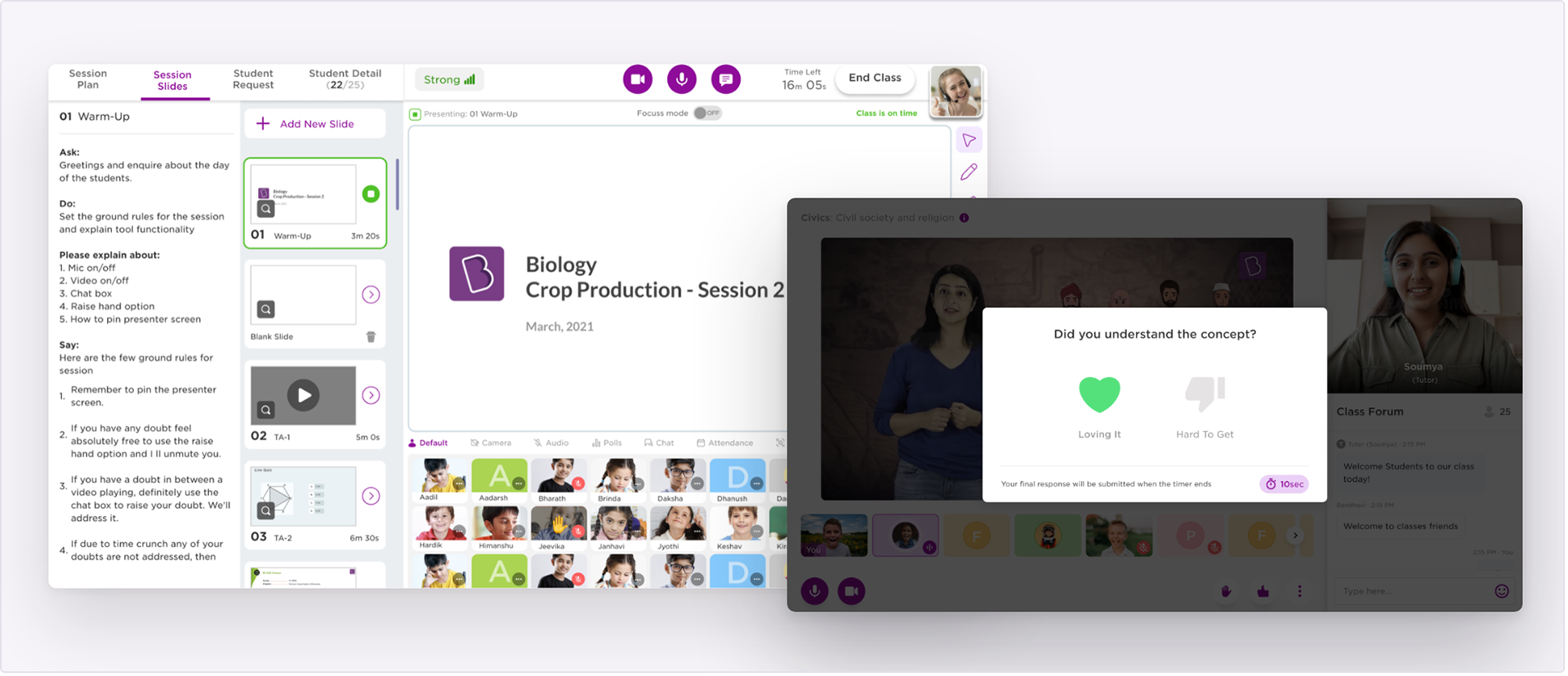
Designing for Byju's live classes
Byju's Classes was the live online classroom product, running on desktop web, mobile web and a companion tablet called Learn Station. A session put one tutor in front of a class for an hour.
Most students kept their cameras off. Bandwidth was unreliable, rooms were shared, and plenty of students preferred not to be seen. So the tutor was teaching a room of coloured tiles with initials on them, and the students were sitting in a class where taking part meant being noticed by everyone at once. Almost every project here comes back to that.
My work on the product ran along two lines. On the tutor's side, the aim was to make a session easier to run and to give the tutor something to read the room by. On the student's side, it was to raise engagement and adoption, and to make the hour feel like somewhere they were present. Several features have a side in both, and that is where the two lines meet.
How the pieces fit together
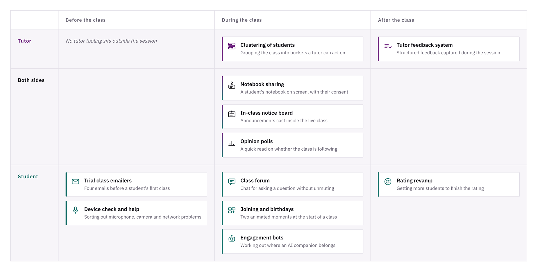
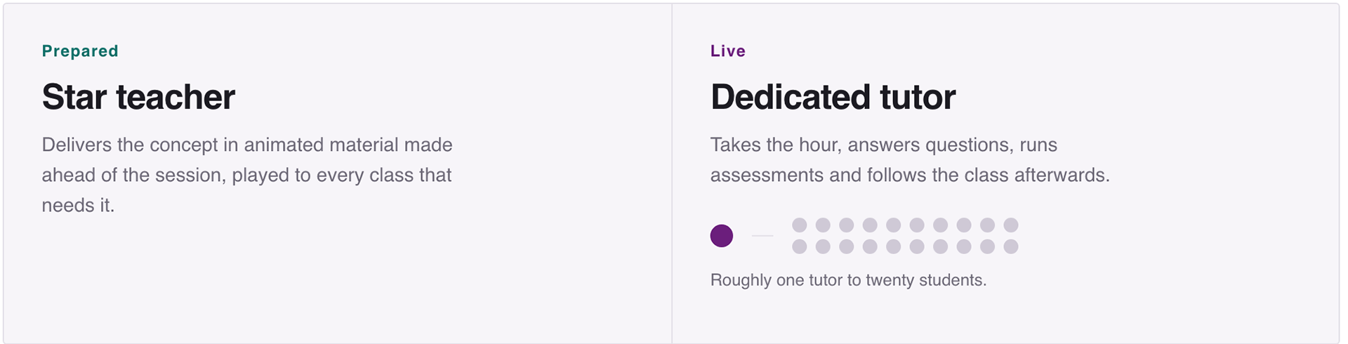
Each project sits at the point in a session where it does its work, and on the side of the class it serves.

The two lines close into a loop at the right hand edge. The rating a student gives after a session becomes the class rating and tutor rating that the tutor sees in class history.
Part one
The tutor's side: experience and efficiency
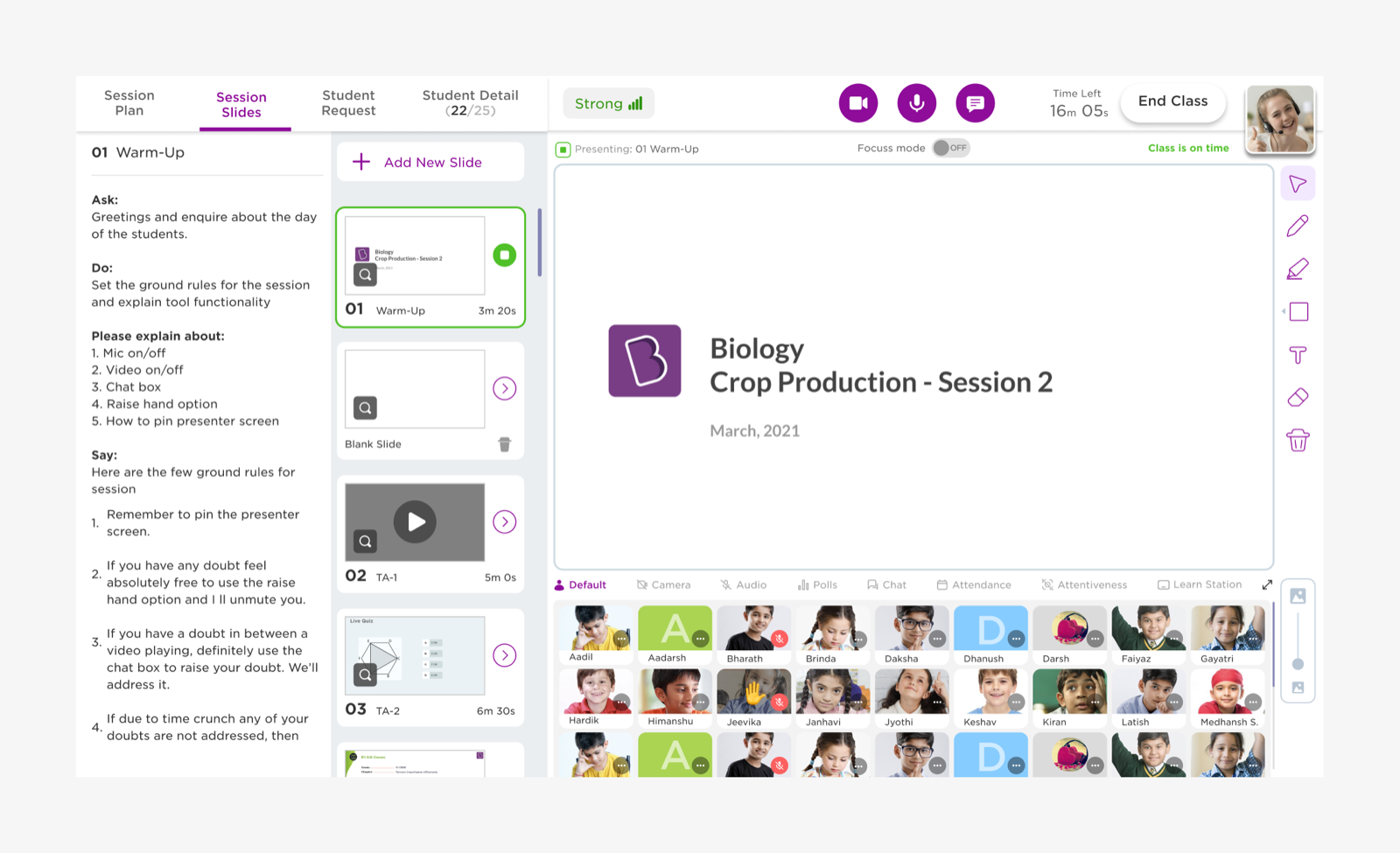
A tutor running a live session had to track attendance, attention, doubts and individual progress while presenting. With most cameras off and a large class, the usual signals of a classroom were missing. These projects added instruments to the tutor console and kept the actions close to where the tutor was already looking.
Clustering of students
Grouping a large class so it can be handled in parts

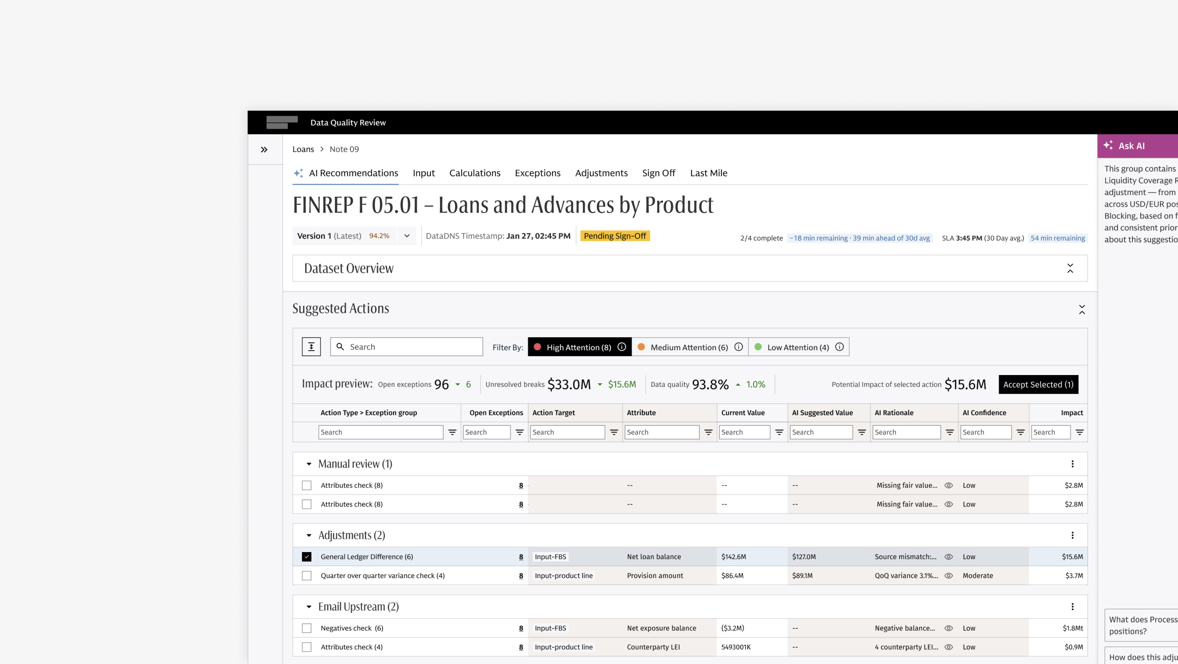
The tutor console during a session. Parameters run along a row of tabs under the presentation area.
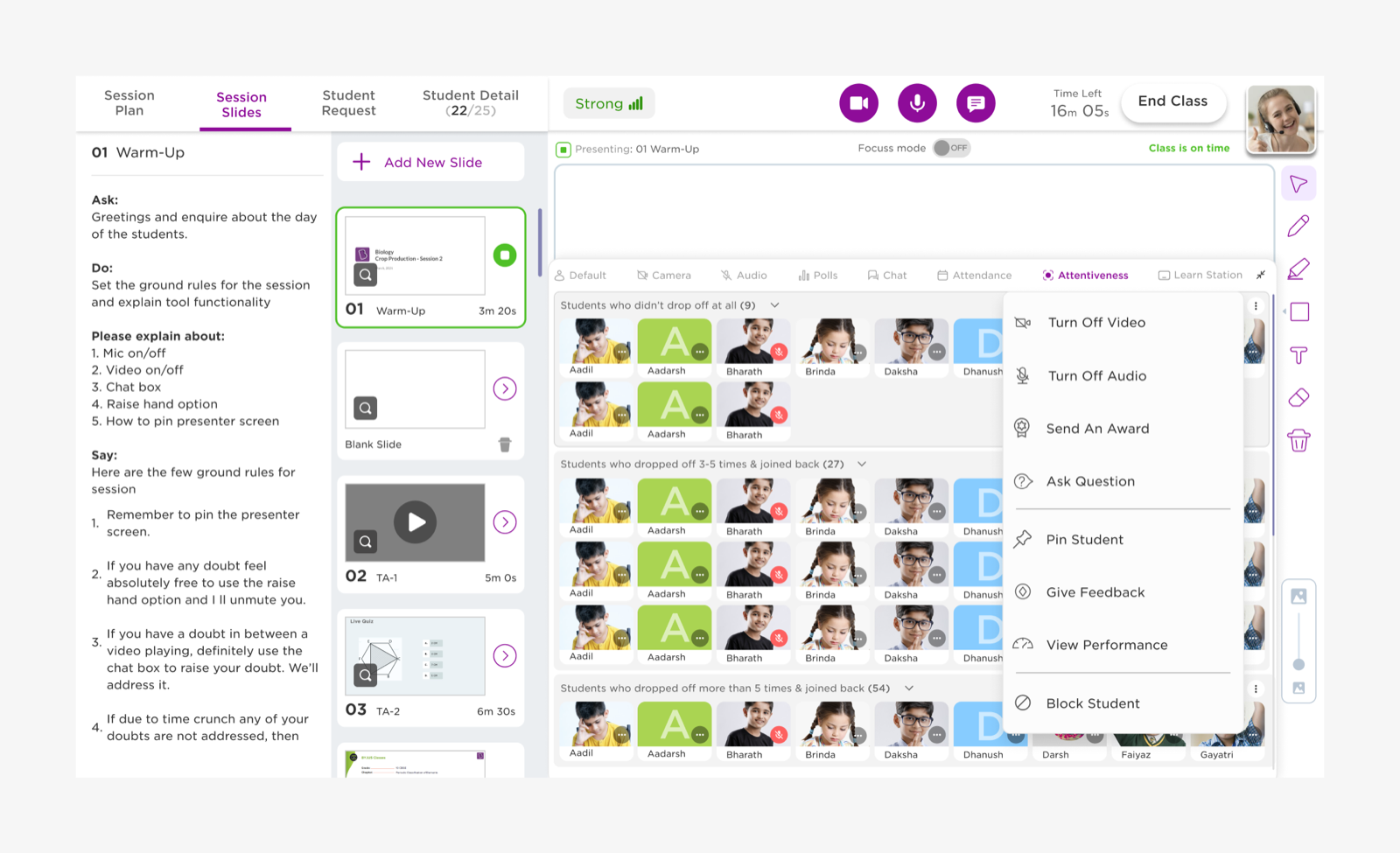
Students grouped by how often they dropped off and rejoined, with actions that apply to a whole bucket.
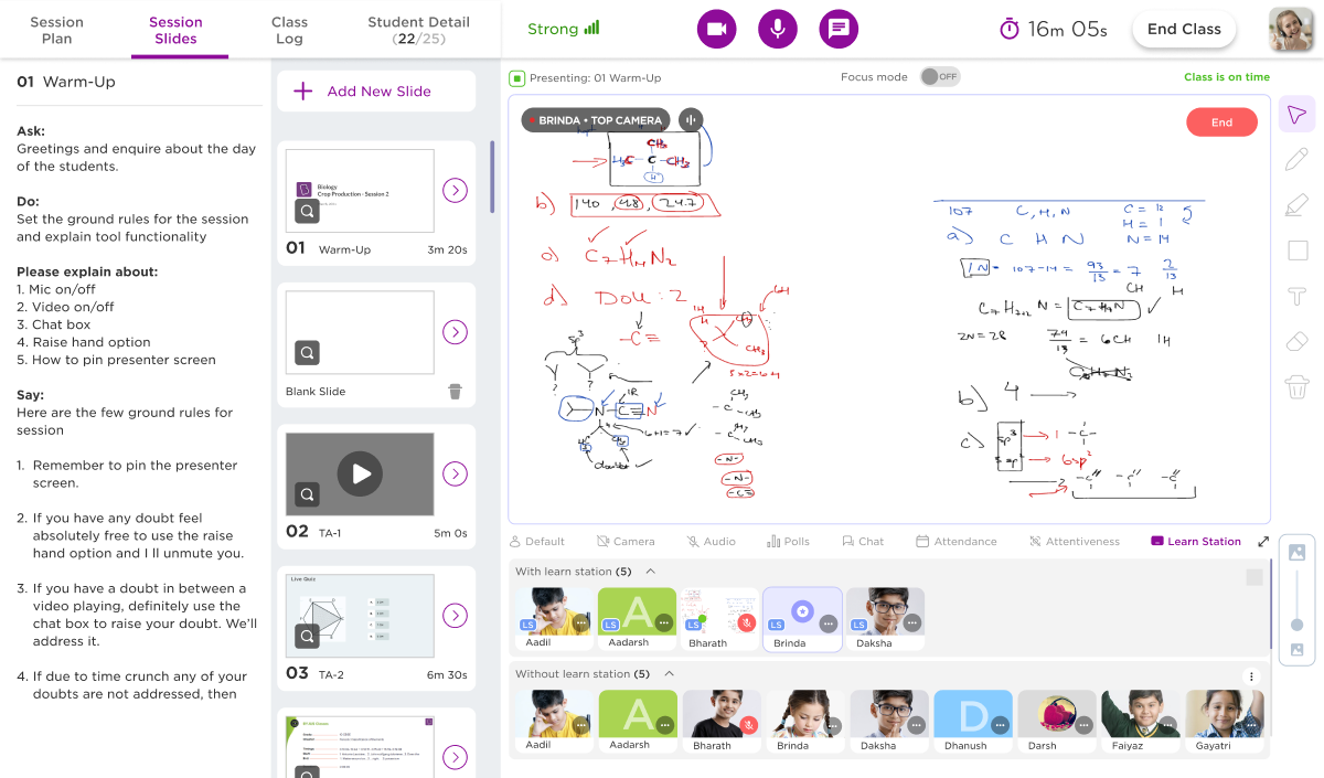
As class sizes grew, tutors could not keep track of students one tile at a time. This project grouped the class automatically under a set of parameters, so the tutor could work with a bucket instead of an individual. Each parameter sits in its own tab, buckets can be expanded or collapsed to suit what the tutor is focusing on, and every bucket carries a menu of actions that apply to everyone in it.
The interesting part is where the parameters came from. Alongside attendance and attentiveness, students were bucketed by how many times they had dropped off and rejoined during the session. Connection quality became something the tutor could see and teach around, rather than a support issue happening somewhere out of view.
Notebook sharing on Learn Station
Using the downward camera to put a student's working on screen

A student's notebook spotlighted to the class from the downward camera on the Learn Station tablet.
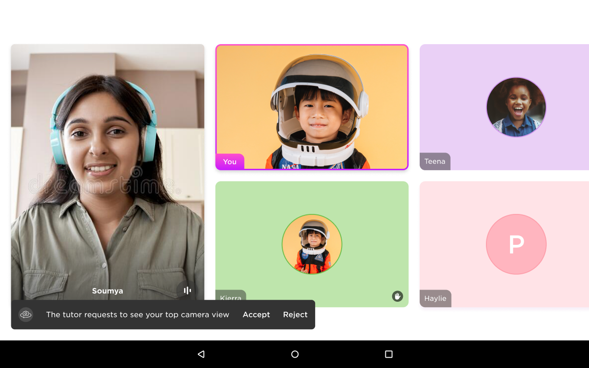
The student's side of the request. Accept and reject carry the same weight, and the bar sits away from the class grid.
Learn Station is a companion tablet with a second camera that points down at the desk. This pilot used it to let a student share their notebook with the tutor and with the class, so a piece of working could be looked at together instead of described out loud. The tutor requests the view, the student accepts or rejects it, and the tutor can then spotlight the notebook for everyone.
Since the feature involves a camera pointed at a child's desk, the student keeps control of it throughout. They can refuse the request, and if they switch the camera off while being spotlighted they get a prompt asking them to confirm rather than being overridden. Students without the tablet are listed separately from students who have it, so the tutor can see at a glance who the feature is even available for.
In-class notice board
Putting announcements where students already are

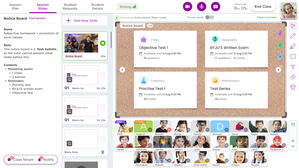
The notice board in flash bulletin mode, cast before the tutor can move on to the session slides.
Tests, exam dates and assignments were reaching students through channels they often missed. The notice board brings them into the live session as a set of cards the tutor casts on screen, sitting in the same slide flow as the rest of the class material.
It runs in two modes. A flash bulletin has to be cast before the tutor can present anything else, which is used when the message is time sensitive and cannot wait for a gap. In the other mode the tutor picks the moment, with a reminder if the session is getting close to its end and the board still has not gone out.
This project has not been written up as a separate page yet.
Tutor feedback system
Capturing observations during class instead of after it

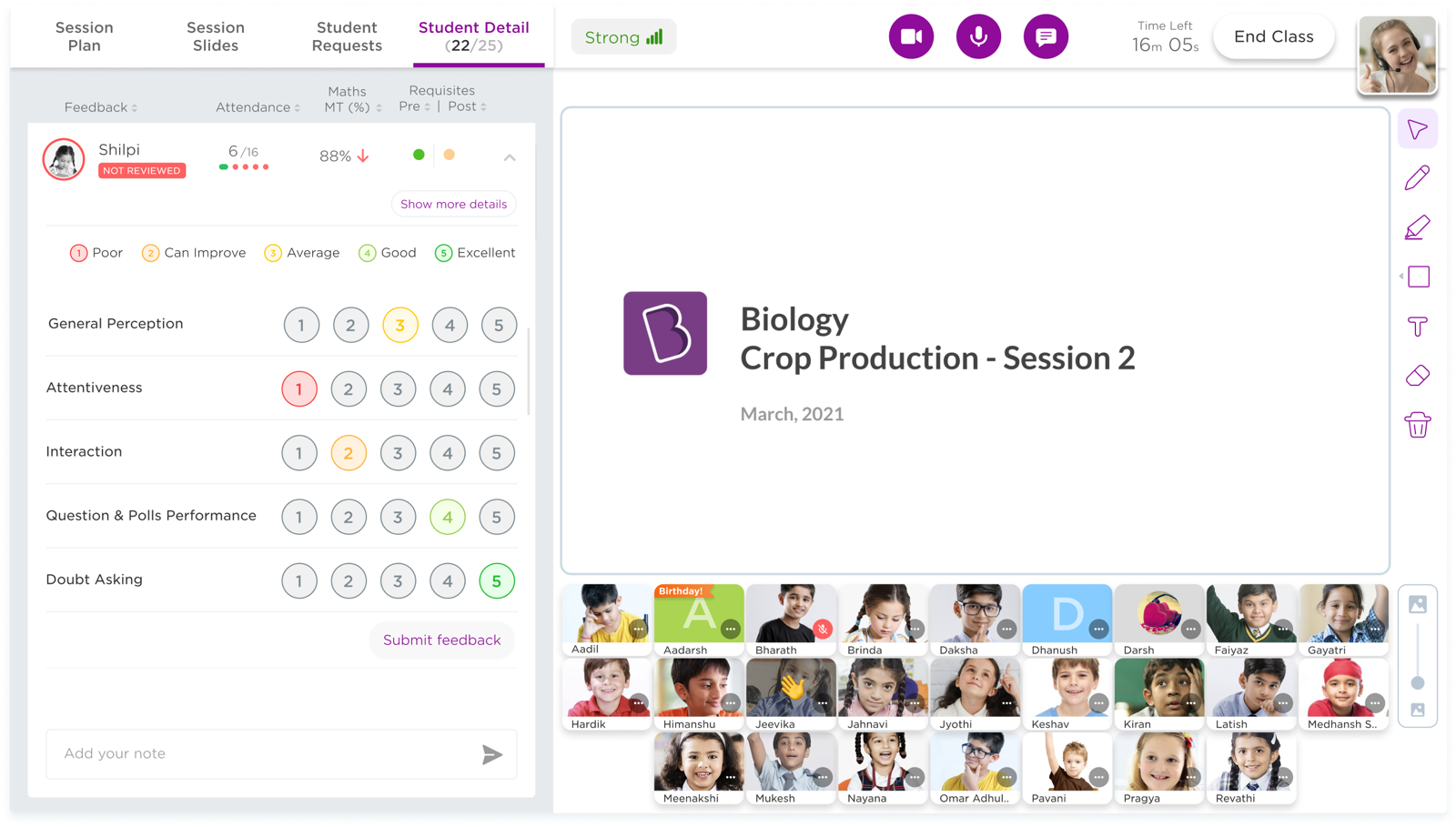
Five parameters agreed with the tutoring team, with room for a written note alongside the scores.
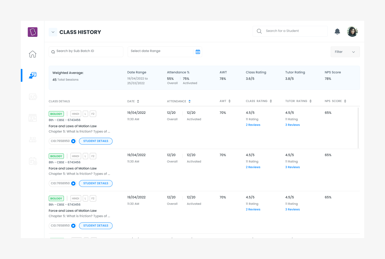
Class history, where feedback can be completed after the session and sits next to the session's numbers.
Mentors needed structured feedback on each student to pass on to parents, and tutors were producing it from paper notes written during class and typed up later. I interviewed tutors about how they were actually doing this. Two things came back consistently: they wanted quantifiable parameters they could mark quickly, and they did not want to lose the qualitative comments that carried the context.
The result gives both. Five parameters were defined with the tutoring team and can be scored from the student detail panel mid session, with a quick note field next to them. Feedback can also be finished after class from the class history page, which is where the session's attendance, ratings and NPS already live, so a tutor reviewing a class sees the scores and the numbers in the same place.
Part two
The student's side: engagement, adoption and experience
The same hour from the other seat. A student joining a live class was one of a large group, usually with their camera off, and anything they did was visible to everyone. Asking a question, answering one, or admitting they had not followed something all carried a social cost.
These projects worked on that from a few directions: making it technically possible to take part, making it cheap to speak, and giving the session some warmth so it felt like a place rather than a stream.
Trial class emailers
Building some anticipation before the first class

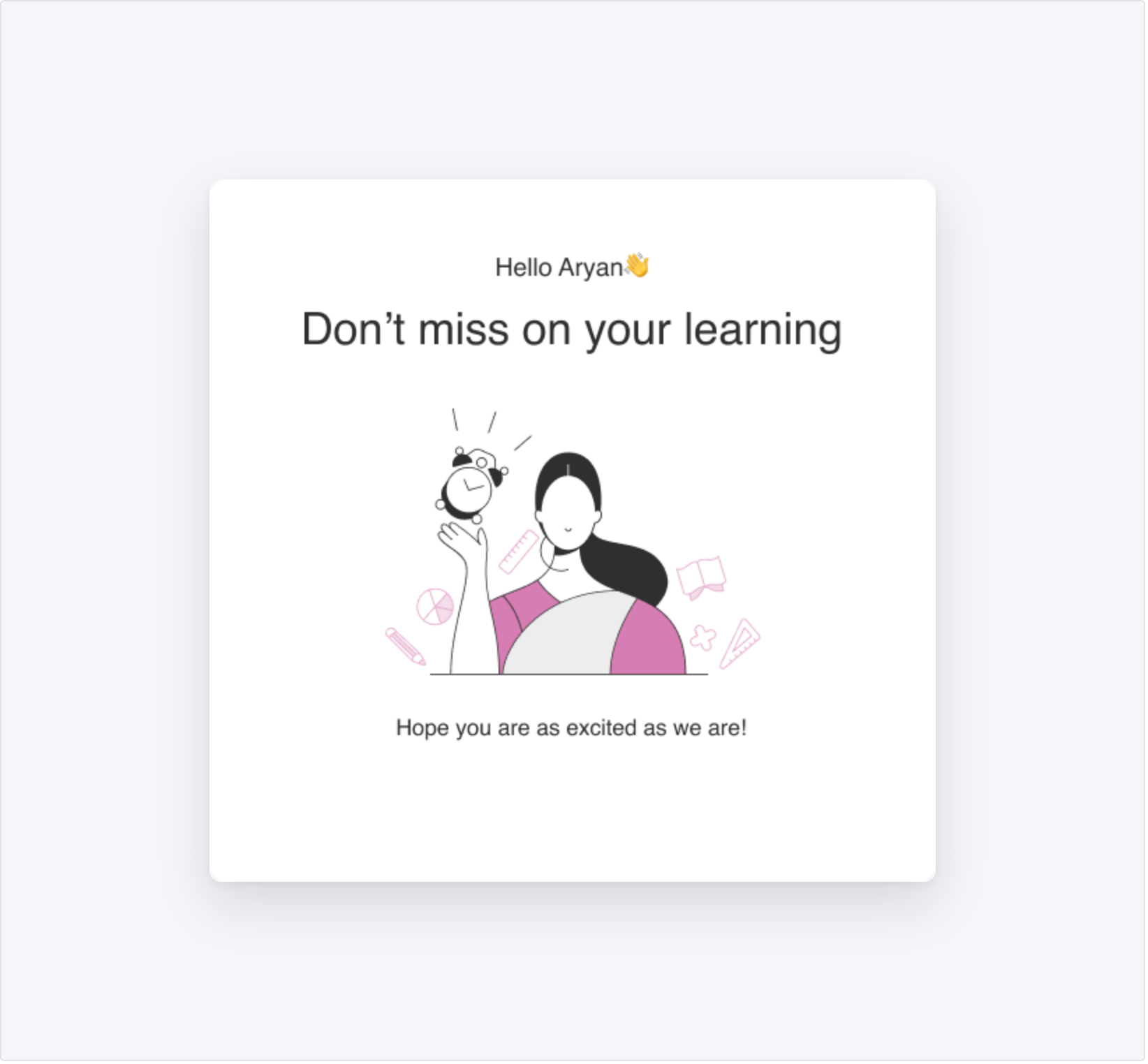
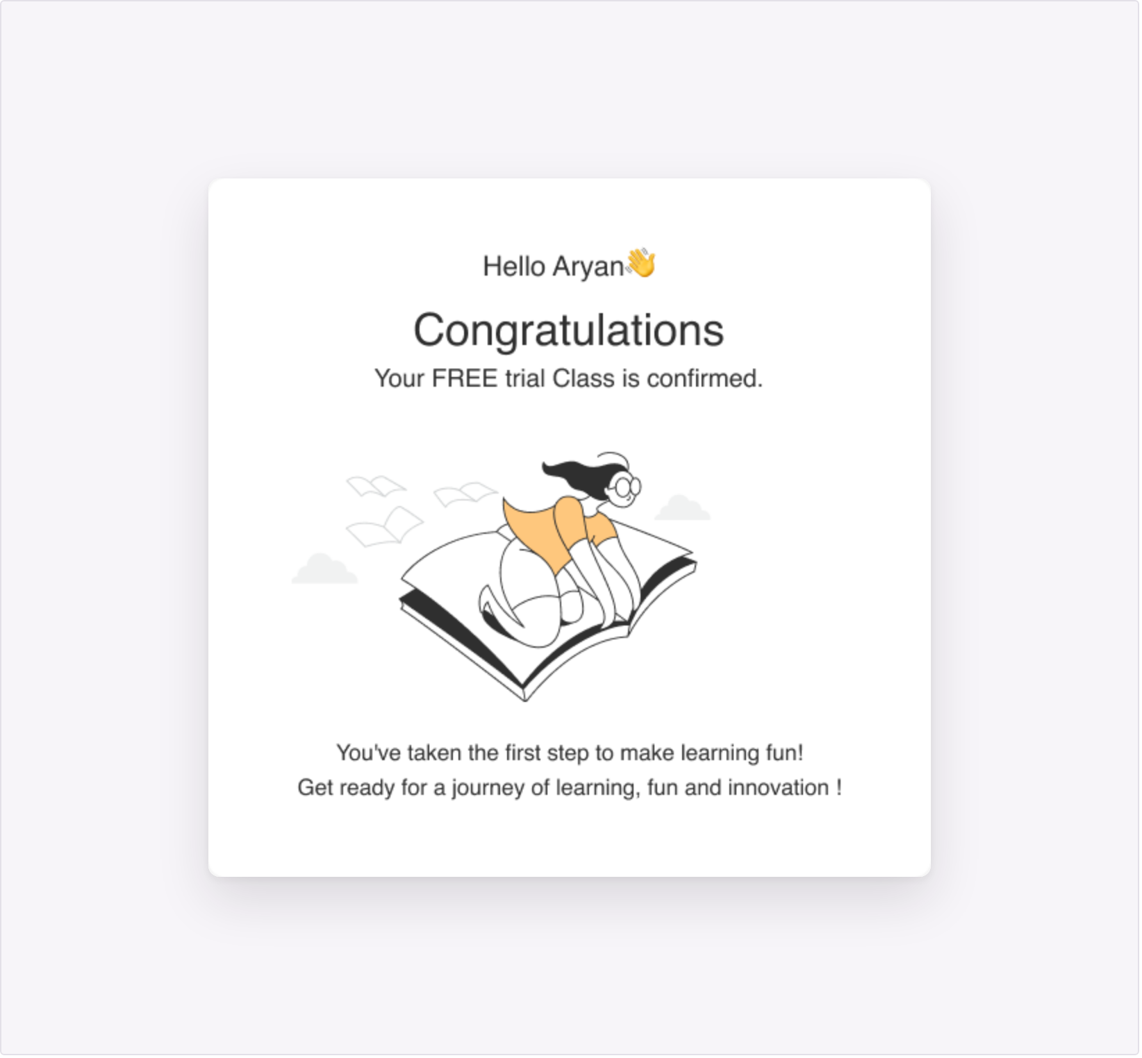
One of four emails in the trial class sequence, designed for desktop and mobile.

A set of four emails for students who had signed up for a free trial class: a booking confirmation, an overview of what they would get access to, a reminder shortly before the session, and a follow up afterwards. Each one was designed for desktop and mobile.
The brief here was closer to emotional design than to interface work. These arrive before a student has seen anything of the product, so the job was to make the class ahead of them feel worth turning up for. The illustrations are deliberately simple, the tone is written to a student rather than to a parent, and the sequence builds from confirmation through to a reminder that lands shortly before the class starts.
Device check and in-class help
Getting students into the class and keeping them there

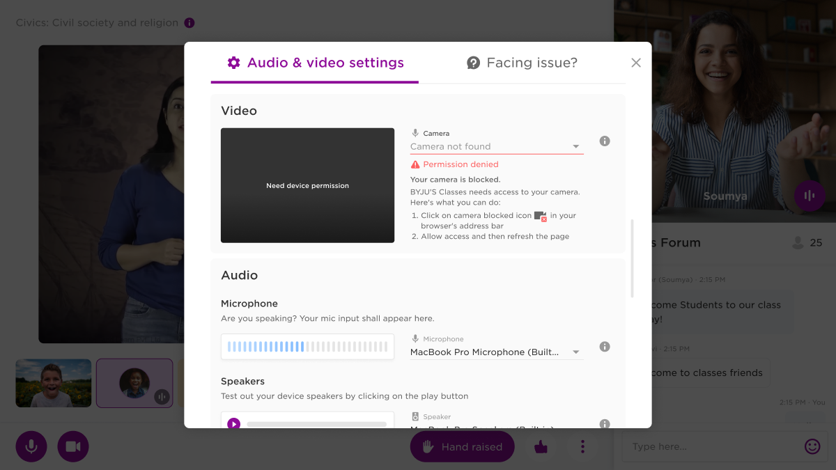
Device settings with a blocked camera. The instructions are specific to the browser the student is in.
A share of every session was being lost to microphone, camera and network problems, and students had no way to sort them out without leaving the class. This project put device settings and help into one panel, available before the session starts and while it is running.
The microphone shows a live input meter so a student can confirm it is picking them up, speakers can be tested with a sample, and connection strength is reported in plain terms. A blocked camera returns the steps to unblock it for that specific browser instead of a generic failure message. A second tab lets the student report a problem they cannot fix themselves, and short nudges appear during class when the microphone or the connection looks like the reason someone has gone quiet.
This project has not been written up as a separate page yet.
Class forum, first and second release
A chat panel built for asking without unmuting

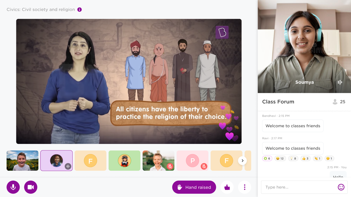
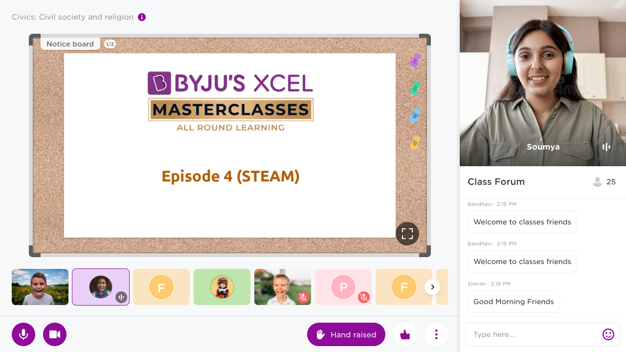
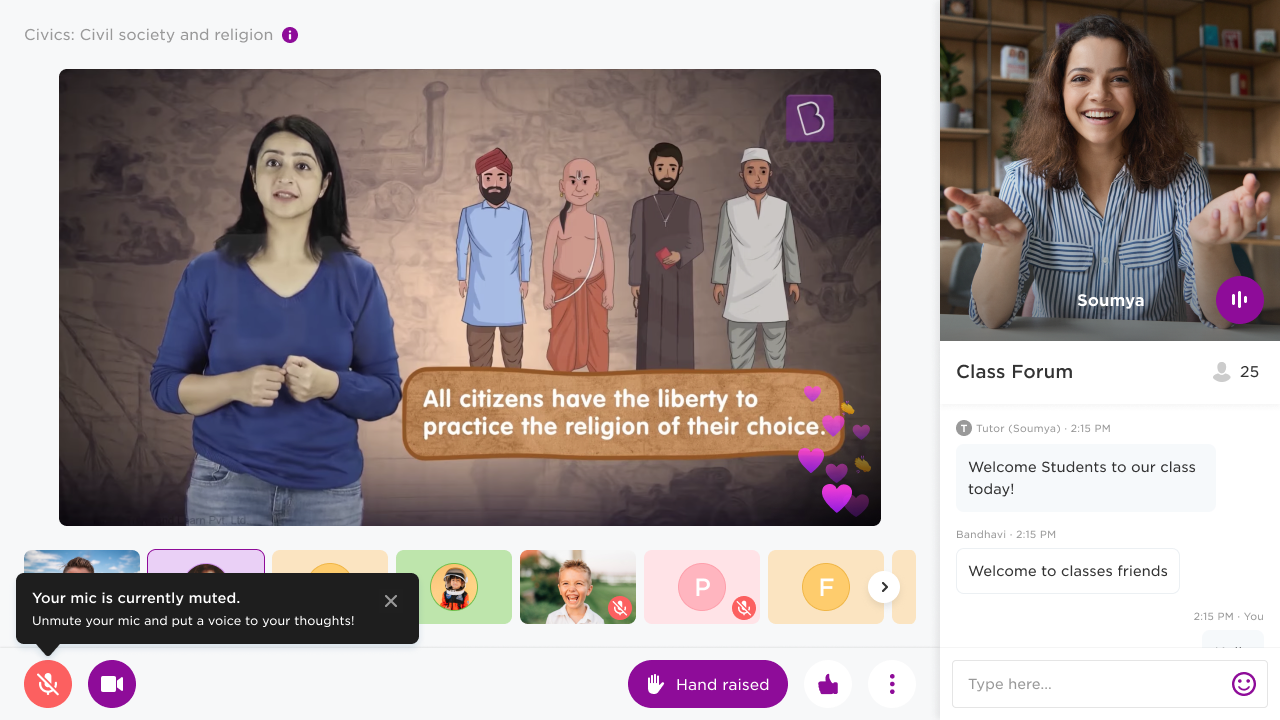
The forum in the second release, with reactions and counts on messages and reactions floating over the class video.
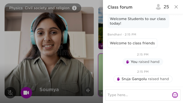
The class forum is the chat module inside the live class. It gives a student a way to ask something without interrupting the session or turning on a microphone, and it doubles as a log of the class with timestamps against what happened.
The first release covered messaging, emoji and stickers, hand raise, tutor replies that can be navigated back to, and the states around them: consecutive messages from the same person, messaging switched off by the tutor, and a control that tells a student how many messages have arrived while they were scrolled up reading something earlier. The second release added reactions with counts, pinned messages that can be stepped through from the top of the thread, and badges that mark students as they join. Mobile was designed as its own layout rather than a narrower version of the desktop one, because on a phone the panel and the video are competing for the same small screen.
Opinion polls and in-class surveys
Answering a question without saying anything

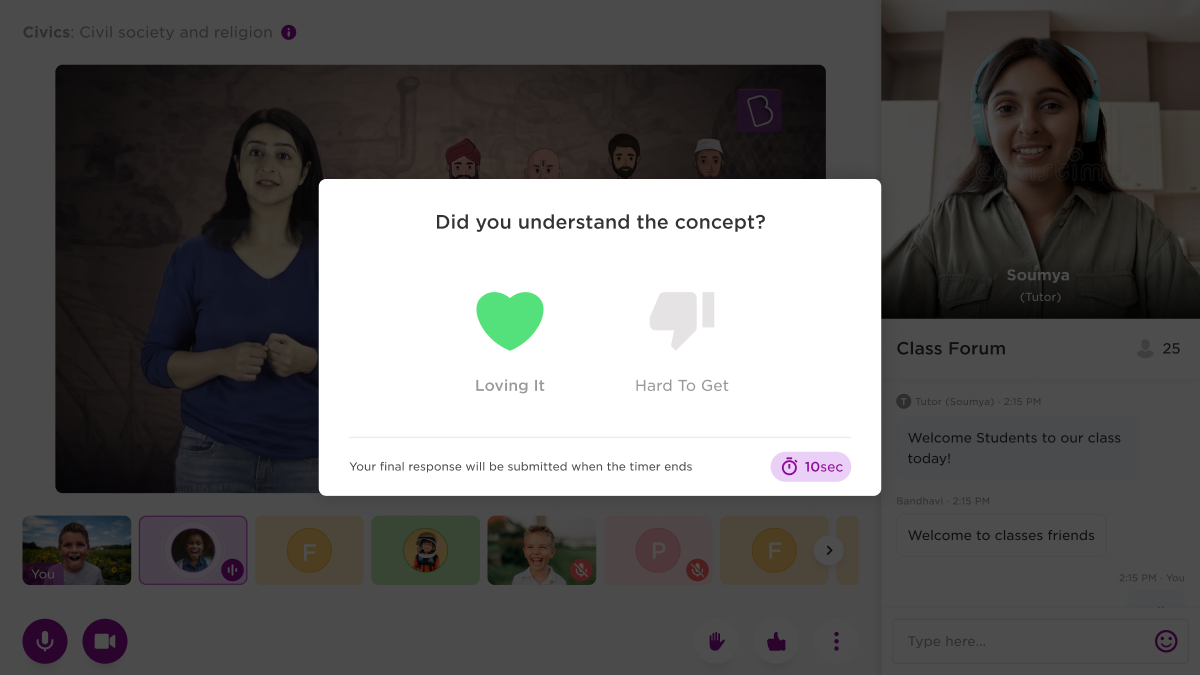
The student's side. The response is submitted when the timer ends, so an answer can still be changed.
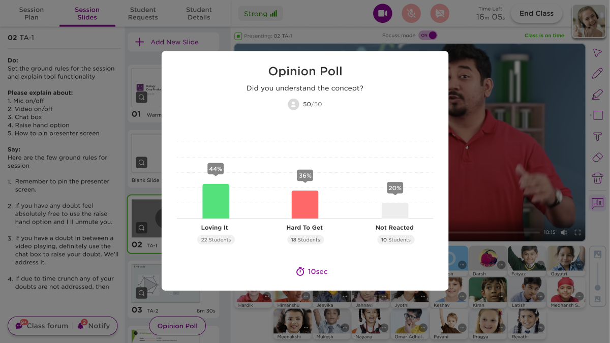
The tutor's results, with the students who did not respond counted as their own column.
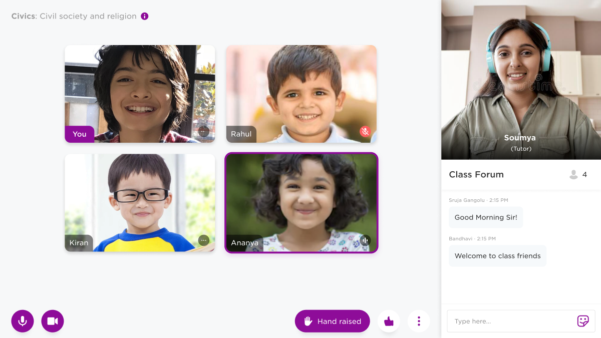
Polls give the tutor a reading on whether the class is following, and give students a way to answer that costs them nothing socially. The tutor starts a poll from the console, it runs for ten seconds, and the results come back as a simple breakdown they can act on before moving to the next slide.
Two decisions shaped it. The student's answer is only submitted when the timer ends, which means a first tap is not a commitment and there is no penalty for hesitating. And on the tutor's side, students who did not respond at all are counted as their own result rather than dropped from the total. In a class where most people are invisible, knowing that a fifth of the room stayed silent is worth as much as the split between the ones who answered.
This project has not been written up as a separate page yet.
Class joining and birthday celebration
Two moments that give the session some warmth

The first minute of a session, as students arrive one at a time.
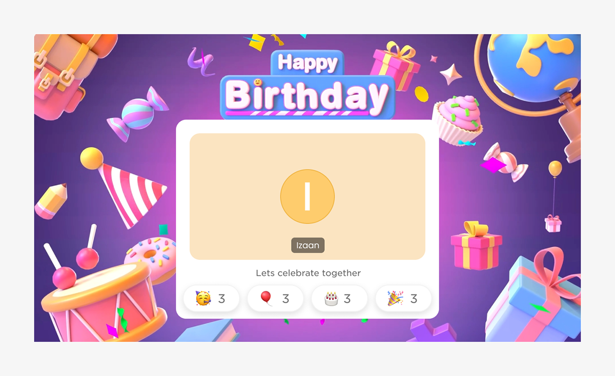
The birthday screen. The student is represented by their initial, since the camera is usually off.
I did the experience design and art direction for two animated moments at the start of a class. The joining sequence plays as students arrive, so the first minute has something going on in it while the room fills up. The birthday screen marks a student's birthday and lets the rest of the class react to it.
Both had to work for a student whose camera is off, which is most of them. So the design is built around the coloured tile and the initial that stands in for a face, and the class shows up through reaction counts rather than expressions. The joining animation went through ideation sketches, character design, two animatics and a final pass, with the edge cases worked out with the engineering team: what happens when the classroom is still being created, when the tutor joins late, and how the tiles settle once everyone is in.
Engagement bots
A framework for where an AI companion belongs in a class

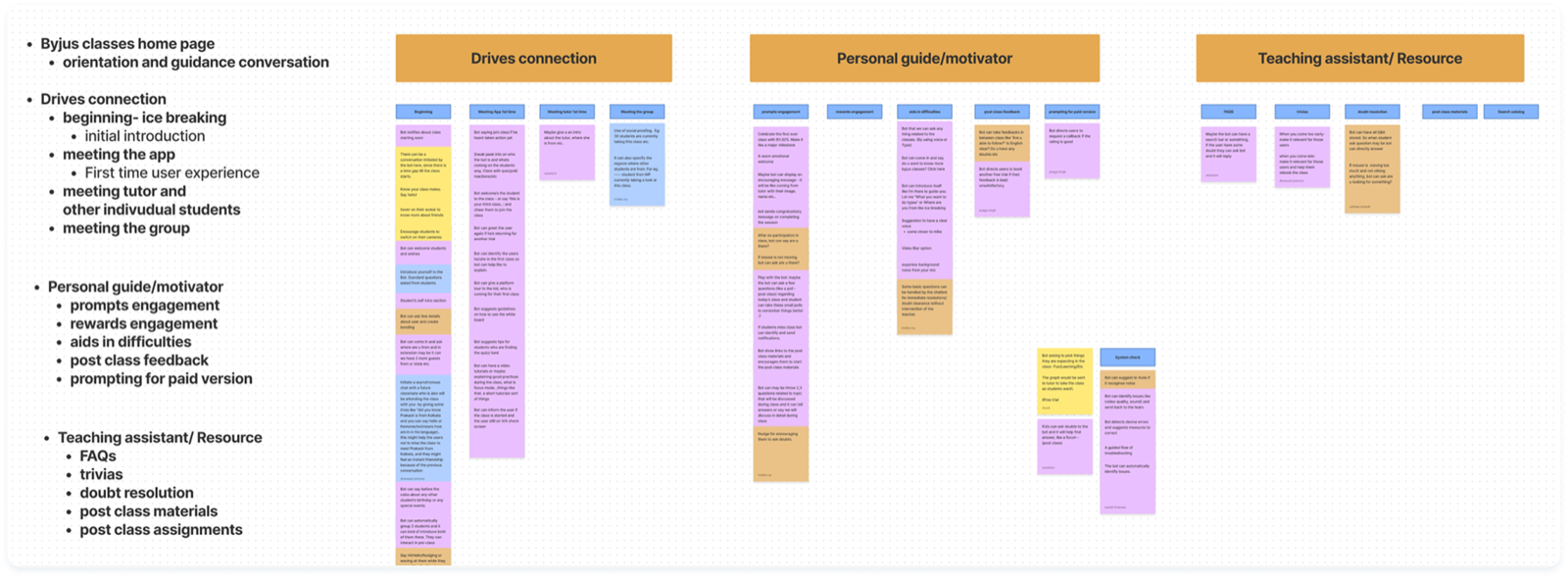
Ideas from the team sessions, sorted into the three roles a bot could take in a class.
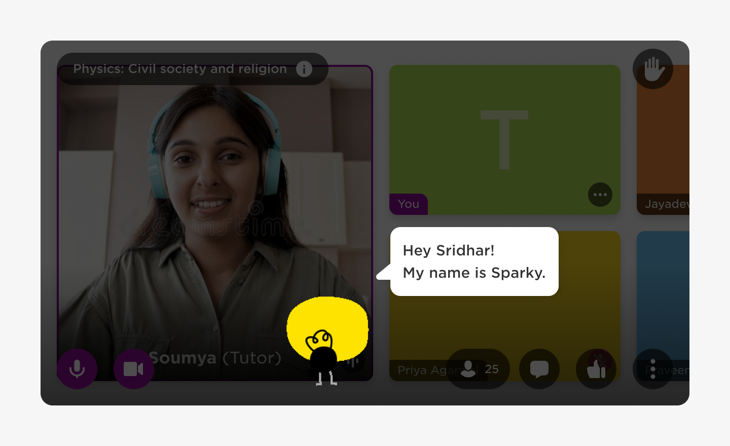
Sparky introducing itself to a new student during onboarding.
Byju's wanted to use AI in the classroom and the question was where it would actually help. I ran brainstorm sessions with the team that produced a large set of ideas, then analysed them and found they sorted into three roles: building connection between people in the class, guiding and motivating an individual student, and acting as a teaching assistant or resource. That framework became the way new use cases were assessed afterwards.
From there, use cases were prioritised with the product managers on an effort and impact matrix. The first two to be built were onboarding for first time students and doubt resolution, where the bot points a student towards the class forum when they seem stuck. I art directed the character, called Sparky, with a character designer, and we produced a set of animated loops for it. The initial use cases went to staging for a trial run with free tier users.
Rating revamp
Asking for feedback in a way students will finish

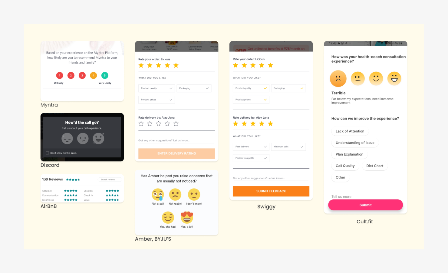
Rating patterns from other products, alongside the scale Byju's was already using.
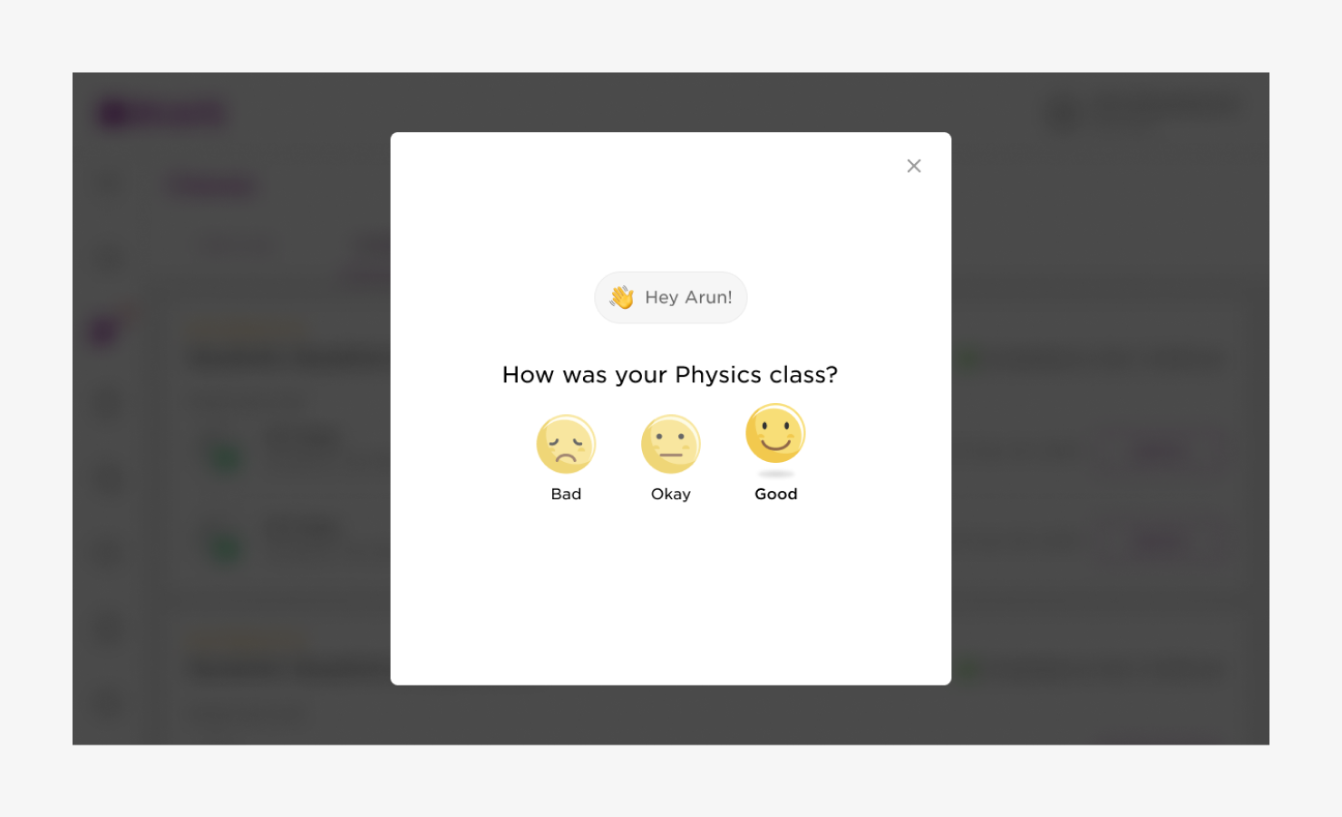
The three point version, with the follow up questions reduced and reworded.
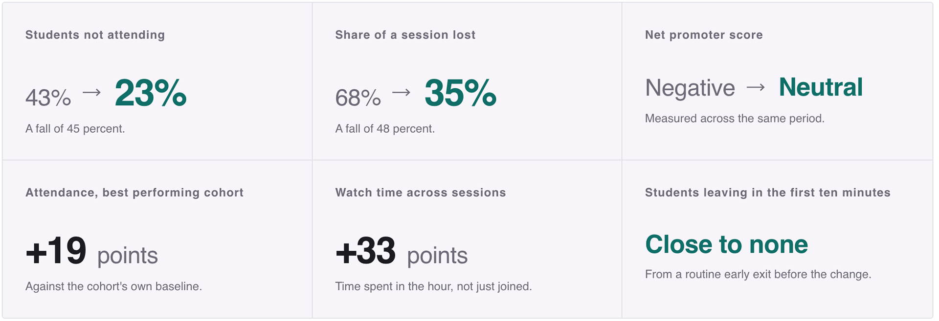

A portion of students were leaving at the end of a session without rating it, which left the product short of the feedback it was using to judge class quality. Working with a researcher, I looked at how other consumer products ask the same question, including Myntra, Discord, Airbnb, Swiggy and Cult.fit, and at the scale Byju's already had in place.
A binary scale gets an answer fastest, but it leaves a student with nothing to pick when the class was fine and nothing more. That was the argument for testing it against a three point scale rather than assuming, so both versions were designed for an A/B test. Beyond the scale itself, the follow up options were cut down in number and rewritten in plainer language, since the length of the second step was part of why people were abandoning the first.

You may also like

Back to Top