A portion of students was dropping off after sessions without providing rating and feedback in the existing design in Byju's classes. Thus, the objective was to make the experience much easier and pleasant. Along with user research team member, I researched on different rating scales and user behaviours. Based on the research, designed user flow and the visual design intended for A/B testing between 3 Point and Binary rating scales.
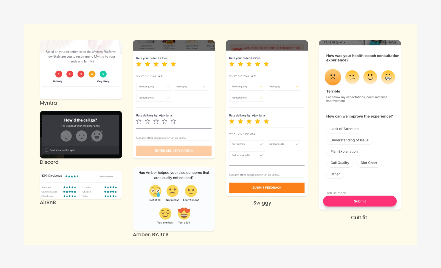
Research helped in understanding and analysing the commonly used rating scales and their pros and cons in the classes context

Although the binary scale provided quick means of feedback, it doesn't address the grey area in between a yes or no. Thus we decided to do an A/B testing to choose between 2-point or 3-point scale.
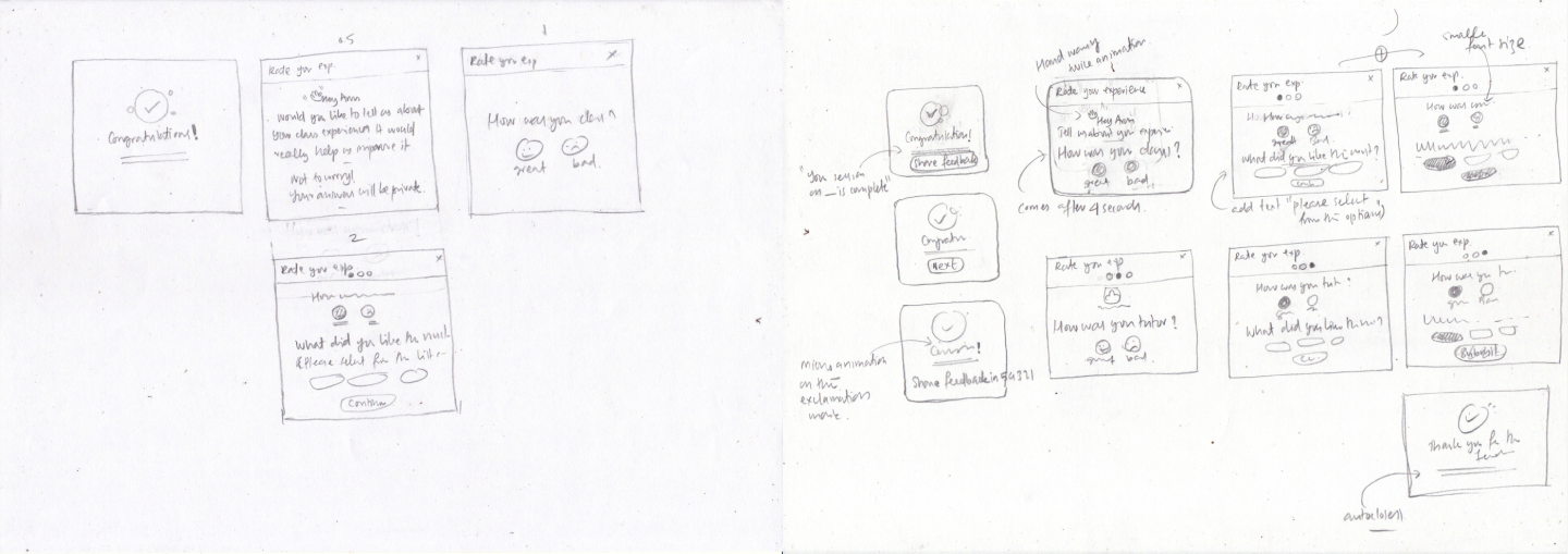
Hand drawn wireframes helped in quickly evaluating the flows.
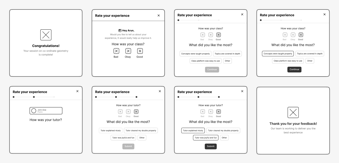
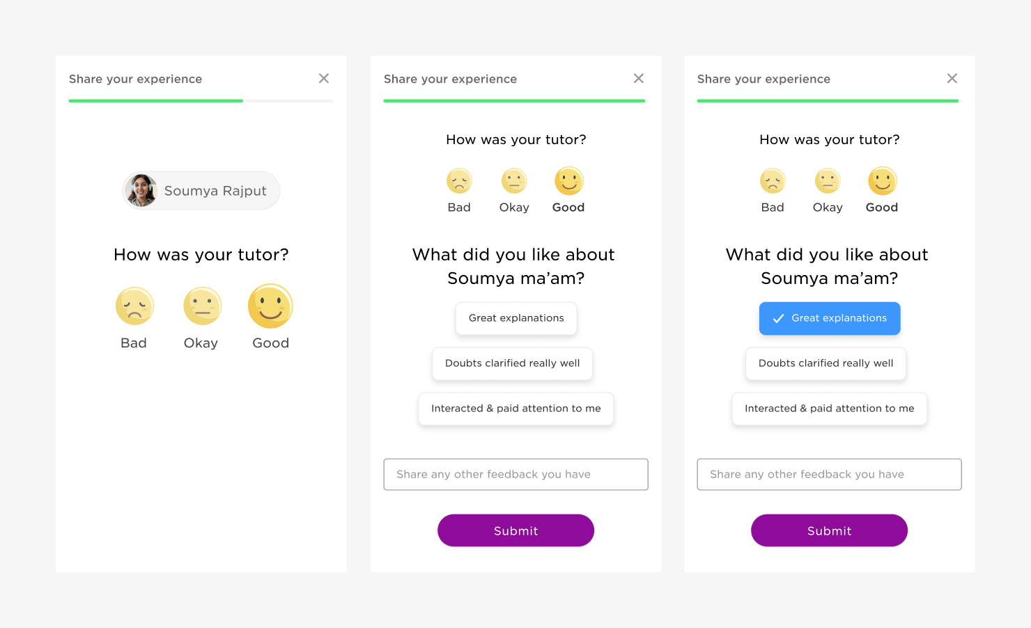
Reducing the number and simplifying the language of the feedback options to further reduce the cognitive load.
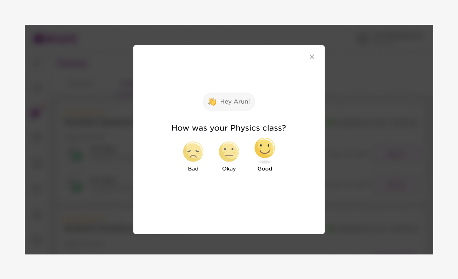
Desktop UI screen sample- hover state for rating emoji
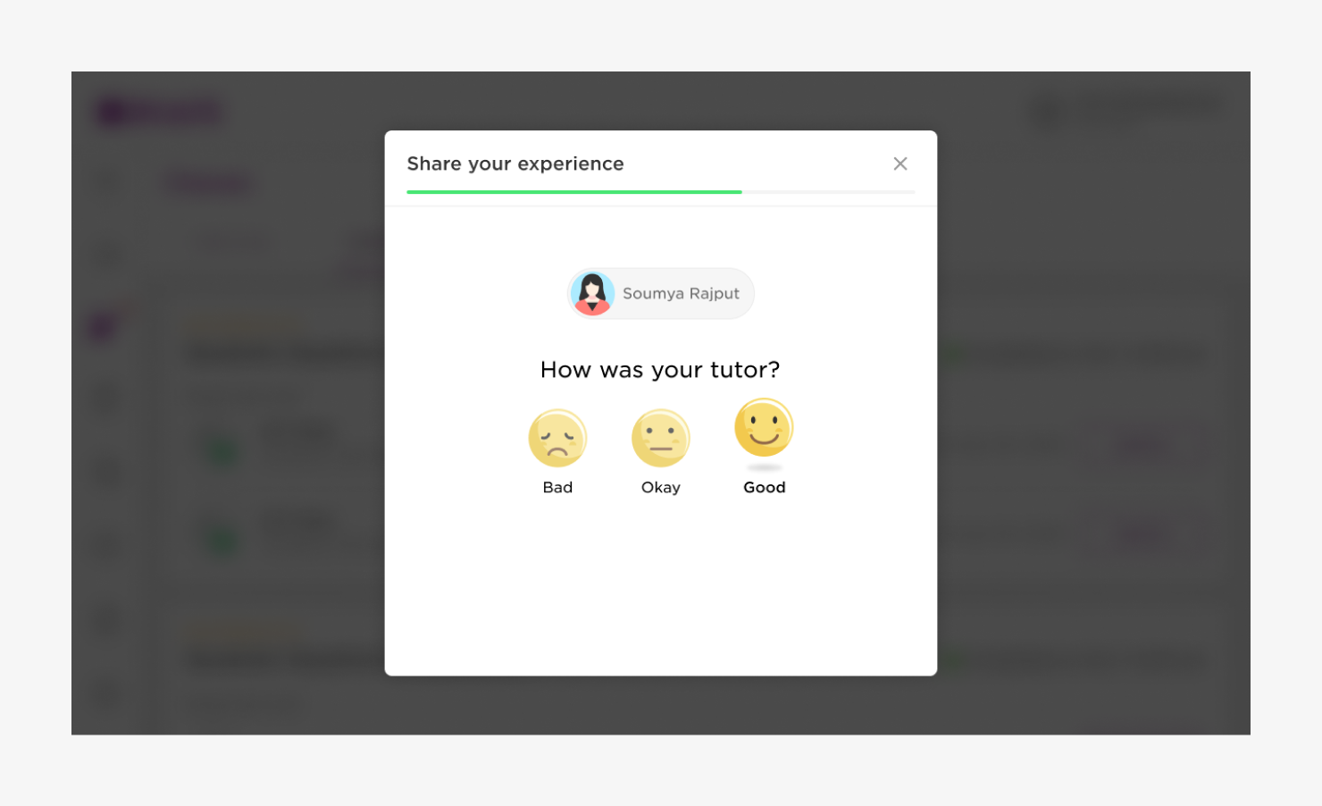
Desktop UI screen sample- placeholder for tutor thumbnail
Mobile UI screen samples
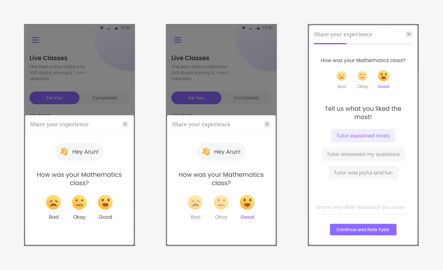
APP UI screen samples