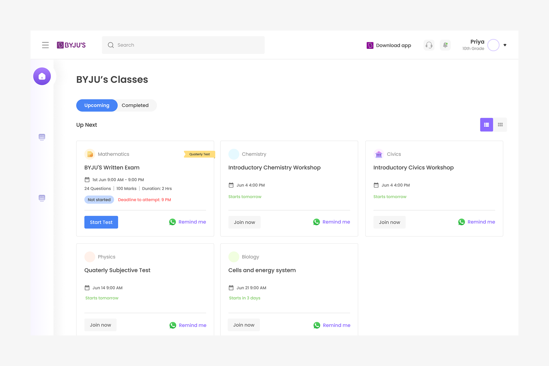
The exam is scheduled for all students together on a specified time slot. Students can join the exam from the upcoming cards, as well as directly from notification
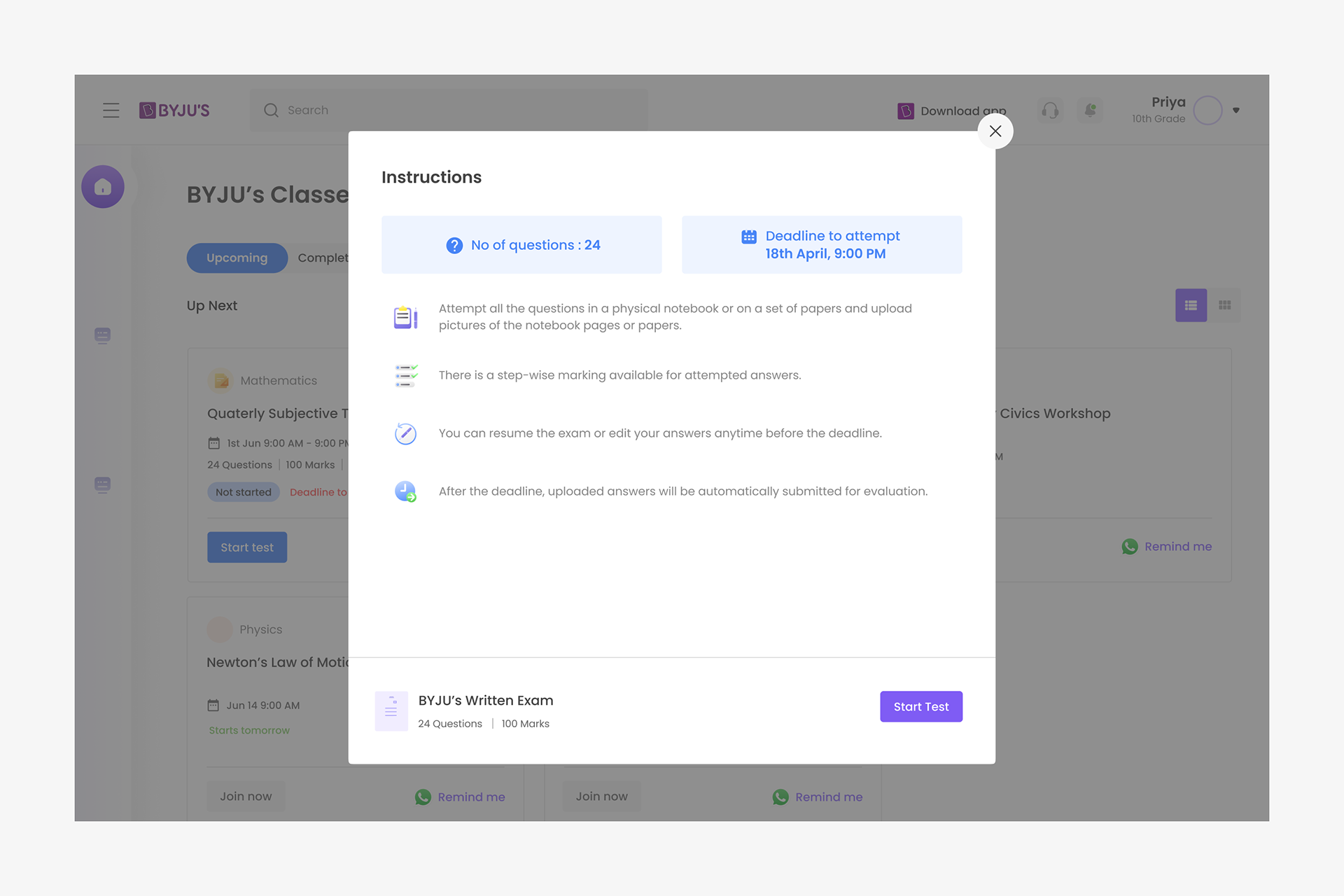
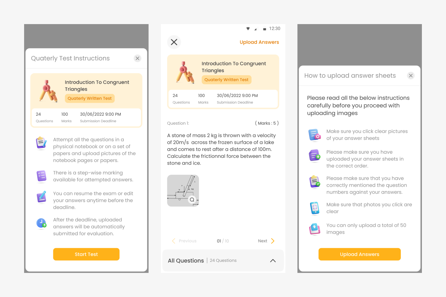
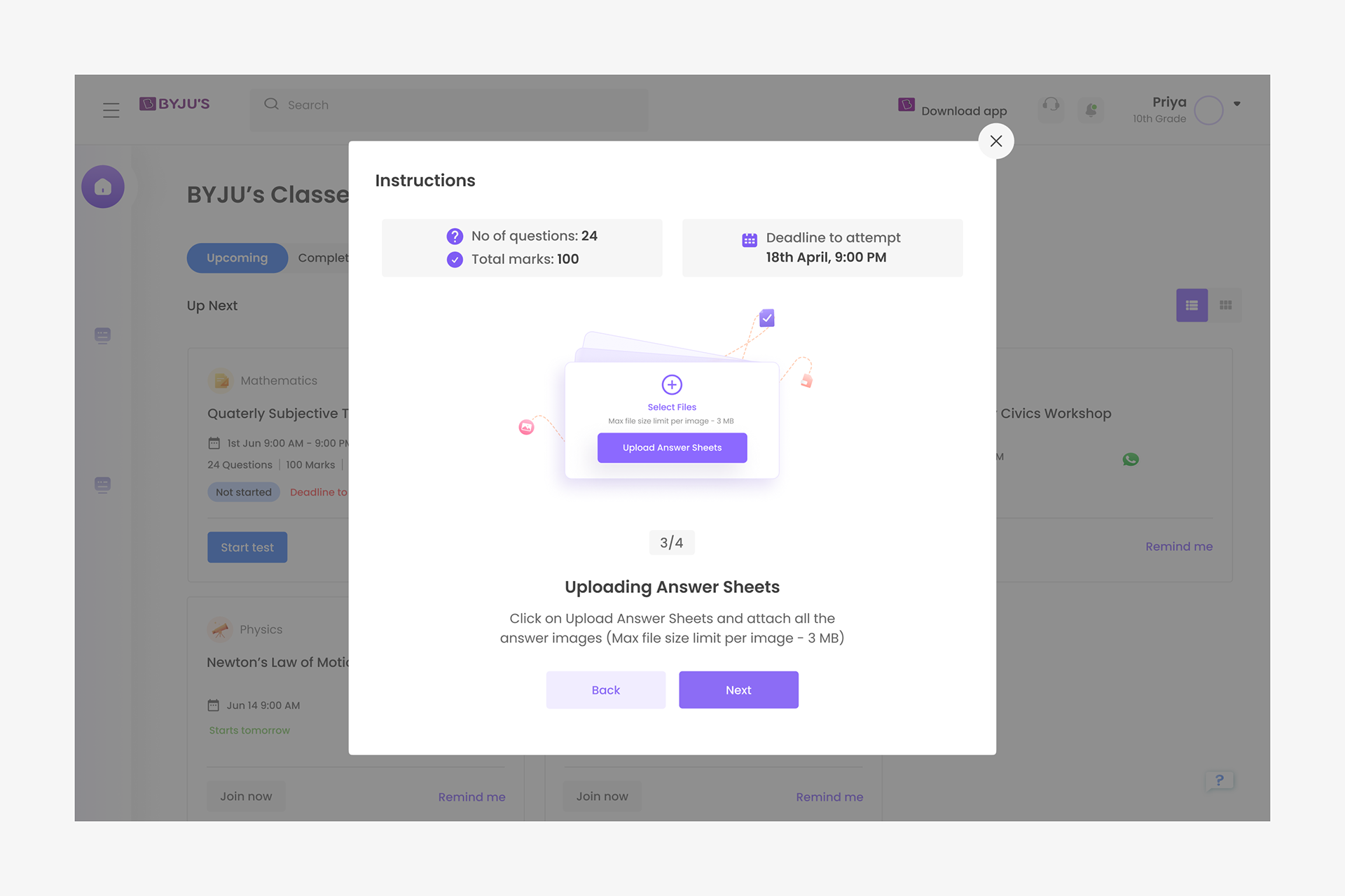
Key instructions are shown prior to starting the test (Version 1).
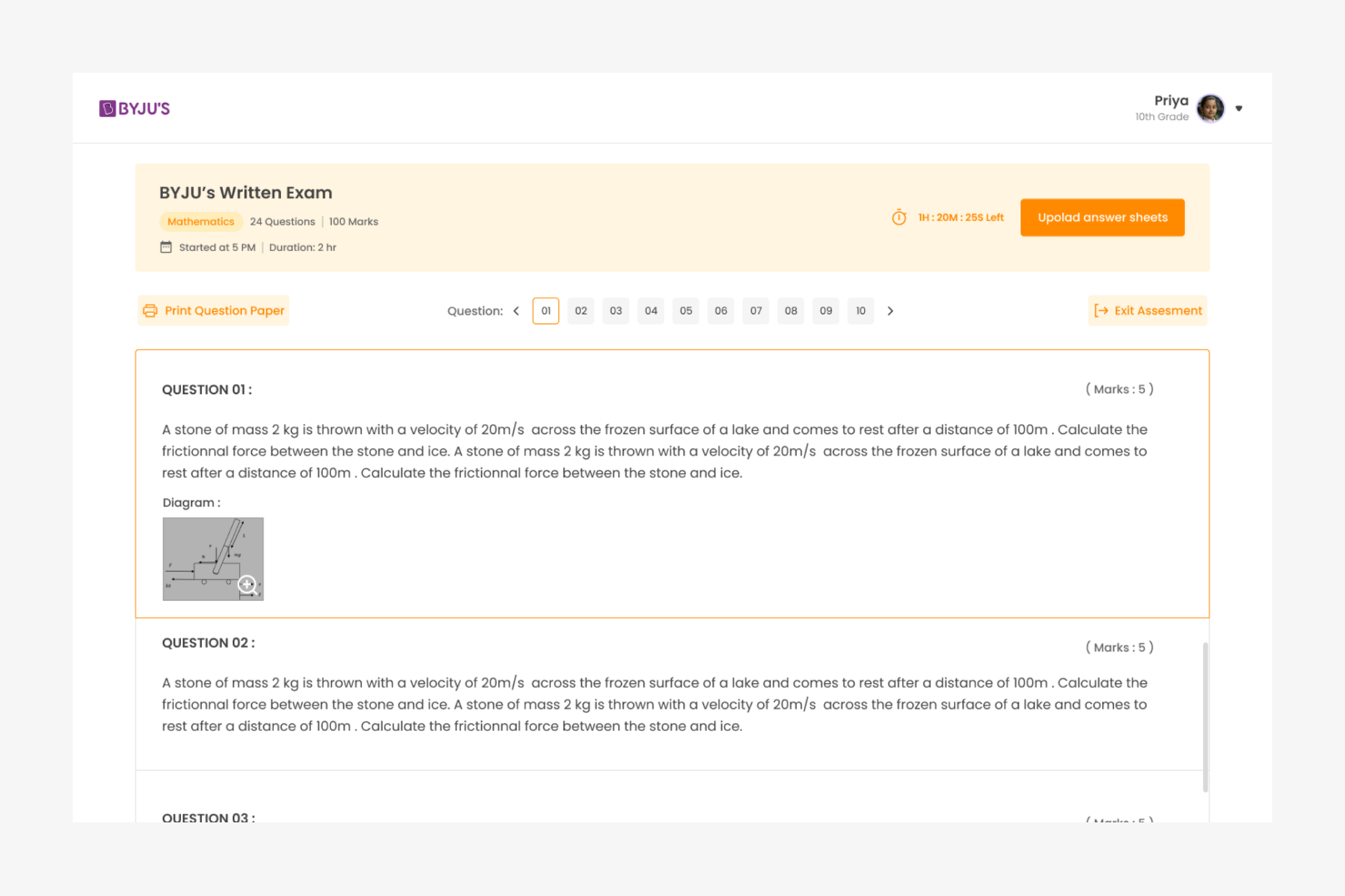
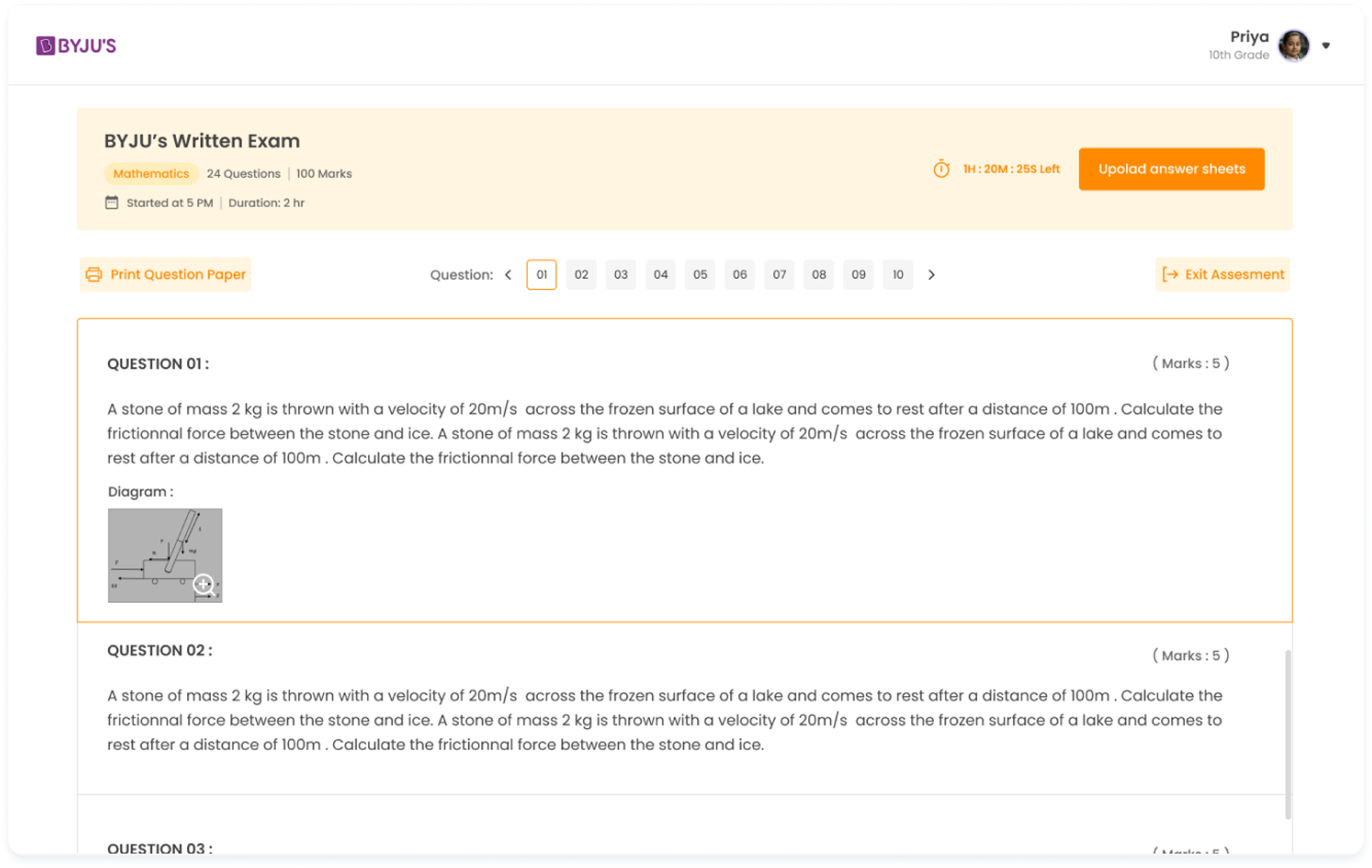
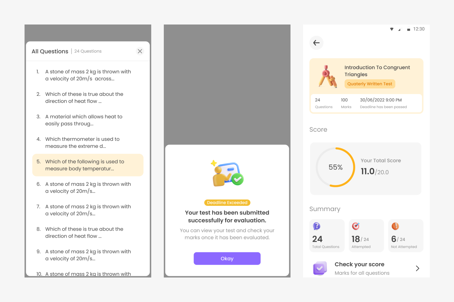
The questions can be navigated by scrolling or by clicking question number in the pagination
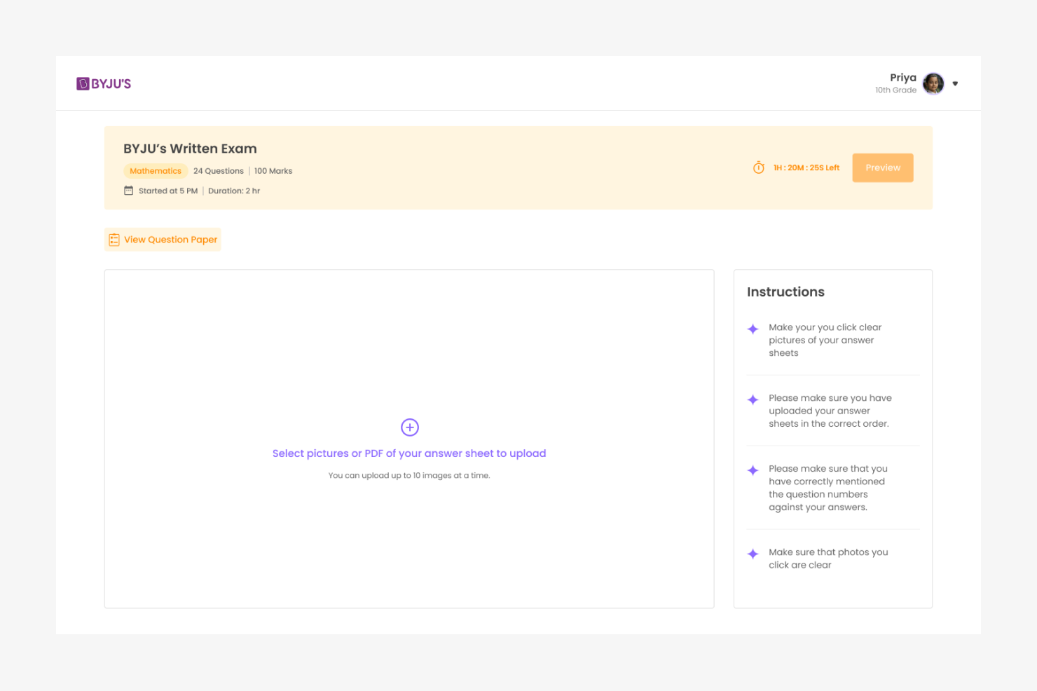
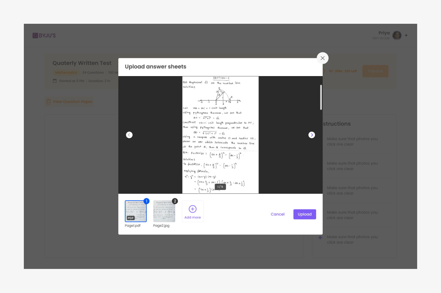
Screen to upload answers
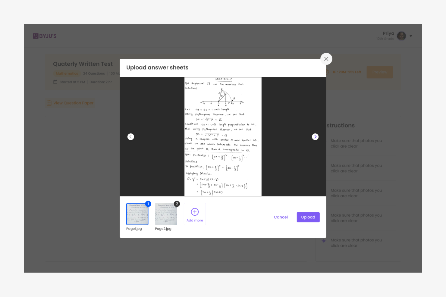
Images can be cropped and rotated in the upload window itself
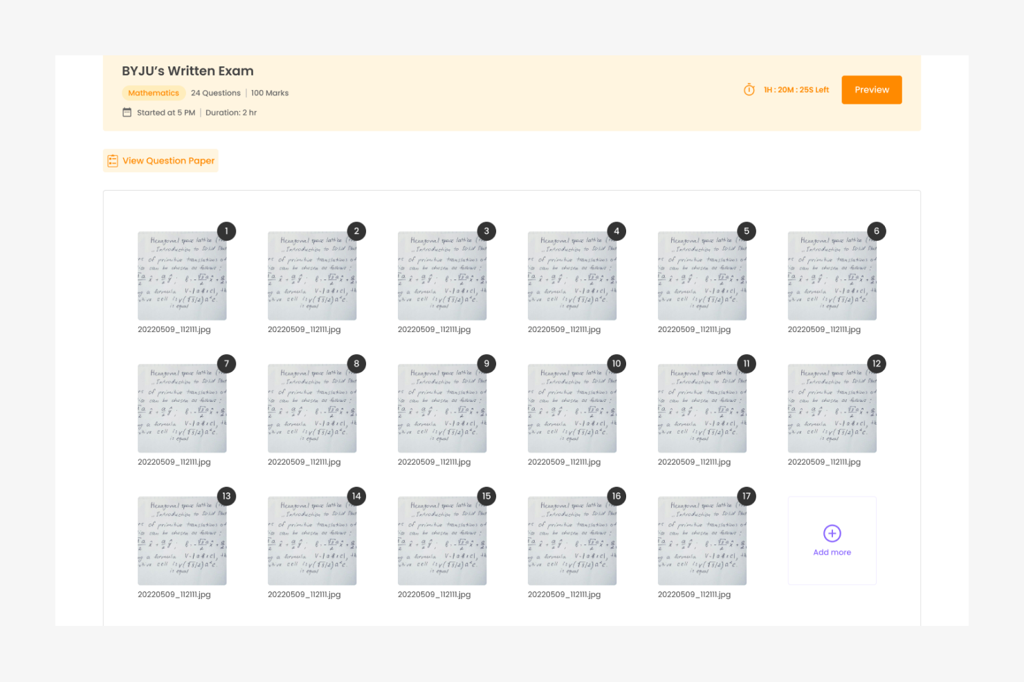
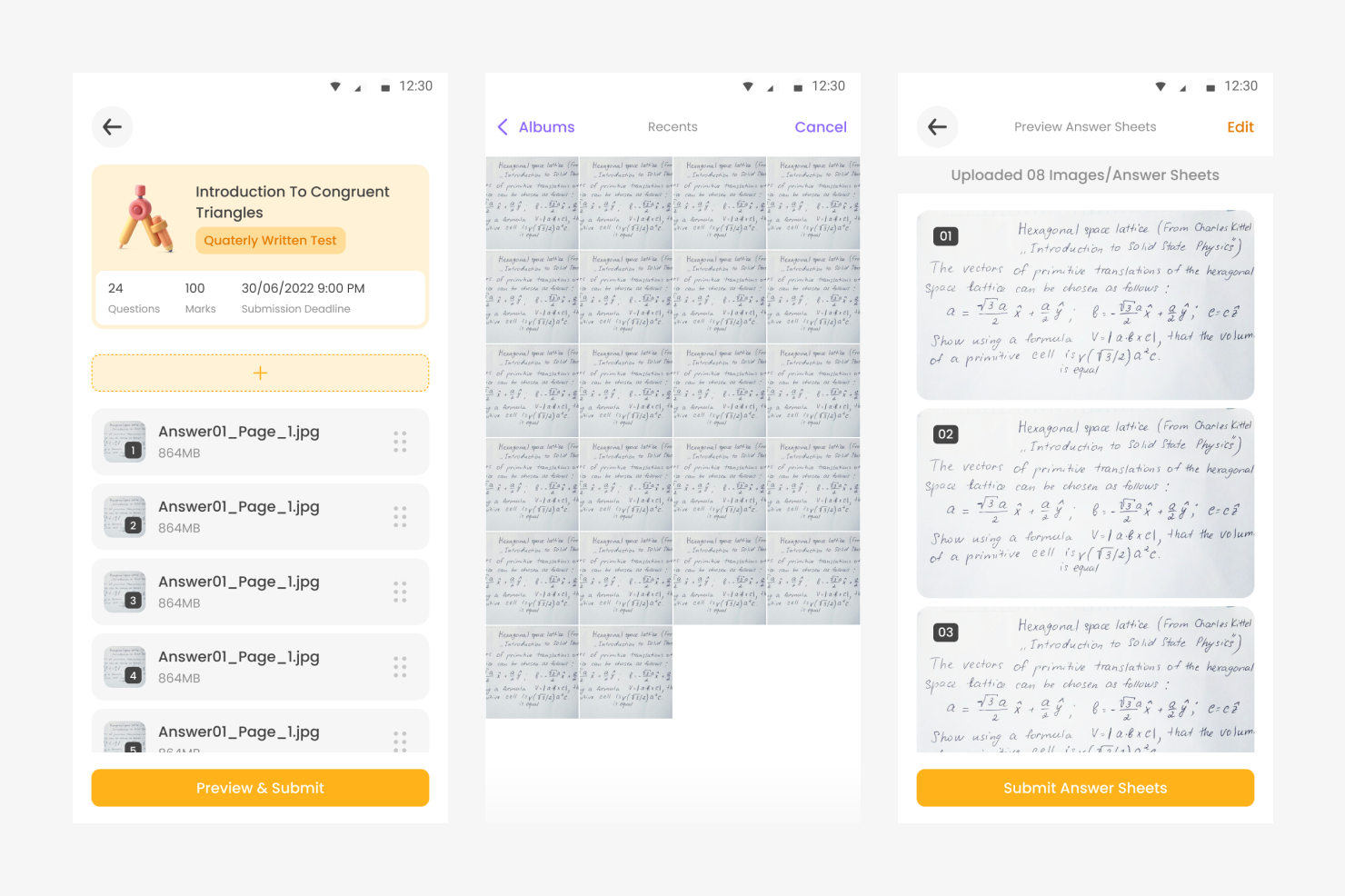
Pages could be re-ordered in this view after the upload
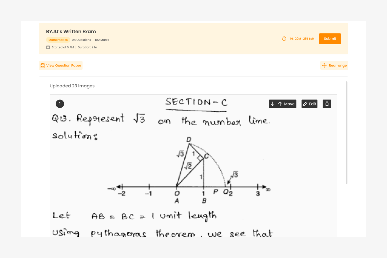
A mandatory preview acts as a revision also for the students, where they can re-order the and edit as well.
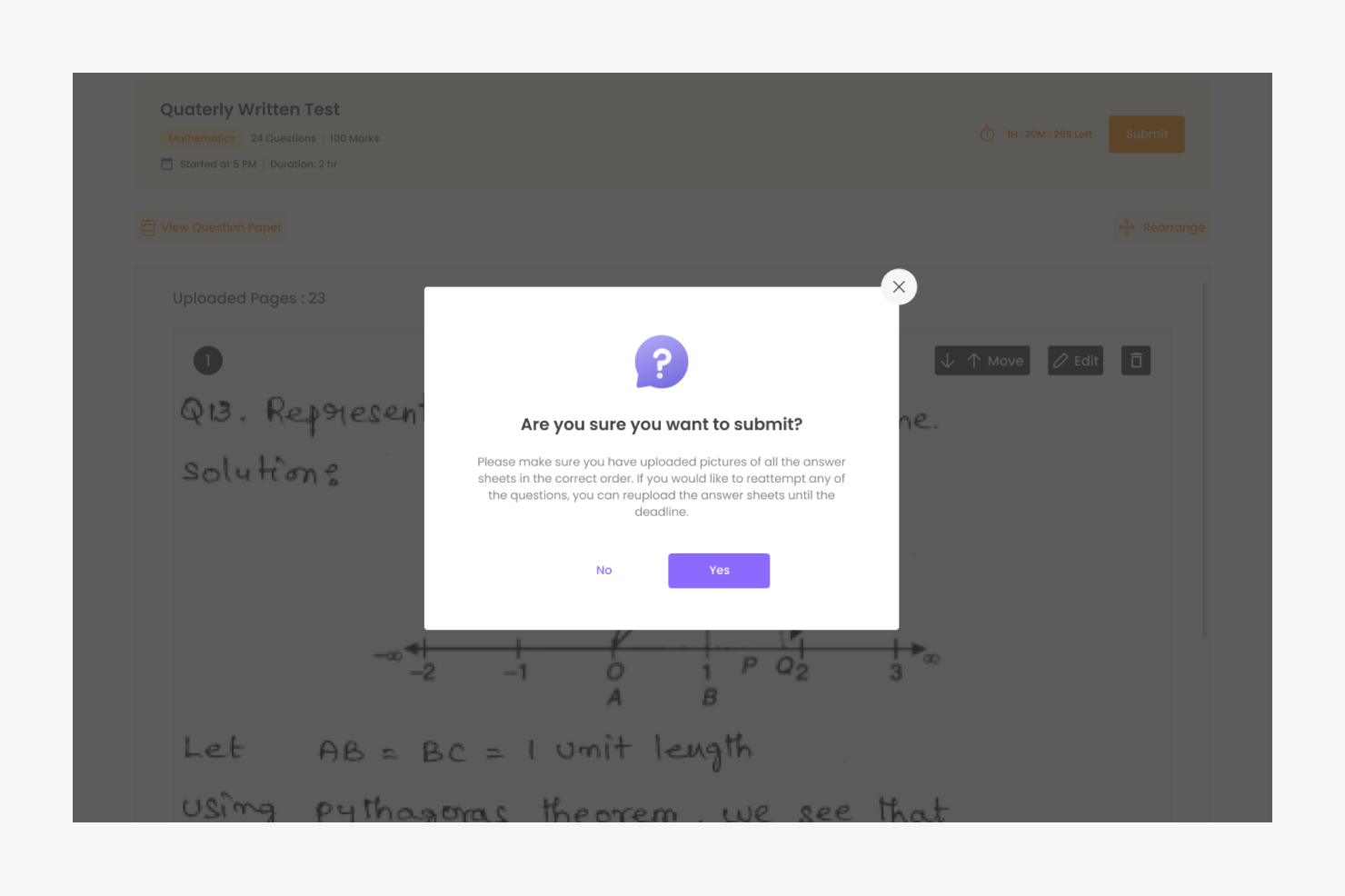
A confirmation nudge is pushed when submits
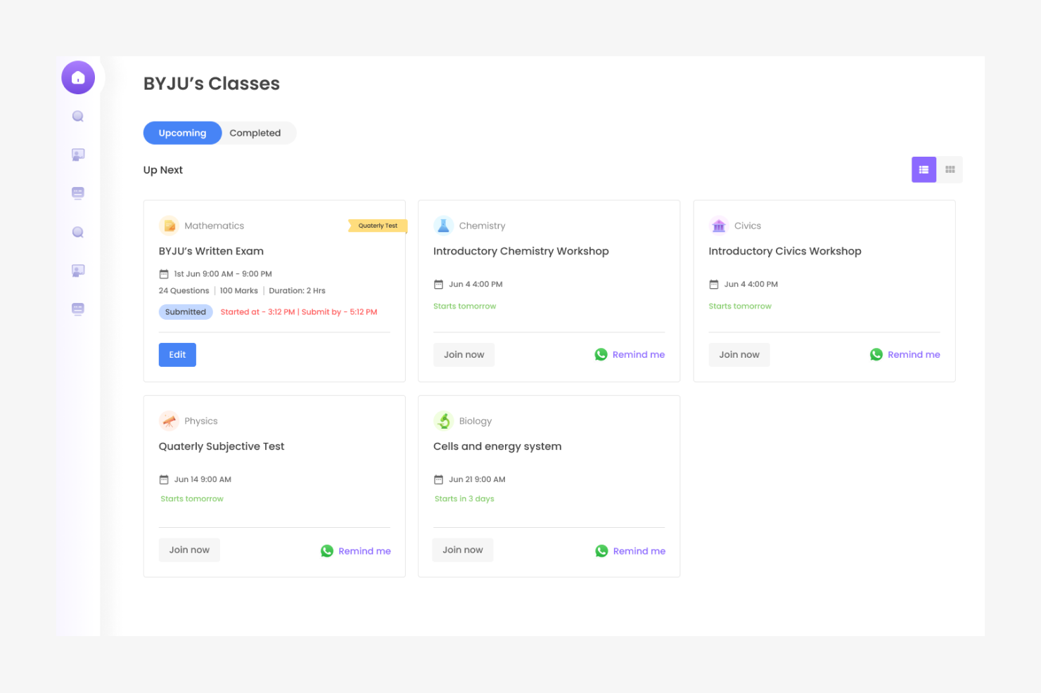
Card status is submitted in the homepage and student can edit responses till the time period ends
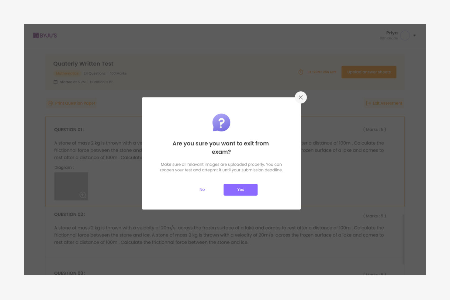
A confirmation nudge is pushed when student tries to exit the exam
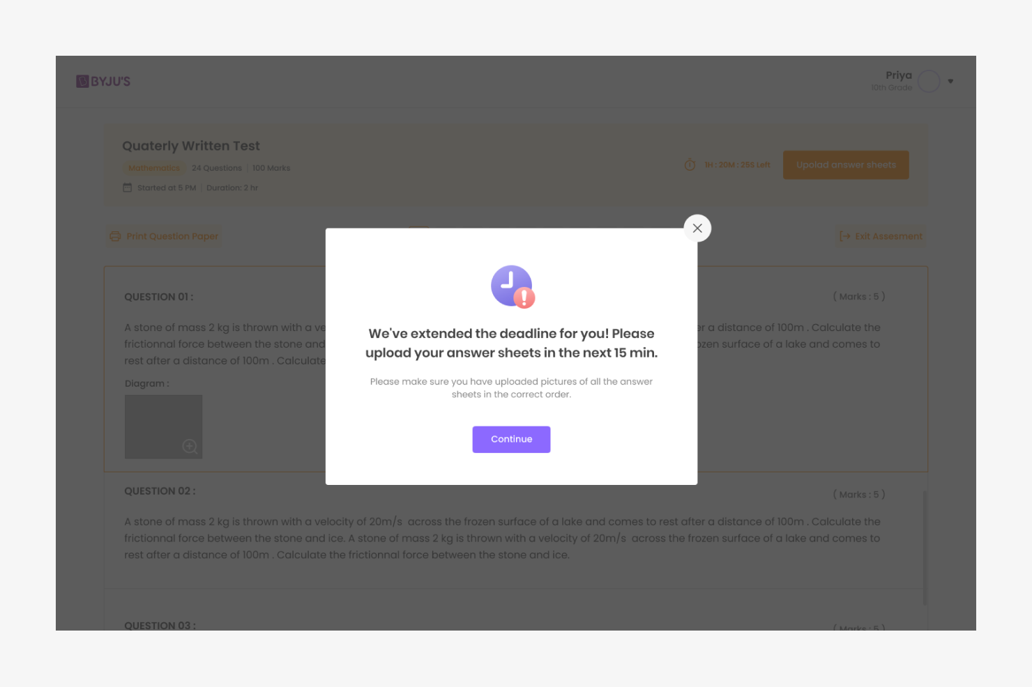
A grace period of 15 minutes is given to all students who haven't submitted
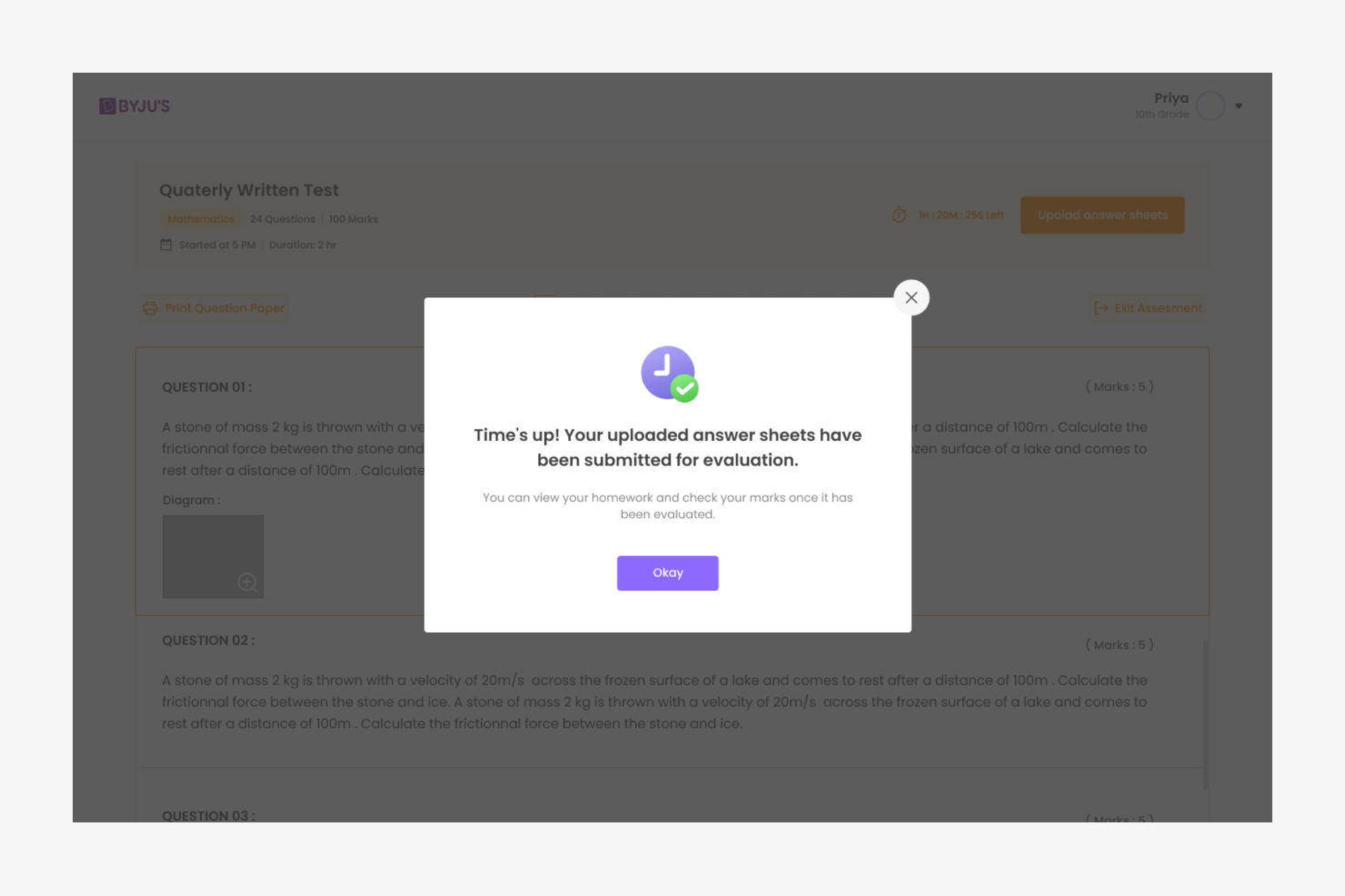
After the grace period, the paper is auto submitted
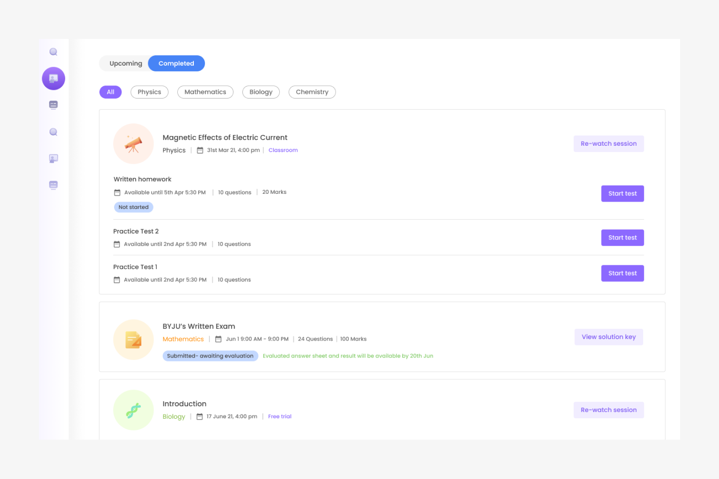
After end of grace period, the card is moved to the completed tab and answer key is made available
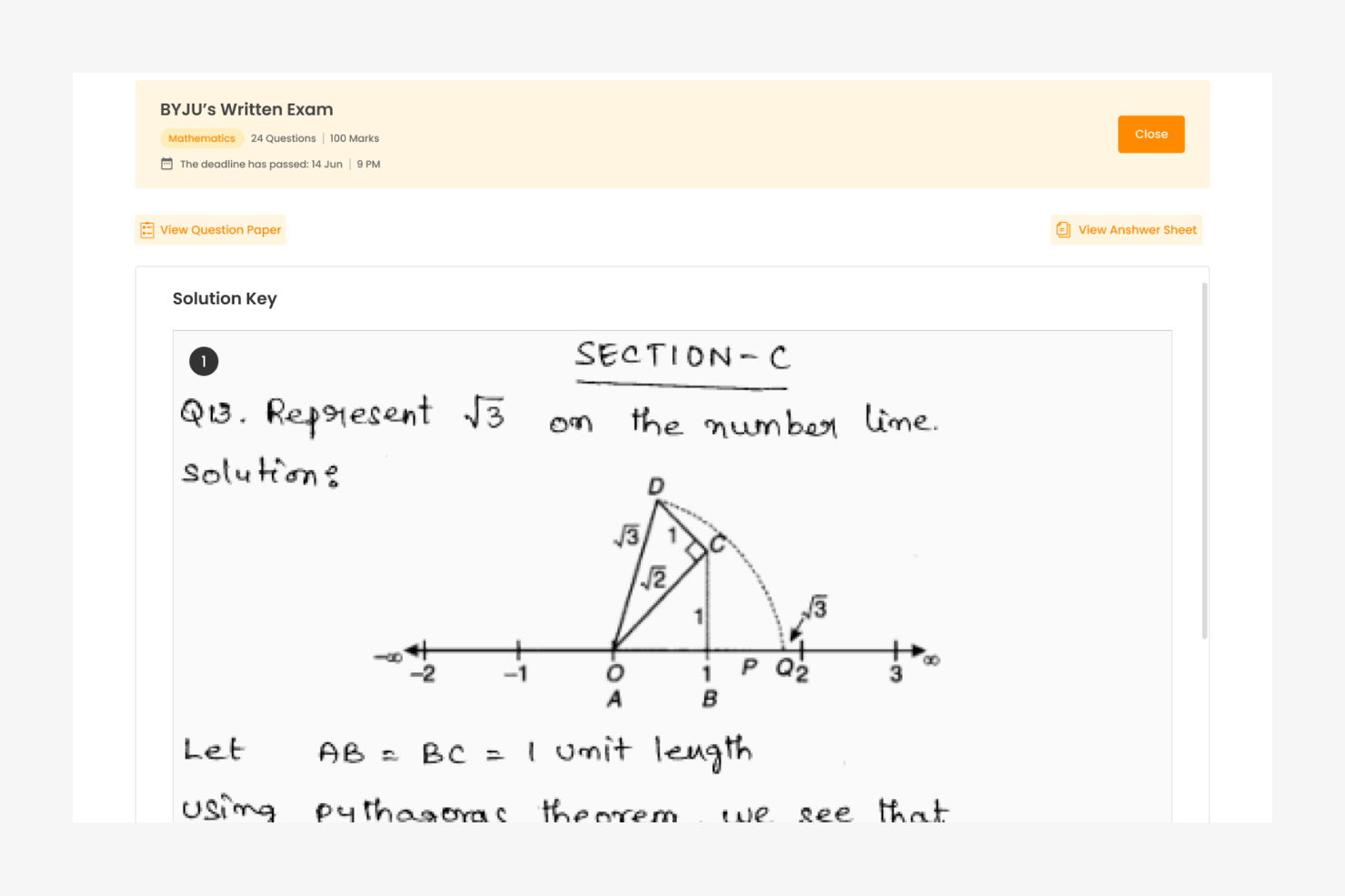
The student can view the answer key and his answers as well and compare
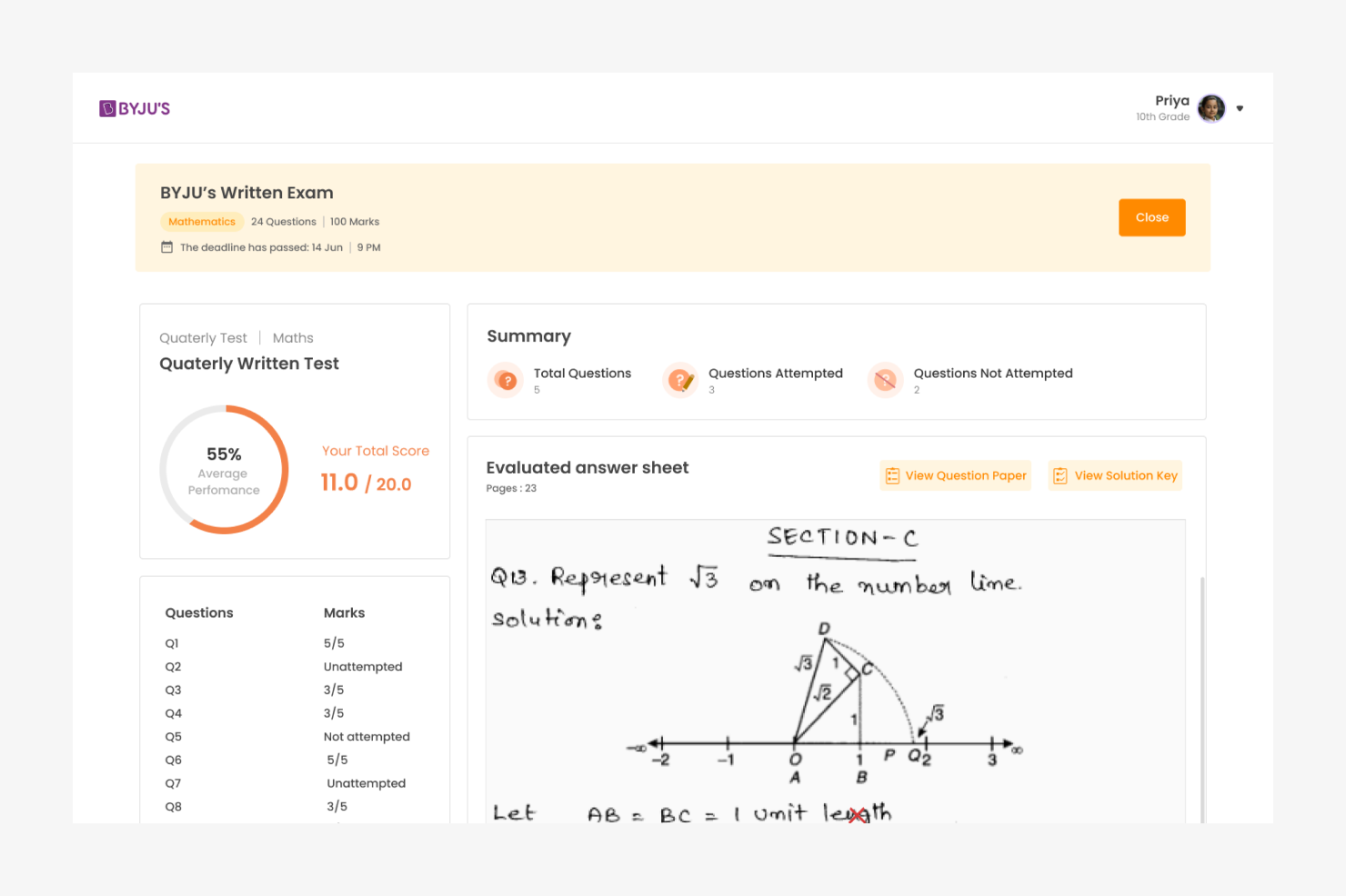
Once the evaluation is done, corrected sheets ans question wise marks are made available
PDF upload is also enabled as answer keeping in mind the different scanning apps students might be using
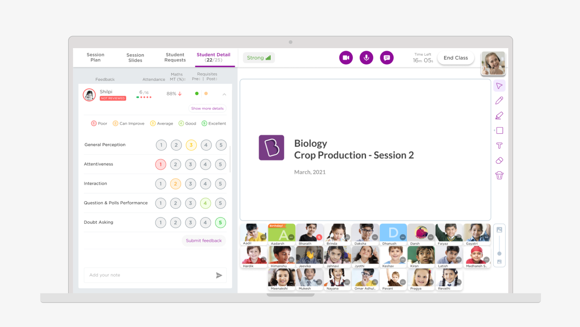
The app design language is as per the revised Byju's app style guidelines
Interface is designed keeping in mind touch interactions and accessibilities of touch
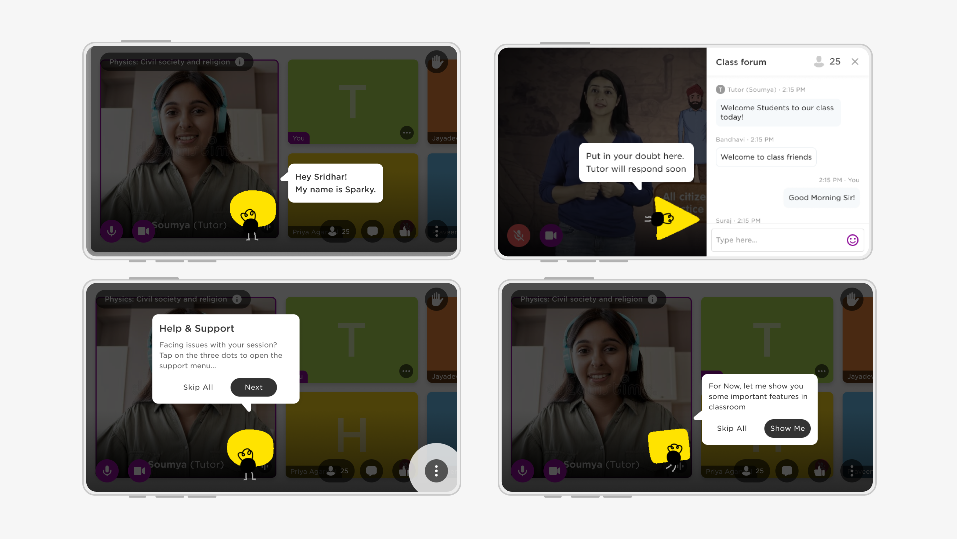
Some more app screens
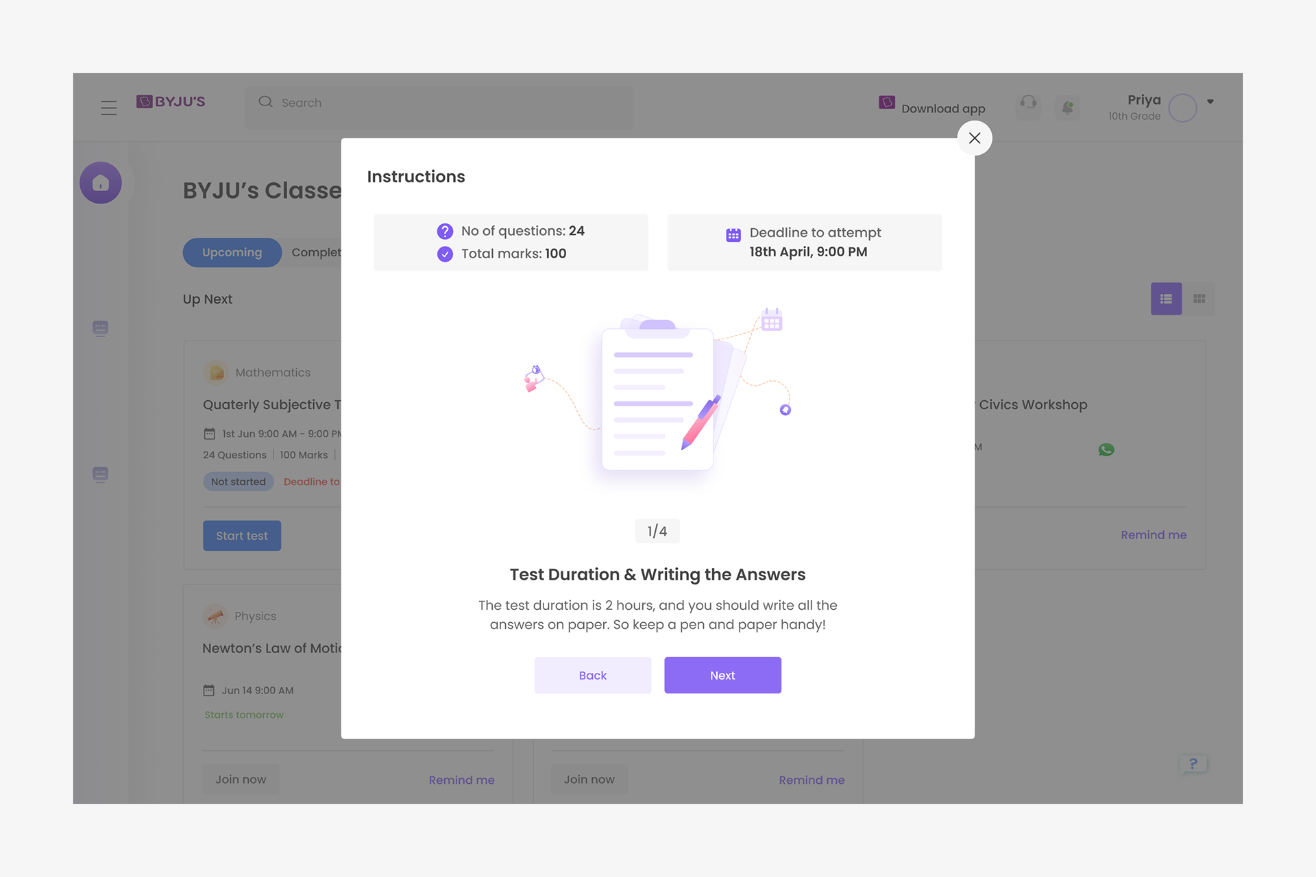
The student has to go through all the 4 instructions to start the test.
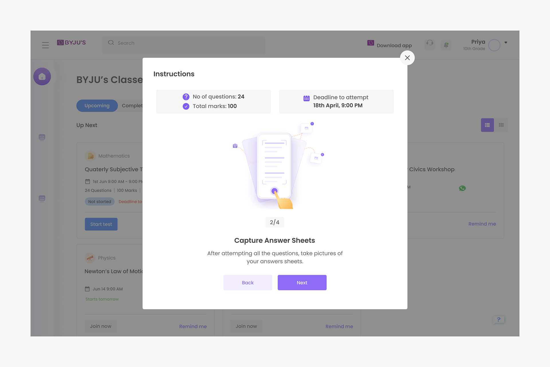
The diagrams are designed for easy understanding even for the lower grade students.
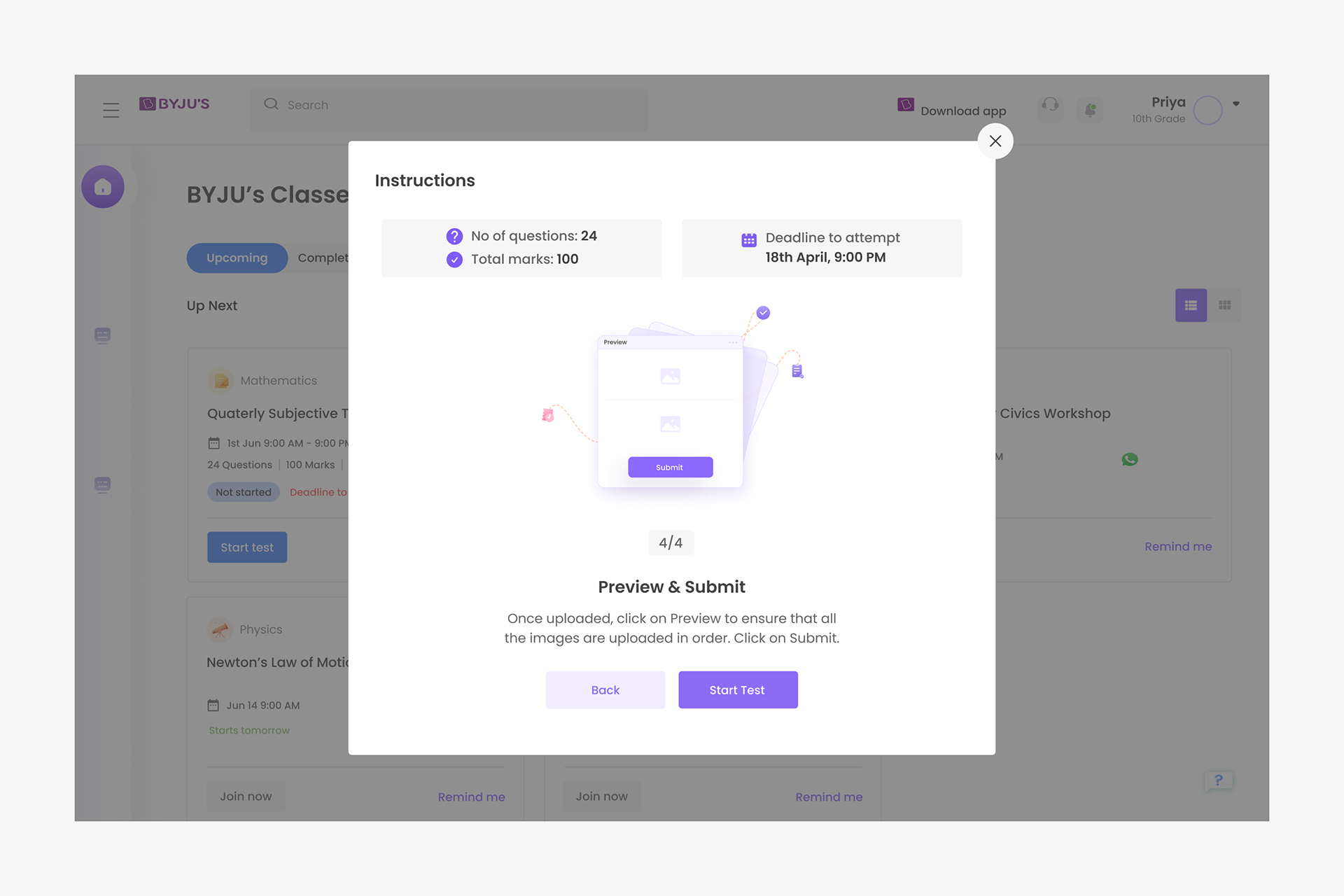
The CTA to start the test is given in the fourth and last instruction.
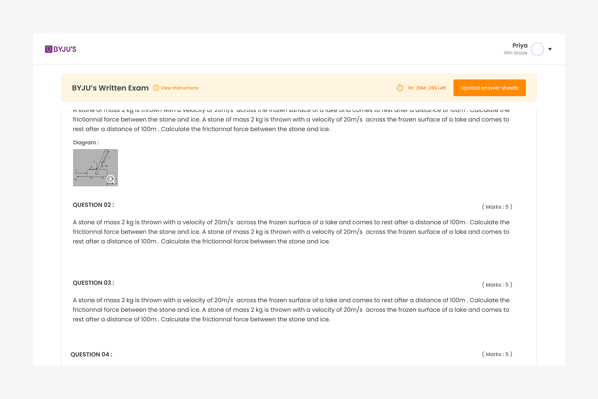
The CTA to upload answer sheets and to view the instructions again are made available in the Questions view on scroll as well.
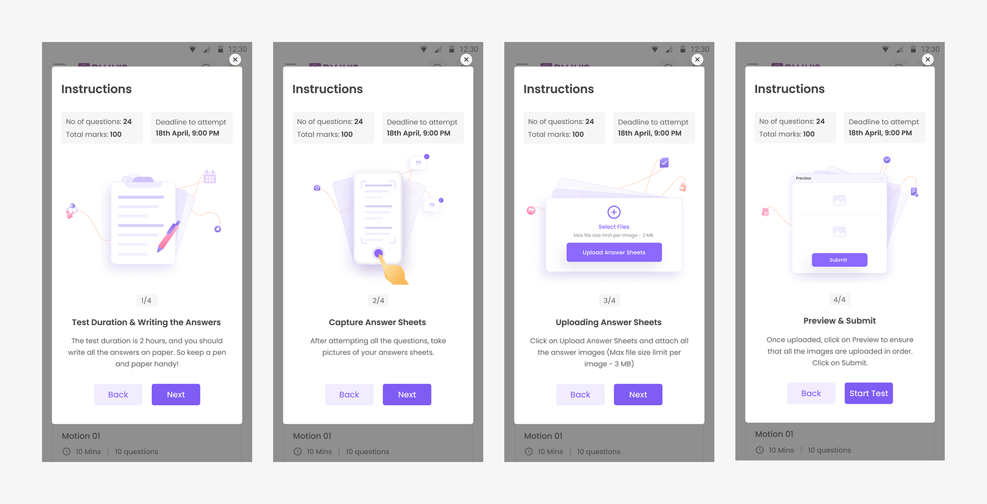
Instructions in mobile view