Project Overview
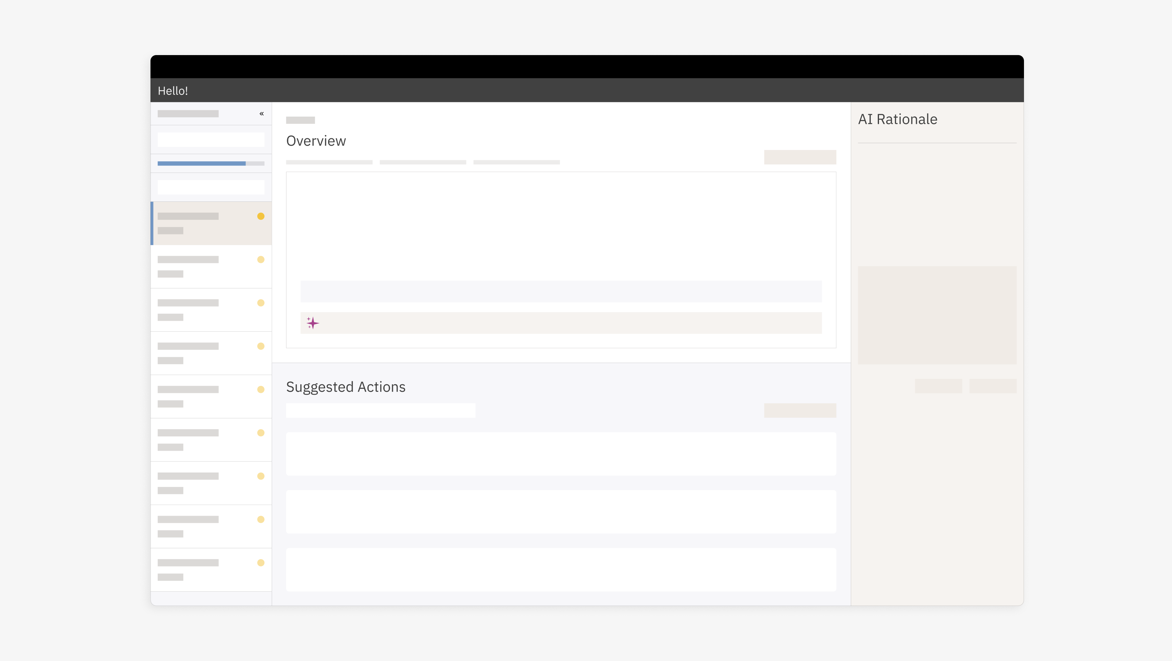
This project focuses on designing the user experience of the non-financial risk and control assessment platform for Goldman Sachs . The platform was redesigned to address inefficiencies in assessing risks and controls, streamline workflows, and enhance operational resilience through a scalable, user-centered solution.
Background
Problem Statement:
The existing system lacked a systematic and intuitive approach for evaluating risks tied to operational units. This resulted in inefficiencies, inconsistencies in risk evaluation, and challenges in mitigating critical risks effectively.
The existing system lacked a systematic and intuitive approach for evaluating risks tied to operational units. This resulted in inefficiencies, inconsistencies in risk evaluation, and challenges in mitigating critical risks effectively.
Objectives:
• Build a robust framework for risk identification and assessment.
• Simplify workflows to improve usability and reduce cognitive load.
• Ensure data relevancy and reliability for informed decision-making.
Design Process
1. Research & Discovery:
• Conducted extensive research to analyze the limitations of legacy systems.
• Engaged in user interviews to identify pain points and understand workflows.
2. Requirement Gathering:
• Collaborated with business and engineering teams to define requirements amid ambiguous initial stages.
• Identified constraints in existing processes and proposed scalable solutions.
3. UX Principles & Strategy:
The following principles guided the redesign process:
The following principles guided the redesign process:
4. Iterative Design Approach:
• Designed a scalable foundation that accommodates future needs.
• Analyzed feedback from user sessions to identify patterns and prioritize improvements.
• Partnered with engineering teams to ensure seamless implementation of design decisions while addressing technical constraints.
5. Key Improvements:
• Reduced navigation complexity by integrating relevant information into fewer clicks or screens.
• Enhanced clarity through contextual tooltips, inline explanations, and visual cues.
• Improved visibility of critical data directly within task views, eliminating unnecessary toggles or layers.
Comparison of Legacy vs Redesigned Platform
See the detailed case study of the work in progress here.
