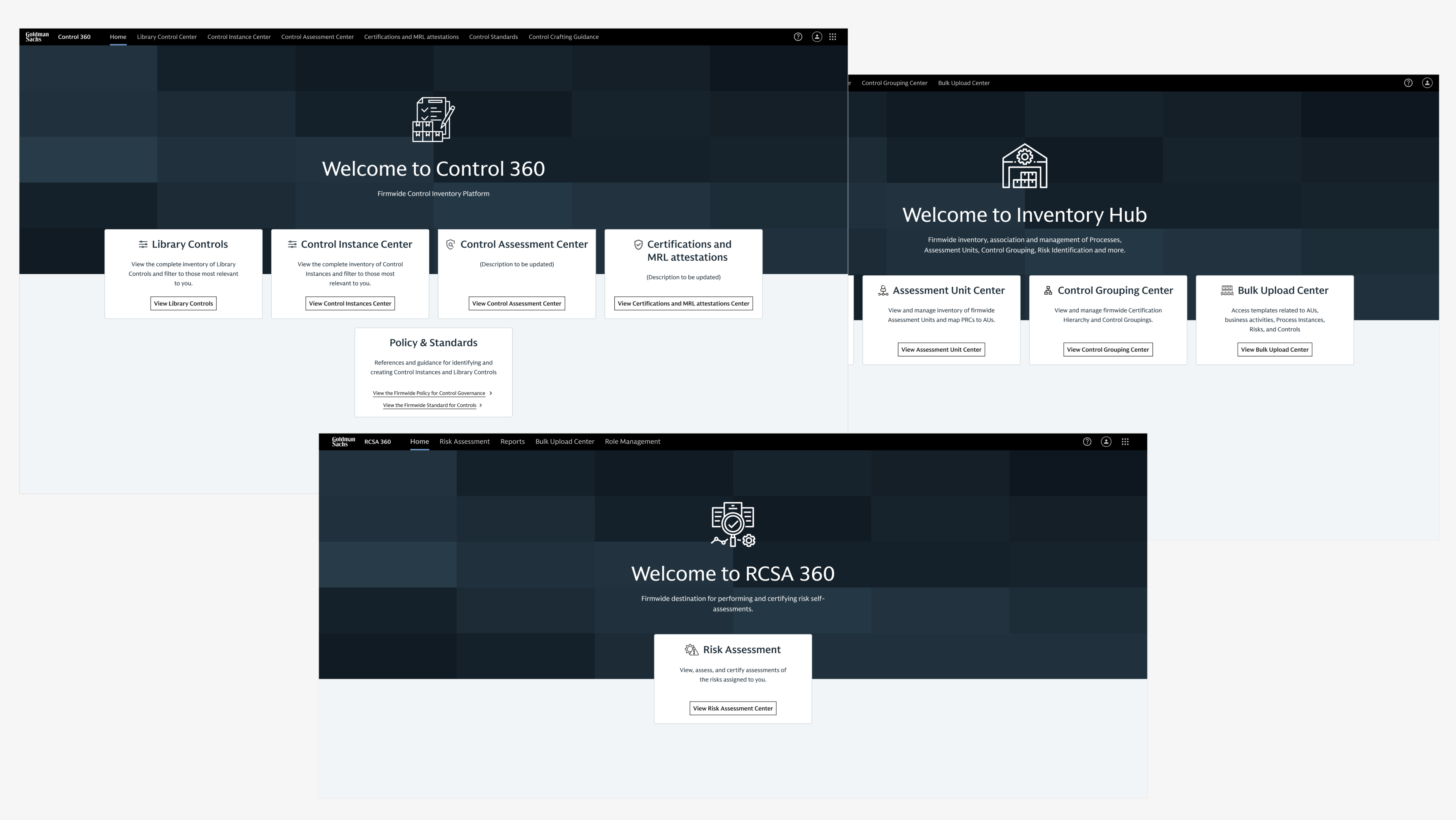
Overview
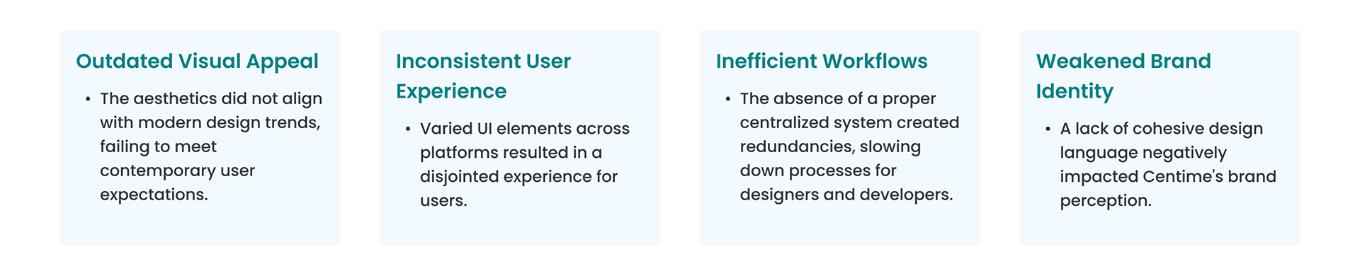
Centime, a fintech company, encountered challenges with its existing product interface design. The design lacked a contemporary aesthetic, exhibited inconsistencies in places, and fell short in terms of efficiency. As a core member of a three-person team, I played a pivotal role in developing a comprehensive design system to address these issues and elevate Centime's product design.
Challenges
My Role
Core Team Member: Part of a 3-member core team.
Visual Foundation: Explored design trends and defined the system's fundamentals such as the colour palette, typography, and spacing.
Component Creation: Created the Figma component library, designing reusable UI elements like buttons, forms, navigation, and data display components to ensure consistency and scalability.
Accessibility Advocate: I ensured the design system met accessibility standards to support an inclusive user experience.
Illustration and Animation Design: Created iconography and loading animations.
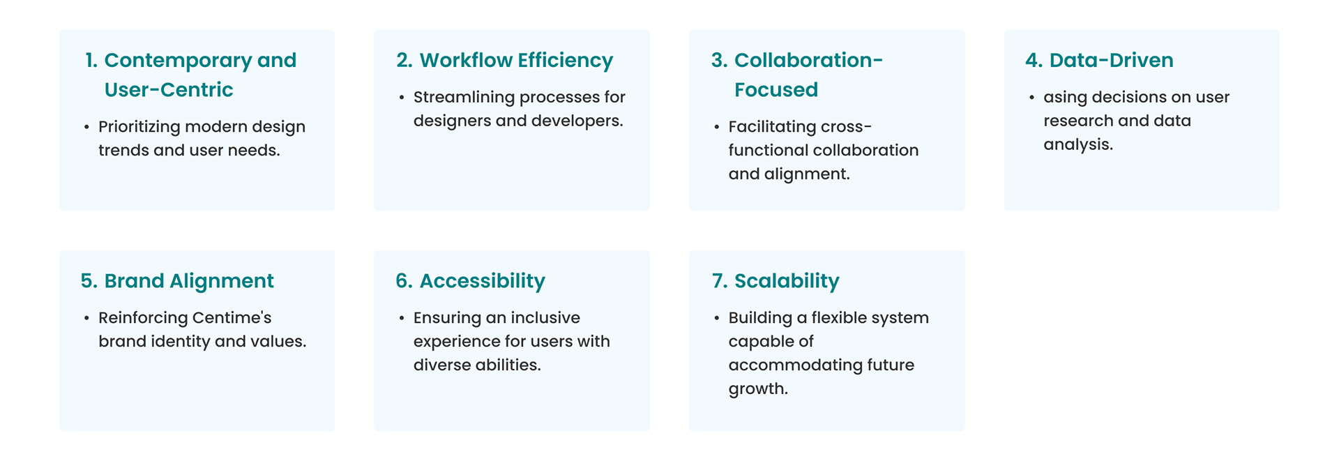
Design Principles
The design system was guided by the following principles:
Design Process
User Research: Conducted interviews with customers, product managers, engineers, sales, and marketing teams to identify pain points with the existing product, understand their concerns and requirements, and gather insights to inform the design process.
Competitor Study and Benchmarking: Analyzed industry benchmarks and competitors to understand the characteristics of a modern UI for a product like Centime and the best practices for creating a comprehensive design system.
Auditing the App: Performed a comprehensive audit of the existing app, analyzing numerous screens and features to identify the key screens and components that would be essential for the Figma component library.
UI Explorations: As a team, we explored various UI design options, aligning on inputs and incorporating the best elements from different concepts to arrive at a final, cohesive UI style and look for the key screens.
Atoms, Molecules, and Components Approach: Utilized the principles of atomic design to create a modular and scalable design system, breaking down UI elements into smaller, reusable components.
Collaboration with the Development Team: Worked closely with the development team to define design token nomenclature, component interactions, and feasibility considerations, ensuring a seamless design-to-development handoff.
Documentation: Developed detailed documentation for all elements of the design system, including guidelines, component specifications, and implementation instructions, ensuring consistent application and ease of adoption across the organization.
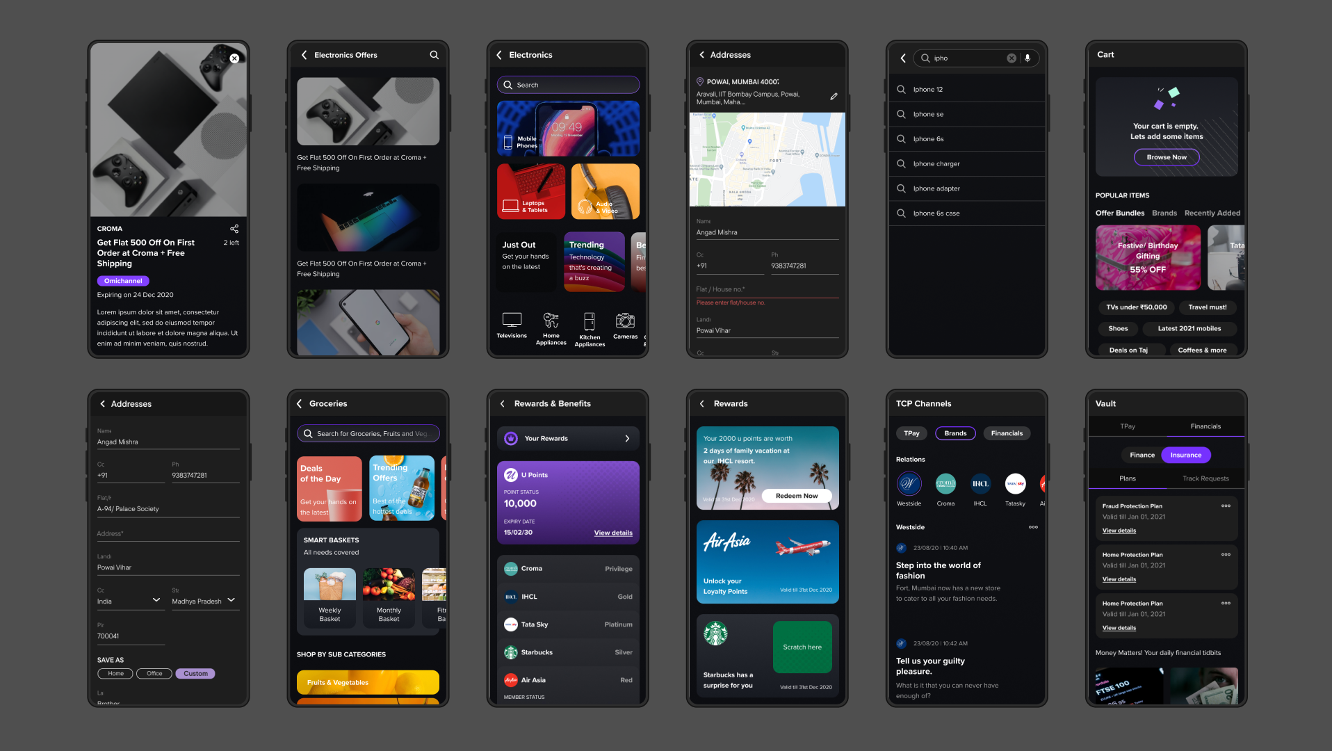
Key Components
Colors: A 100+ color palette meticulously aligned with the brand and featuring a logical naming system.
Typography: Roboto sans-serif for a modern and versatile look.
Design Tokens: To streamline the design-to-development handoff.
Iconography: A well-defined icon library that aligns with the overall design language and ensures visual clarity.
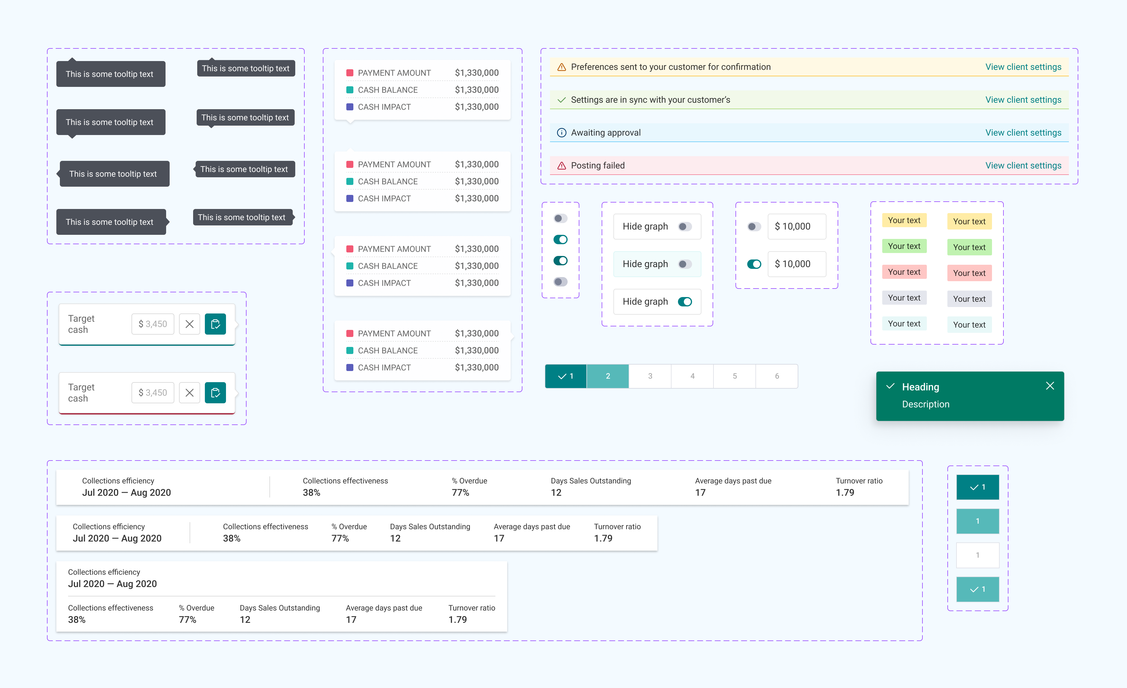
Comprehensive Components: Robust library including
• Buttons
• Input fields
• Navigation elements (Tabs, Tags, Header, Breadcrumbs)
• Popups, Modals, and Notifications
• Data Display (Tables, Timeline, Messages)
• Forms (Toggle, Checkbox, Dropdown, List)
• Layout Elements (Cards, Accordion, Pagination)
• Miscellaneous (Tooltip, Settings)
• Buttons
• Input fields
• Navigation elements (Tabs, Tags, Header, Breadcrumbs)
• Popups, Modals, and Notifications
• Data Display (Tables, Timeline, Messages)
• Forms (Toggle, Checkbox, Dropdown, List)
• Layout Elements (Cards, Accordion, Pagination)
• Miscellaneous (Tooltip, Settings)
Outcomes
Efficiency Gains: Reduced design time and enabled faster feature releases.
Improved Maintainability: Centralized assets reduced ongoing maintenance costs.
Enhanced Consistency: Strengthened brand identity and a seamless user experience.
Accessibility Compliance: Expanded user base and potential increased revenue.
Foundation for Growth: A scalable design system to support Centime's expansion.
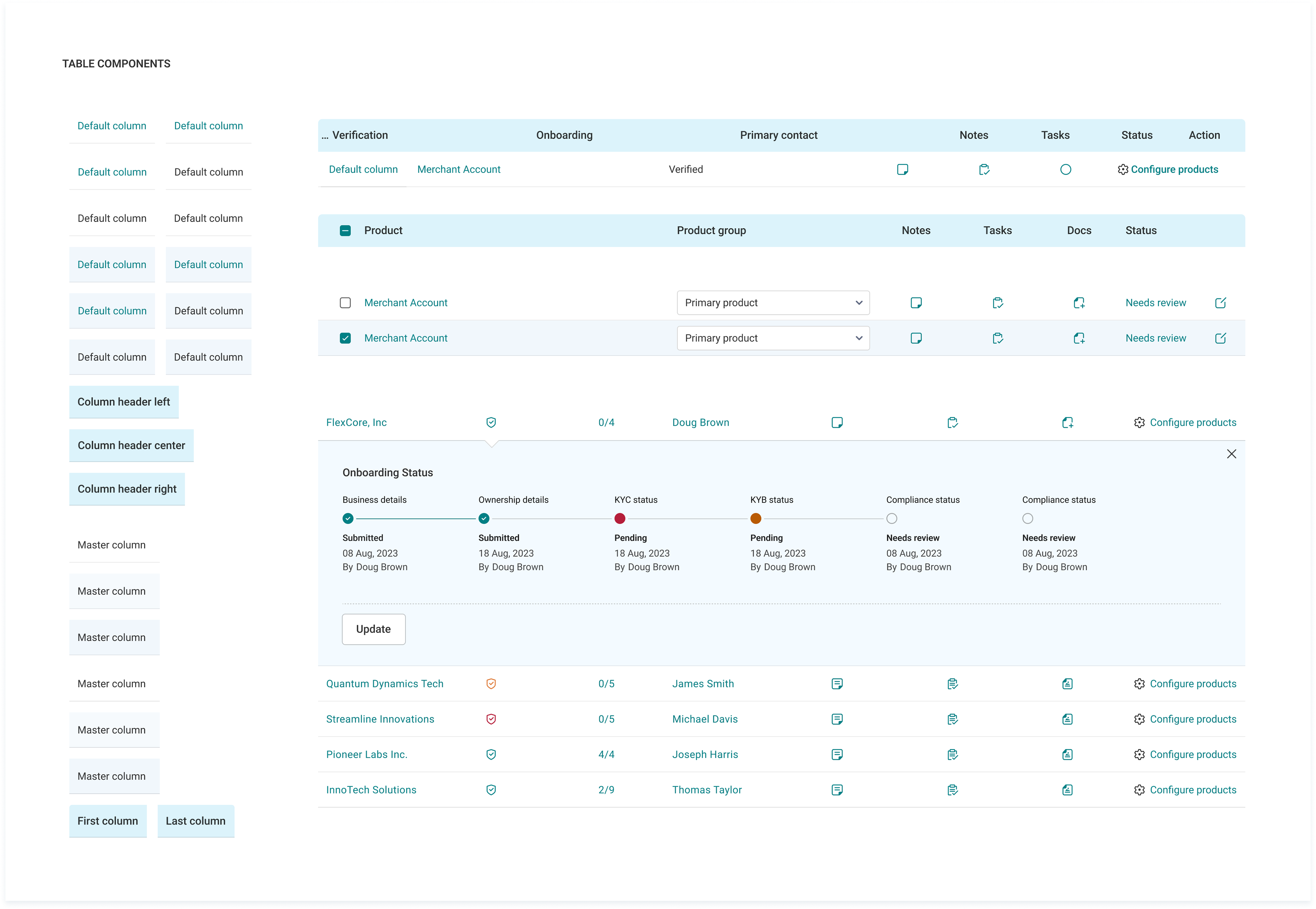
Building blocks for tables
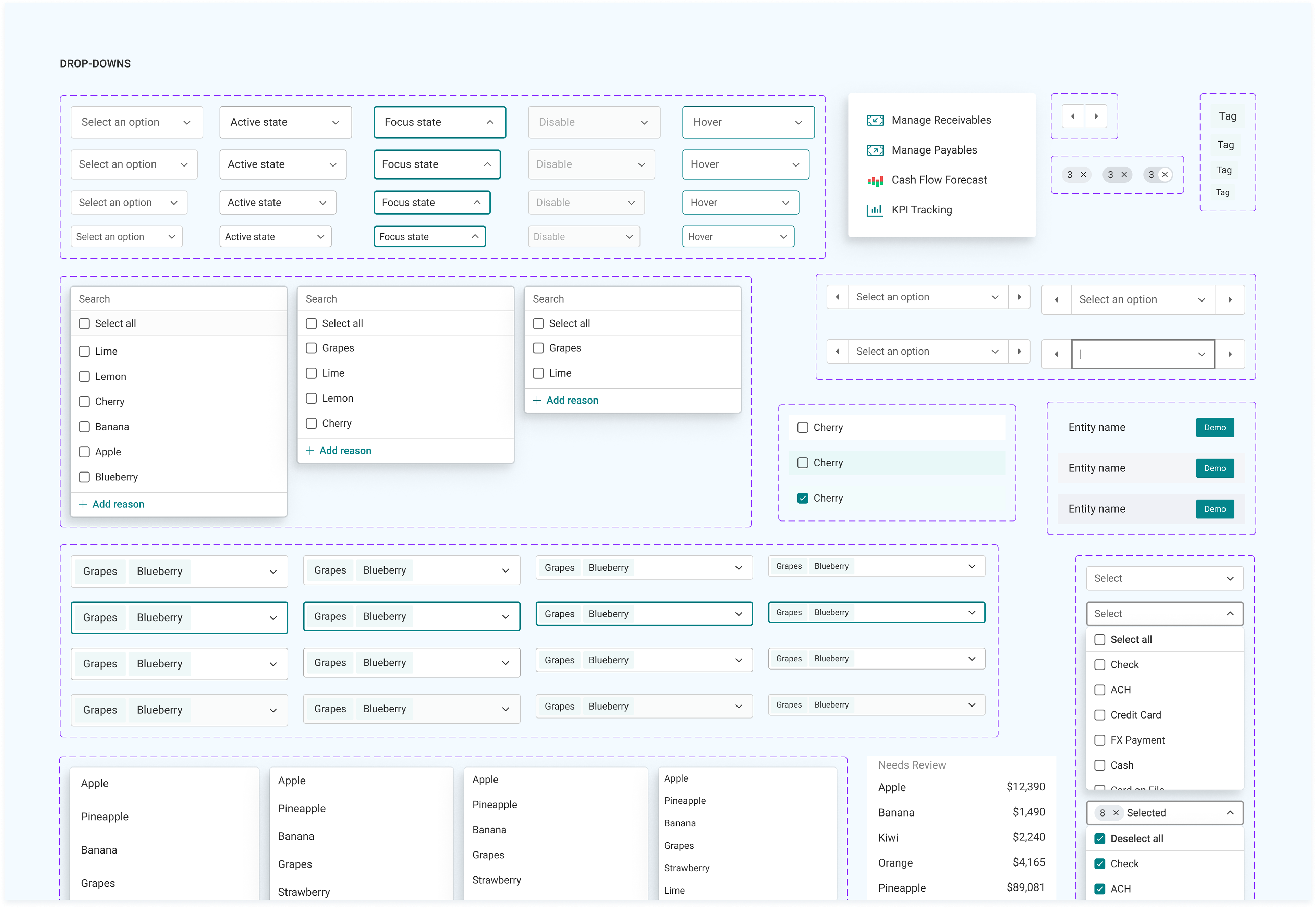
Dropdown components
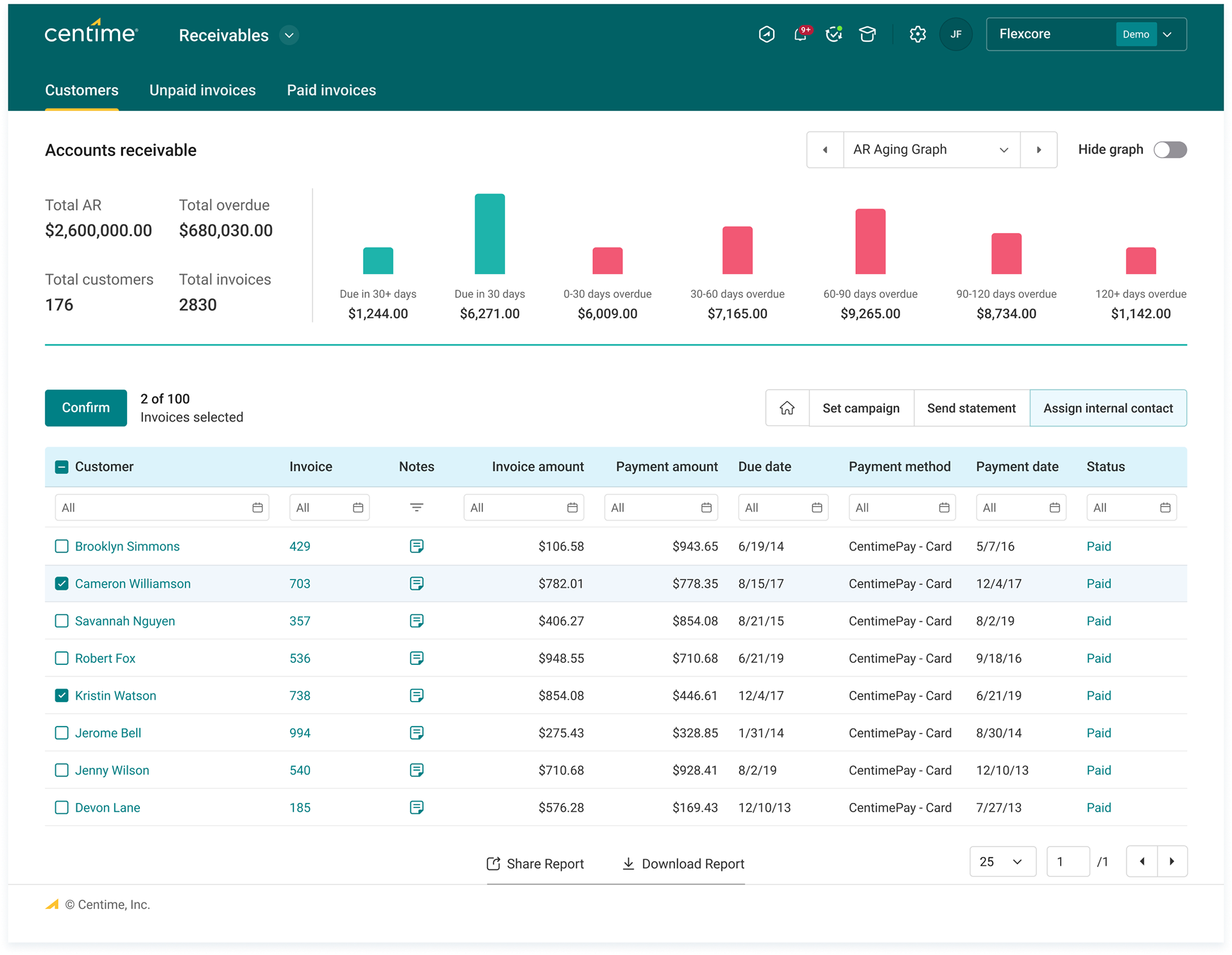
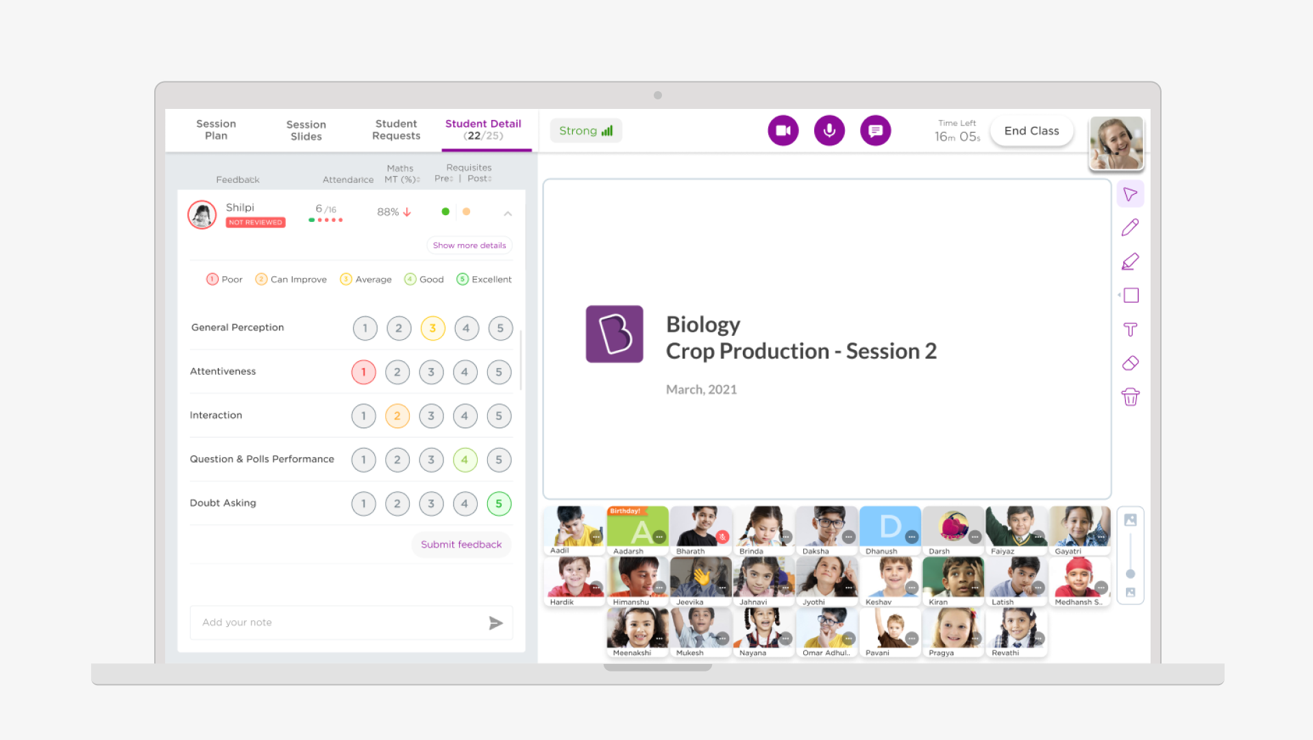
Accounts receivable screen created with design system components.
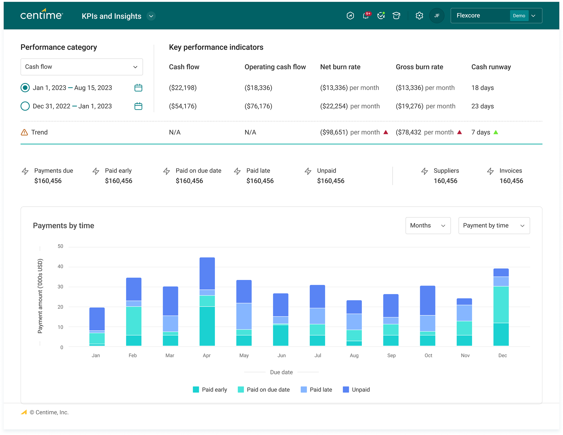
KPI screen created with design system components.
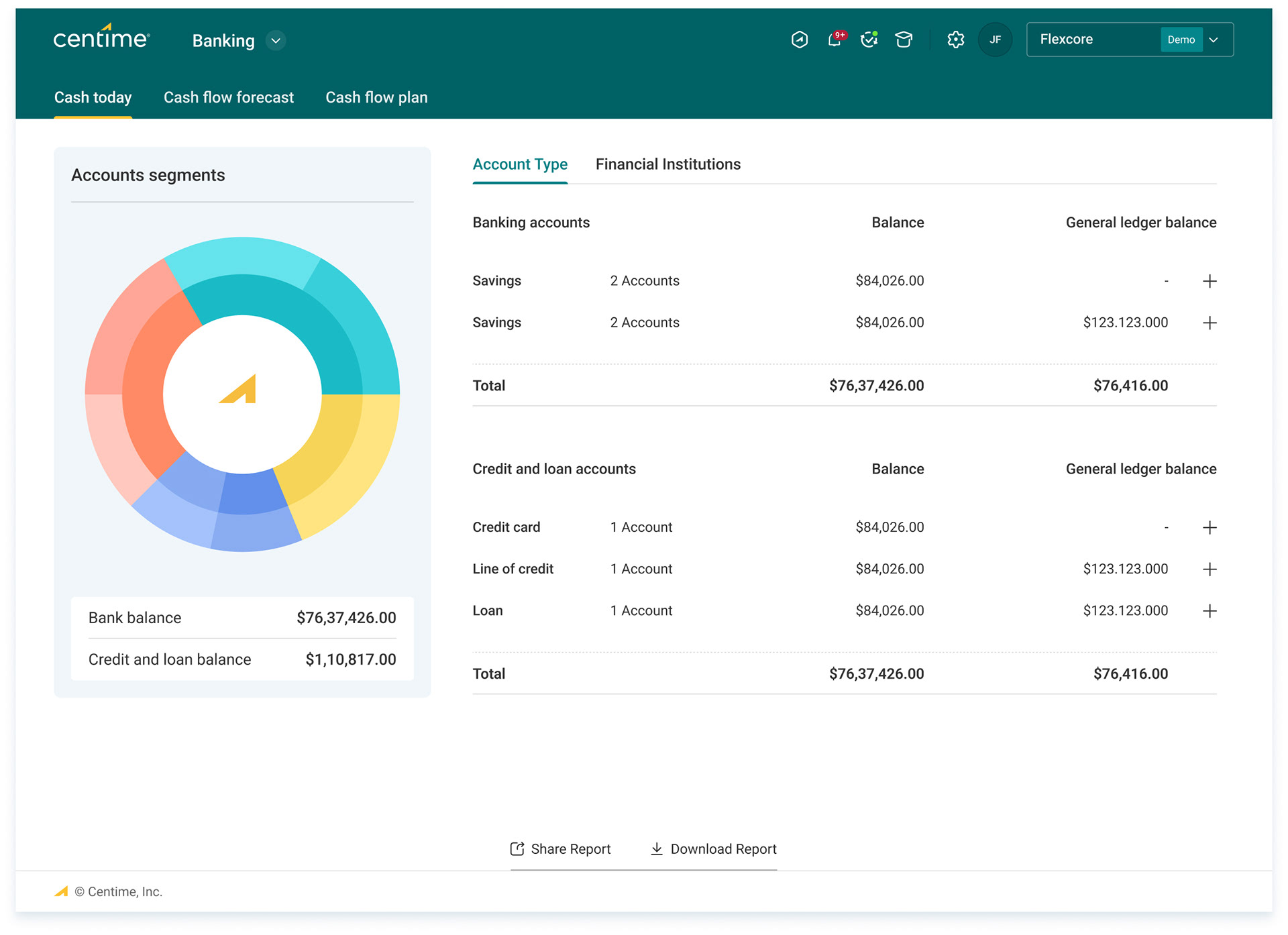
Banking screen
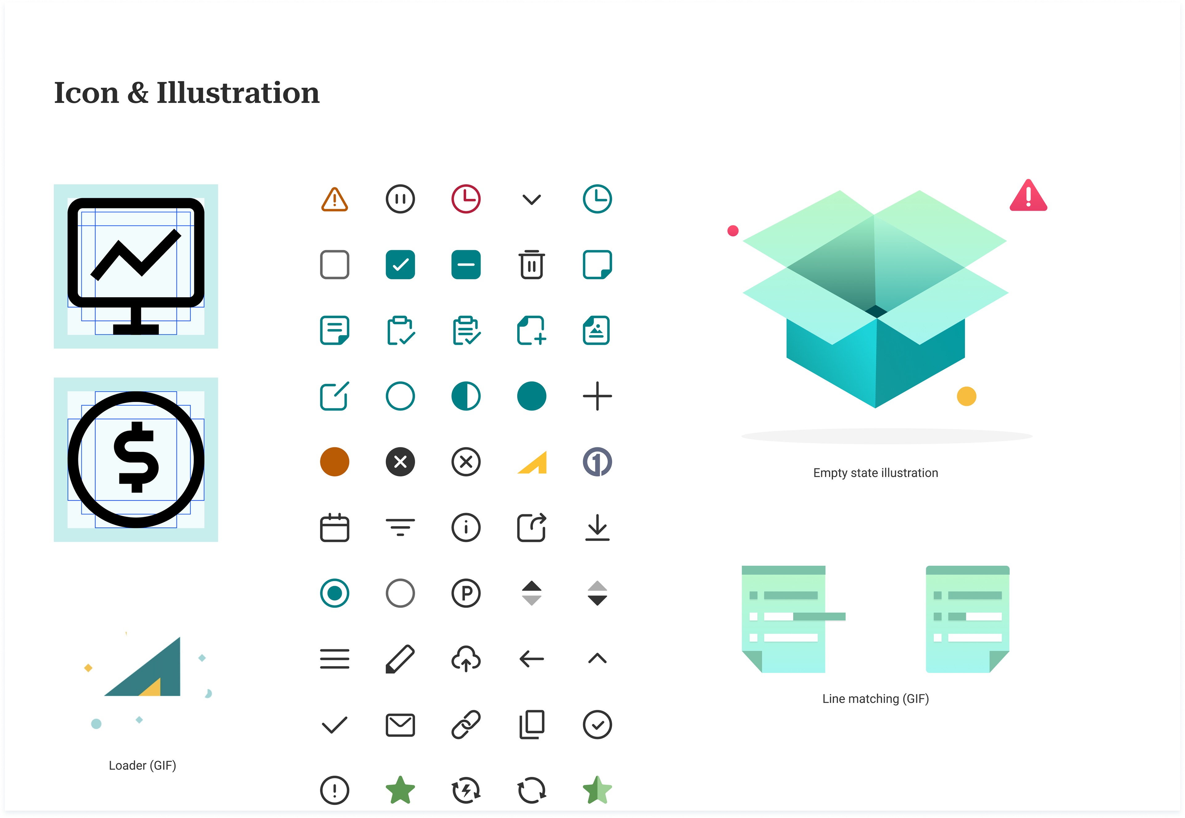
Some of the icons and illustrations