Role: UI UX Design Consultant
Contribution: Research framing, personas, information architecture, wireframes, visual design, usability evaluation
Introduction
Tata has a large number of consumer brands, and each of them had its own customer, its own app and its own loyalty scheme. The Tata Consumer Platform, which went to market as Tata Neu, was the attempt to put them on one platform.
Business context: Build a loyalty ecosystem that deepens the relationship with a customer in one brand, turns them into a customer of another, and extends to their friends and family.
Initial proposition: Spend small, redeem big. Earn rewards and cashback across Tata brands, from grocery and electronics to healthcare and holidays.
My work covered the early stretch of this, from framing who we were designing for through to the app framework, the visual design of key journeys and the first round of usability testing.
Design approach
The process, the order and the depth of each stage depend on the product, the stage it is at, and how much research and data already exists inside the organisation.
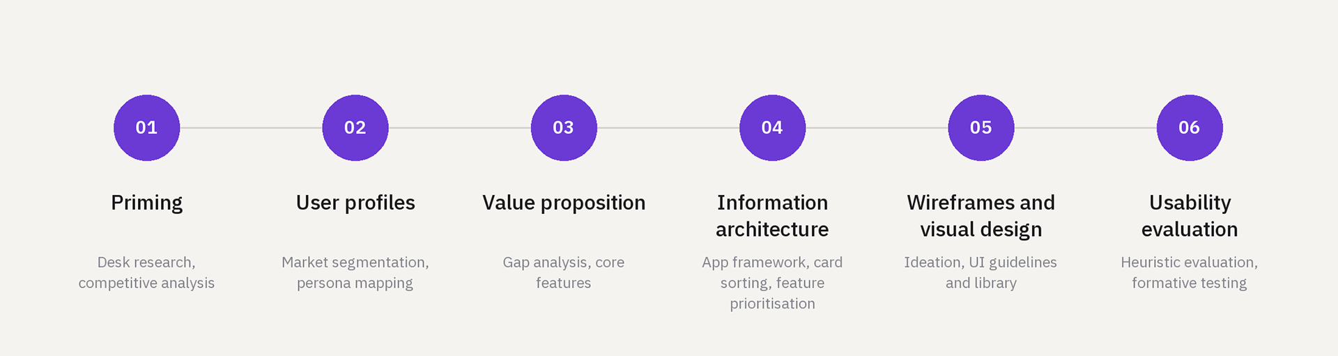
Research, in short
Priming: Existing material, such as the competitive analysis from the marketing team, the segmentation data shared by the brand partners, and the five year business strategy, helped set the demographic, the geography and the kind of customer worth deep diving on.
Super apps elsewhere were a useful reference. On WeChat, lifestyle and e-commerce carry the largest share of mini programs, which said something about where a platform like this earns its daily traffic. Consumption and income data from published market research narrowed the demographic down to the affluent, urban, tier one smartphone user.
User interviews: In person interviews were run with the target base, followed by an insight mapping session with the team. Two questions drove it: who are the people we are actually building for, and where do the current offerings fall short of what they need.
Archetype themes: Affinity mapping across the interview transcripts produced a set of archetypes. Too many to design for, so a prioritisation workshop narrowed them down against the strategic roadmap, the beta launch timeline, consumer data from the brands, and what development could realistically support.
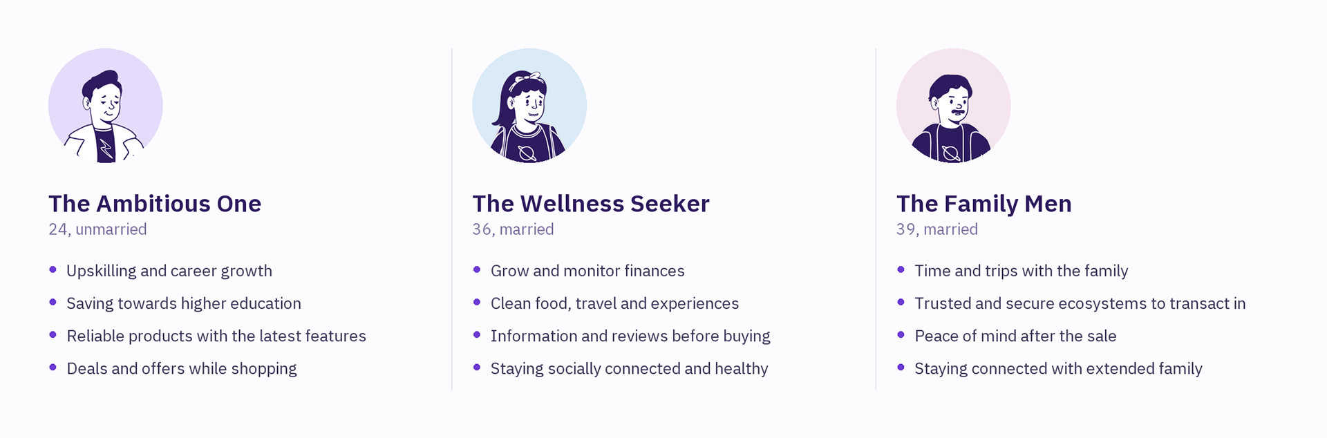
Ambitious One, Sports Fan, Tech Enthusiast, Wellness Seeker, Gamer, Financial Planner, Travel Enthusiast, Fashionista, Socially Conscious, Young Parent, Automobile Fan, Home-maker, Family Men, Foodie, Socializer, Senior
The three in bold became the personas we designed against.
Personas
Three personas were written up with a day in their life, their emotional and functional needs, and how they behave online and offline.
Gap analysis and the value proposition
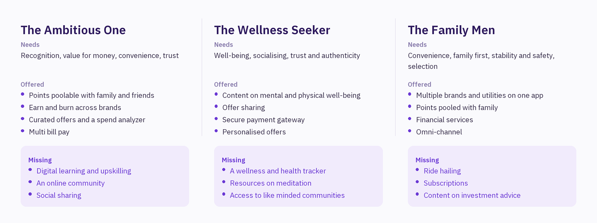
Consistent need for all 3 personas: One loyalty currency, earned in one brand and spent in another, poolable with family and friends. One payments layer, carrying secure payments, multi bill pay, financial services and a spend analyzer. Many brands, one cart, with bundled offers and an omni-channel view.
Information architecture
The architecture was worked out with close ended card sorting and feature prioritisation, then laid out end to end. It settled into six areas.
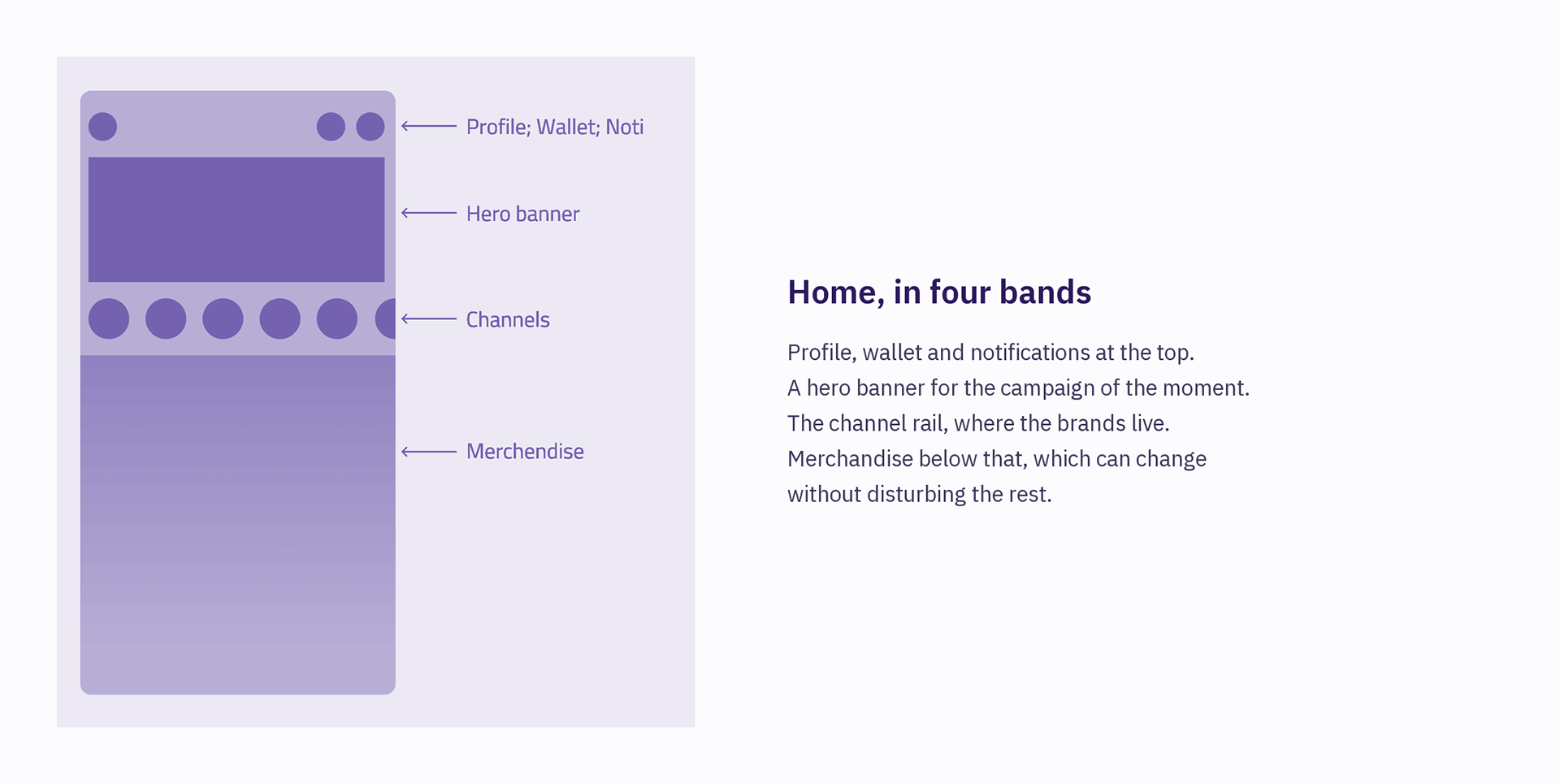
Home: Campaign banner, the channel rail, and merchandise below it.
Discovery: Offers first, with search and filters by location and by brand.
Channels: Brand channels, friends and family, and pooling, all in one list.
Vault: Points and their activity, saved offers, payment methods.
Product and checkout: Detail pages, cart, and payment split across points, cards and credit.
Profile: Details and KYC, the spend analyzer, security and support.
Discovery: Offers first, with search and filters by location and by brand.
Channels: Brand channels, friends and family, and pooling, all in one list.
Vault: Points and their activity, saved offers, payment methods.
Product and checkout: Detail pages, cart, and payment split across points, cards and credit.
Profile: Details and KYC, the spend analyzer, security and support.
App framework and wireframes
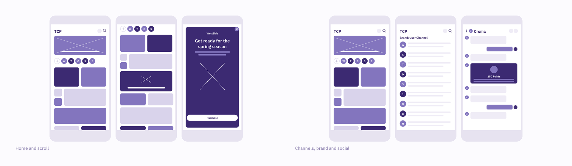
The app is built around payments and messaging, the two things people use every day, and the brands sit on top as channels.
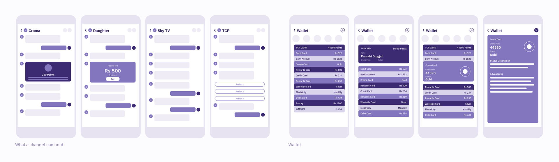
In a channel a brand can post updates, share an offer, or answer questions about an order that is already placed.
Visual design and journeys
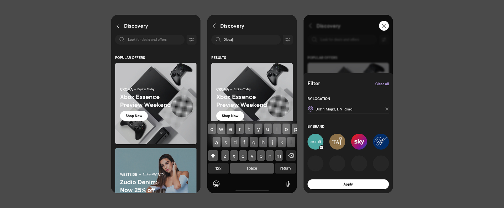
Popular offers, search, and filtering by location and brand.
Channels. Channels are the part of the app people return to without intending to buy anything. Brands post here, orders get tracked here, and the family pool sits alongside them in the same list.
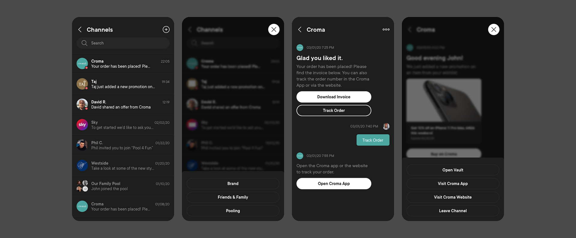
All channels, filtered by brand, family and pooling, a brand channel, and the actions available inside one.
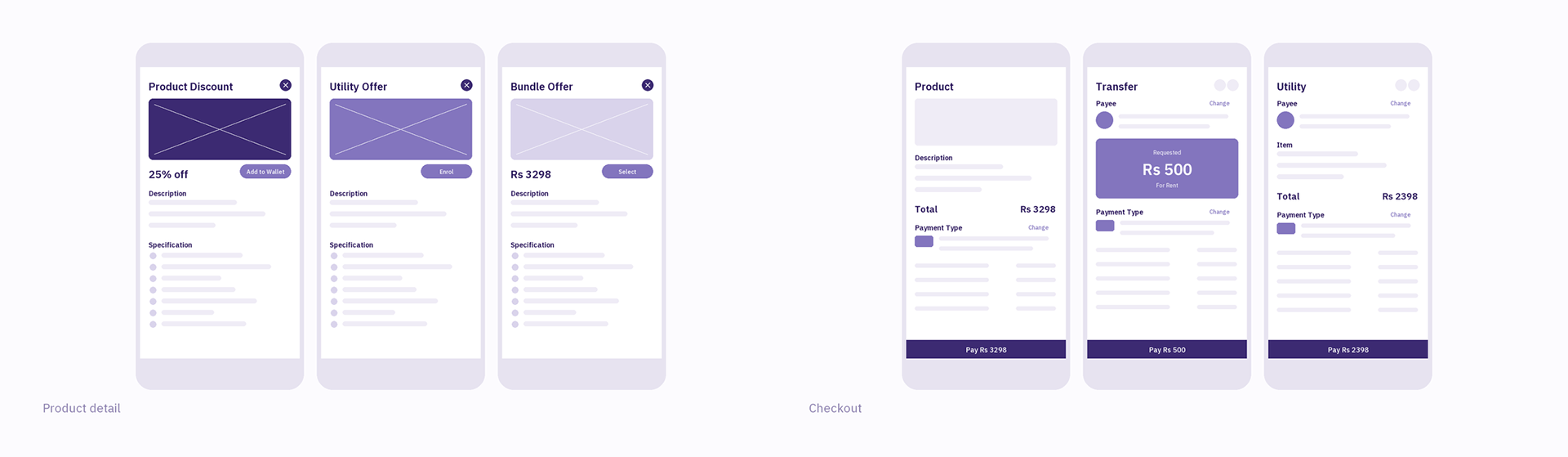
Product detail and the vault. Saving an offer needed to be as easy as acting on it, because the two rarely happen at the same time. An offer added from a product page lands in the vault, which also holds the points balance and the payment methods.
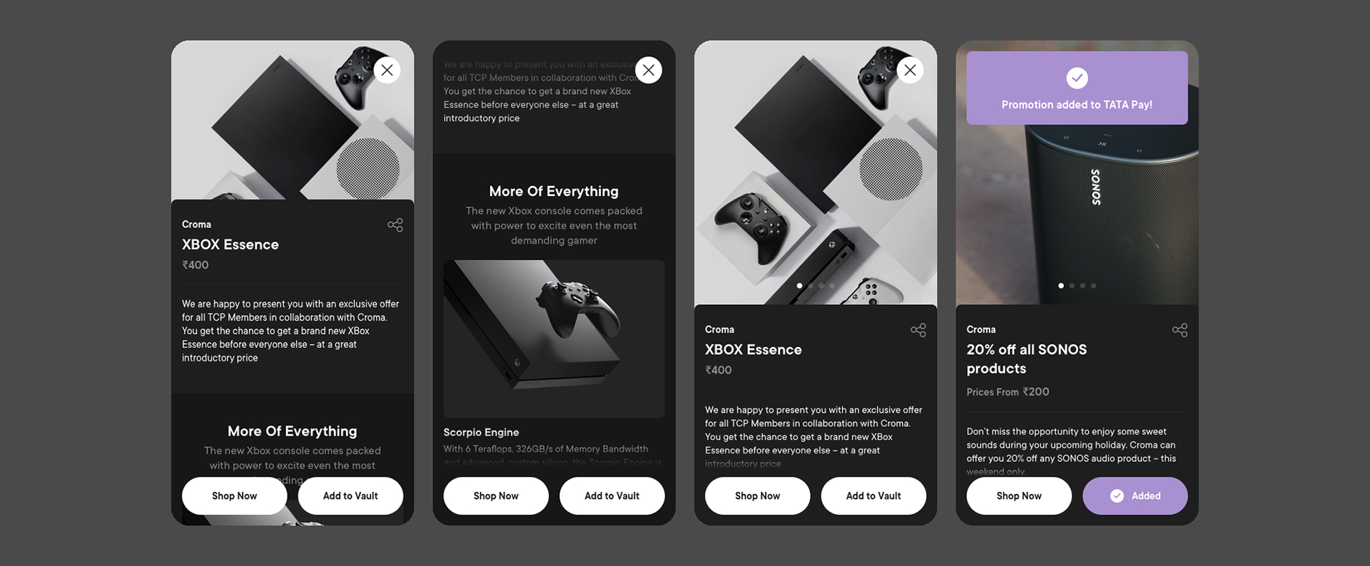
Offer detail, the page on scroll, adding to the vault, and confirmation.
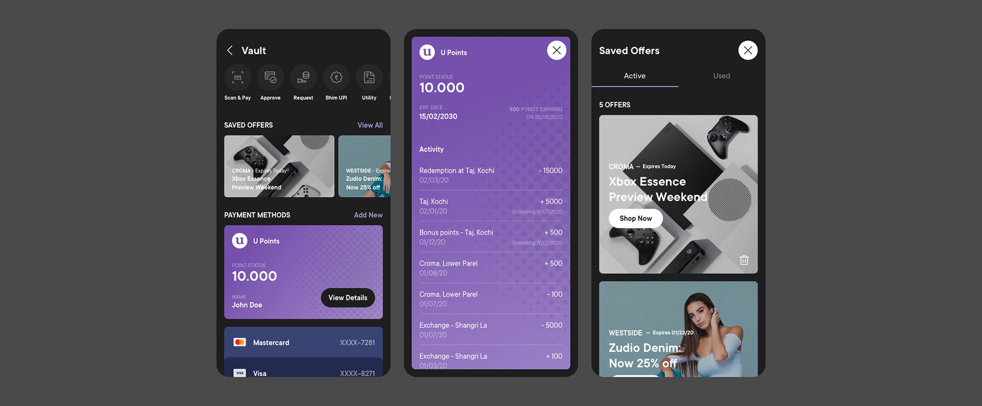
The vault, the points balance and its activity, and saved offers.
Checkout. A person can pay with points, a reward card, a credit line, or any mix of them, and see what each choice does to the total before committing. Credit shows its tenure and interest in the same sheet.
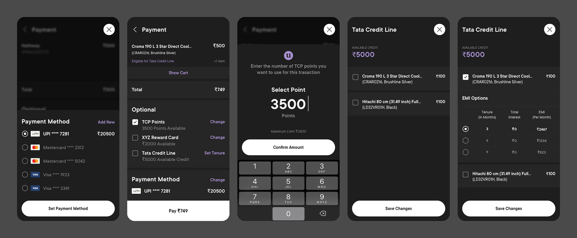
Payment method, the optional sources stacked against the total, redeeming points, and the credit line with its tenure and interest.
Profile and spends. The spend analyzer came directly out of the gap analysis. All three personas wanted a view of where their money goes, and the platform is one of the few places that can show it across brands.
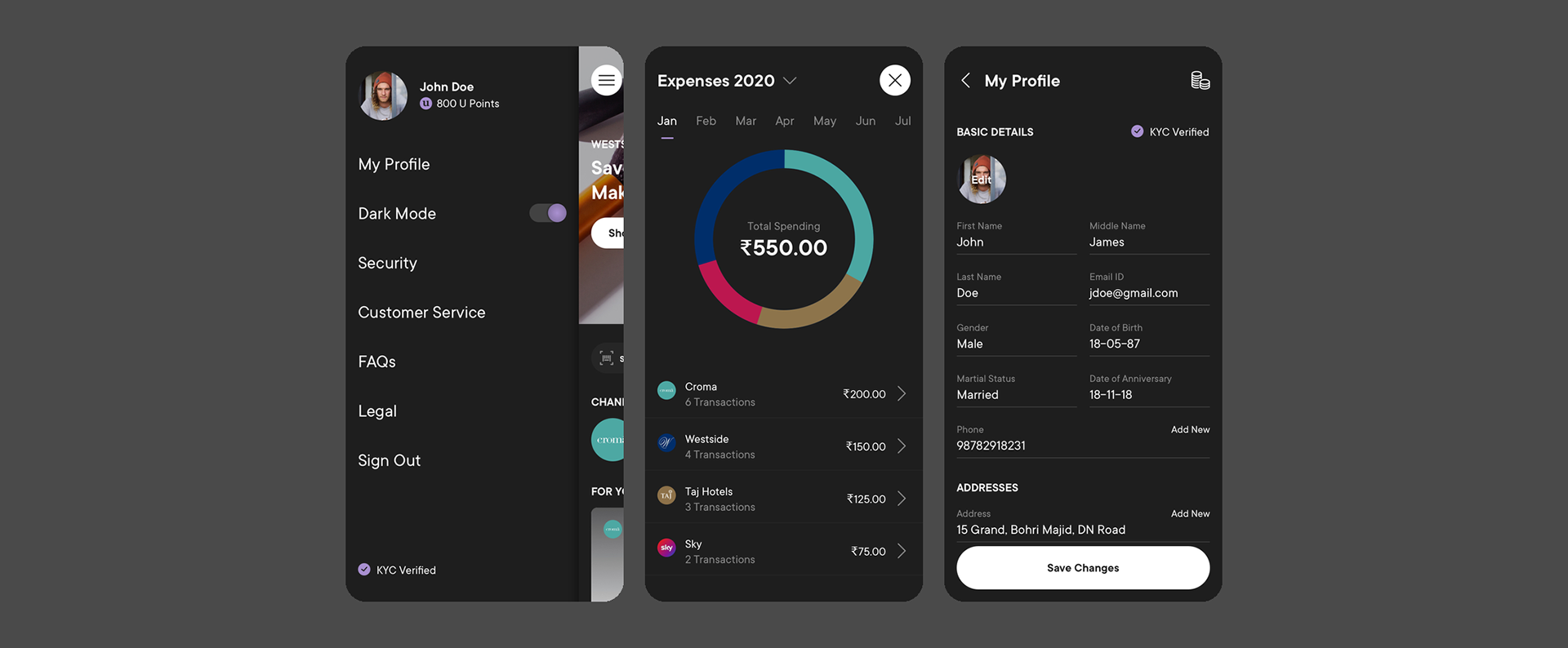
Profile menu, details and KYC, and spends by brand.
Usability evaluation
The app was not live yet, so the testing was formative. The aim was to find where the design broke before development committed to it.
What we wanted to find out. What impression the app leaves in the first few seconds. Whether people can find the categories, the rewards section and the other key features. Where the purchase journeys run into trouble. Whether the labels in the vault and the landing section mean what we think they mean.
How it was run. Remote sessions on a Figma prototype, one participant at a time, an hour each. The scope was too large for a single sitting, so it was split into three phases with a separate set of participants for each, and tasks were assigned at random to keep one task from teaching the next.
Blink test. Ten seconds on the screen to capture the first impression before anyone starts rationalising it.
Task scenarios. Standard tasks with a think aloud protocol, aimed at discoverability and the purchase journeys.
Expectancy test. For the vault and channels, checking whether people could predict what a label or a control would do before using it.
Task scenarios. Standard tasks with a think aloud protocol, aimed at discoverability and the purchase journeys.
Expectancy test. For the vault and channels, checking whether people could predict what a label or a control would do before using it.
Participants were drawn from the target profile: heavy smartphone users, already comfortable with digital wallets and payments, in tier one cities. A heuristic evaluation ran alongside the sessions.
What happened next
Findings from the heuristic analysis and the usability sessions went back to the whole team. New workflows were sketched, taken to development, prioritised, and turned into the next set of designs.
Screens and artefacts shown here are from the design phase of the Tata Consumer Platform. Commercially sensitive figures have been left out.