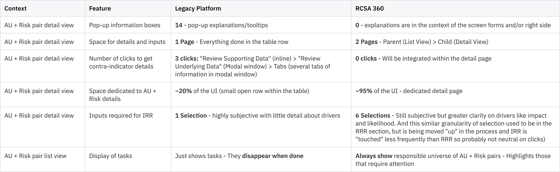
• Lack of relevant real-time insight and regulatory responsiveness.
• Overwhelming forms, ambiguous navigation, minimal personalization.
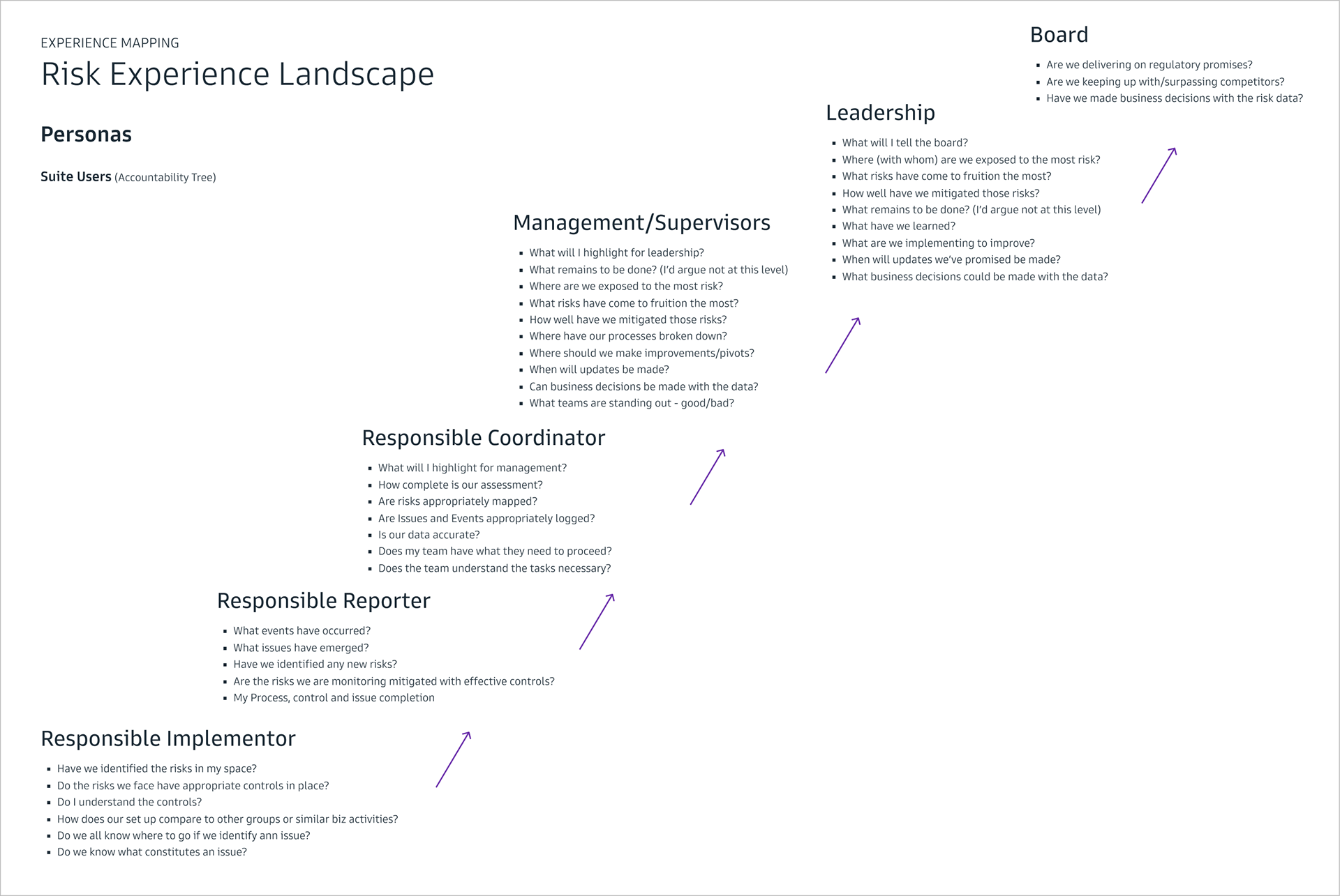
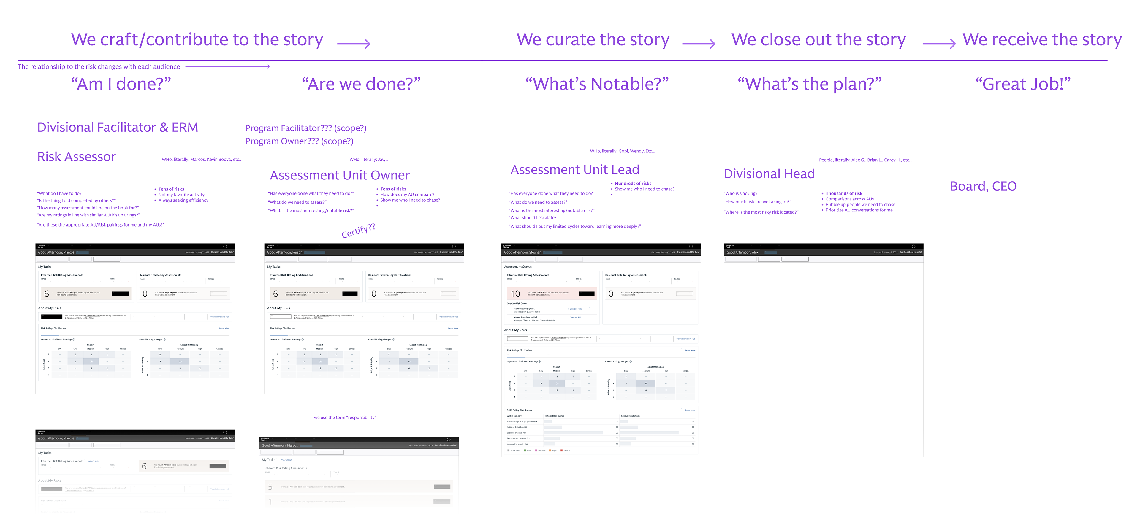
Risk Experience Landscape Mapping across the firm showcasing stakeholder groups.
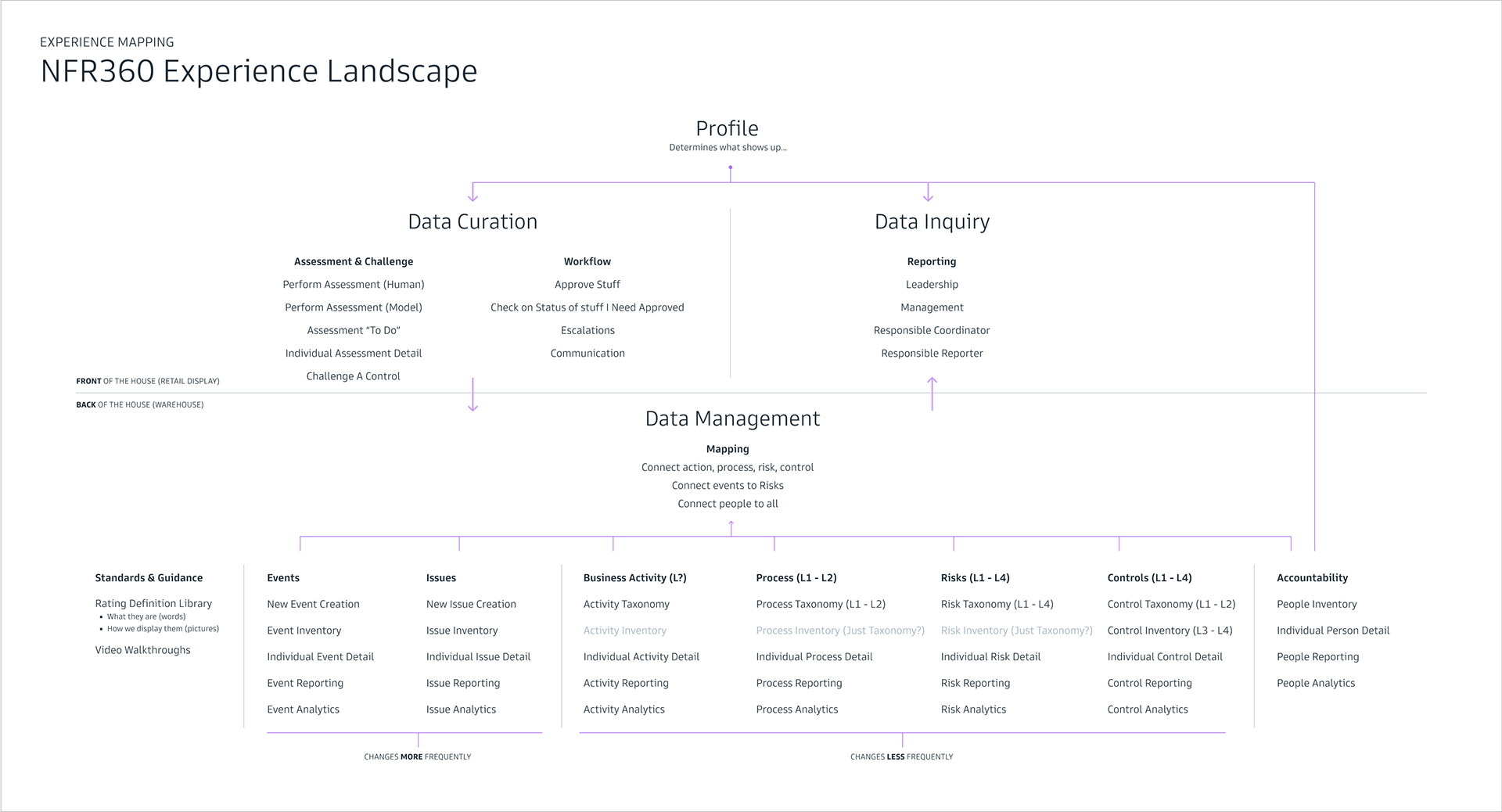
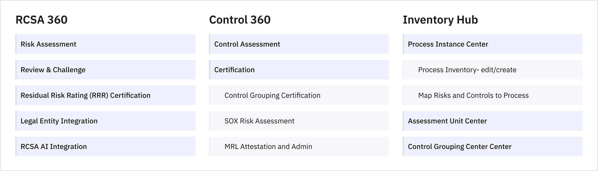
Overall Non Financial Risk 360 conceptual experience model from data type perspective.
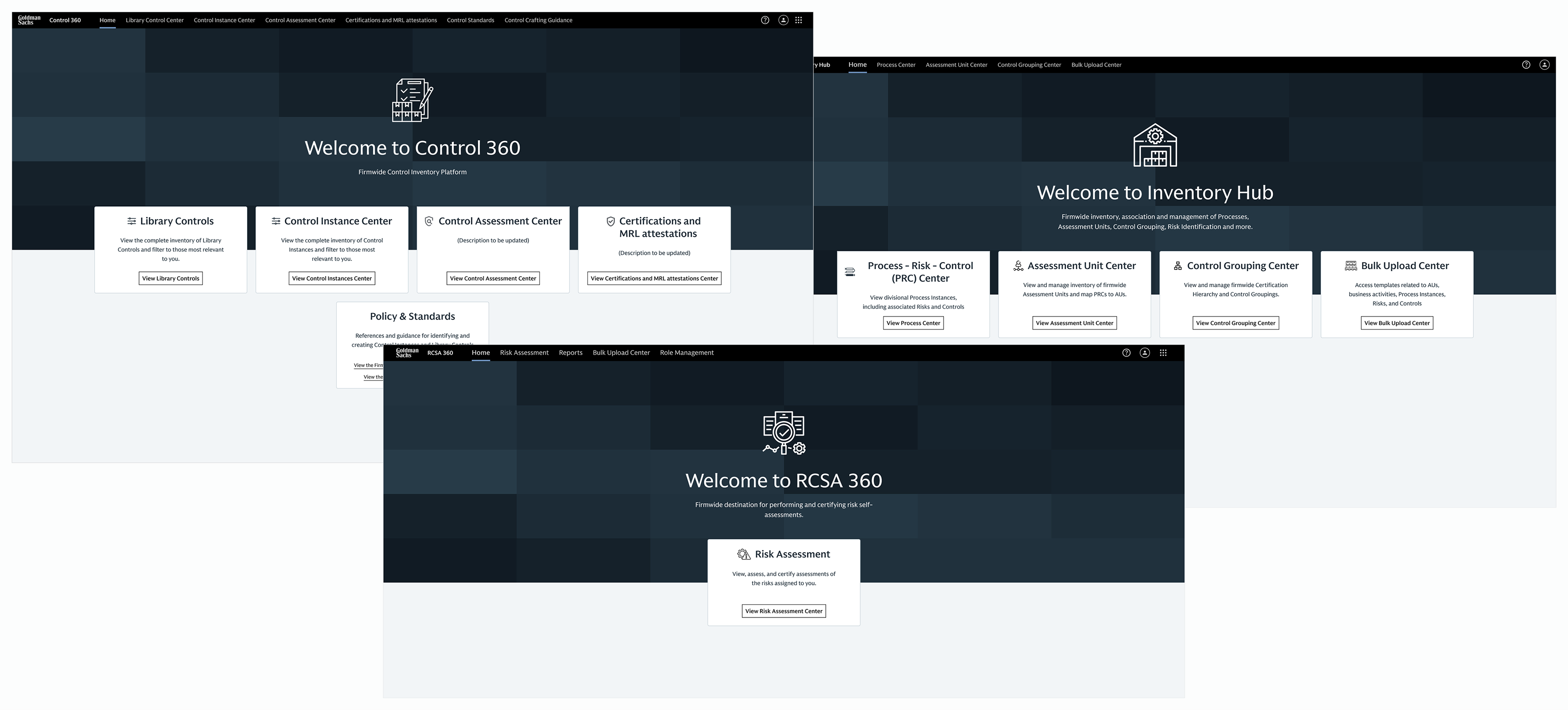
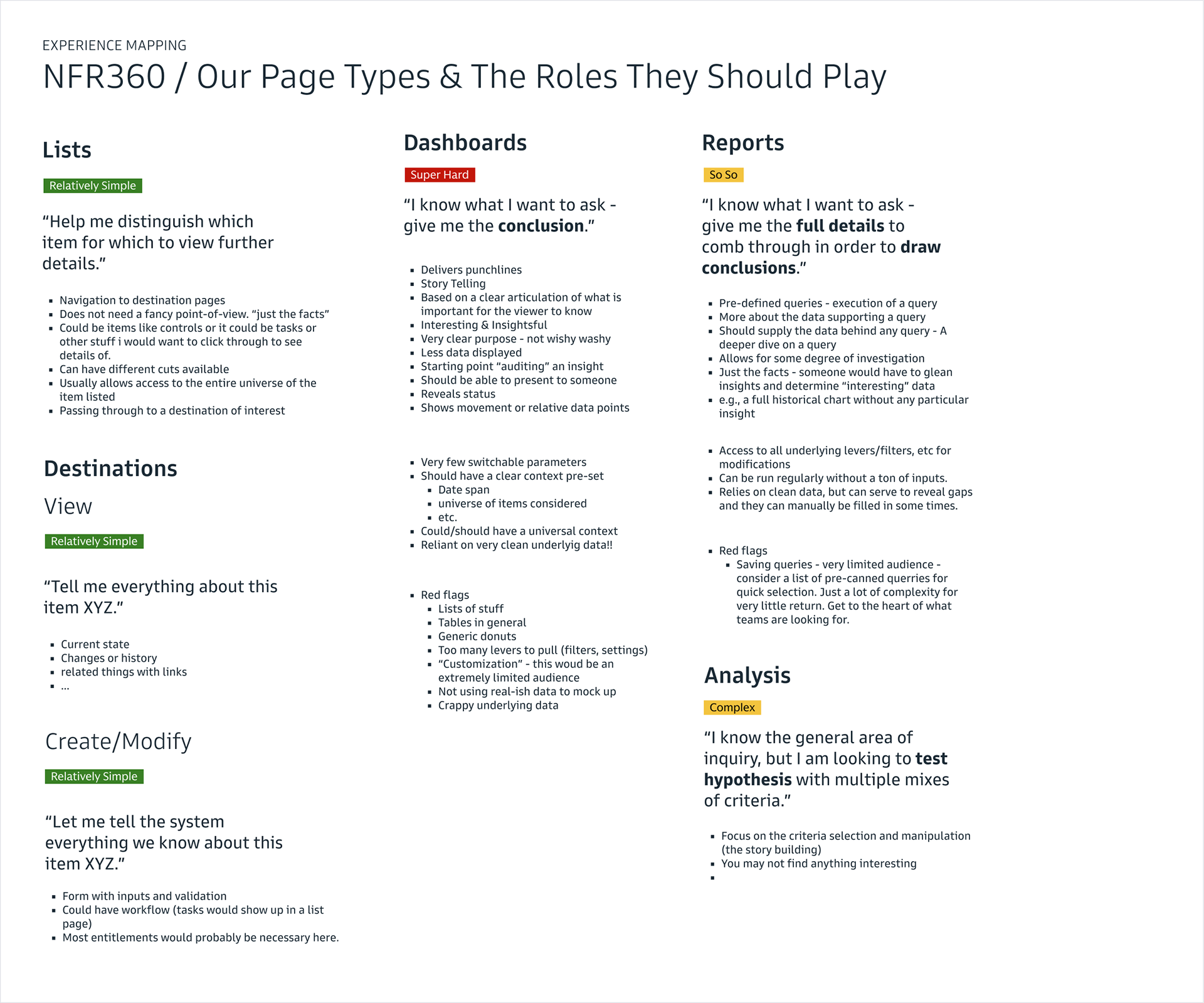
The essential functions of the suite of applications simplified.
→ Cluttered and confusing interfaces
Visual overload made it hard to find information, track progress, or complete tasks efficiently. Unclear cues and complex paths left users unsure of what to do next.
→ Lack of contextual guidance
Insufficient contextual guidance led to frequent mistakes and support requests.
→ Inefficient task management
Lack of personalized view or “My Tasks” view made prioritization and tracking difficult.
→ Poor team collaboration support
Missing features in the UI for proxy work, bulk actions, and monitoring increased workload and reduced transparency.
→ Resulting user fatigue
All these issues turned assessments into a chore, eroding engagement and data quality.
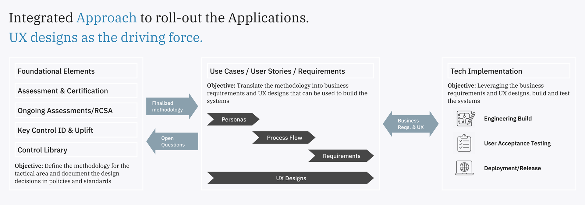
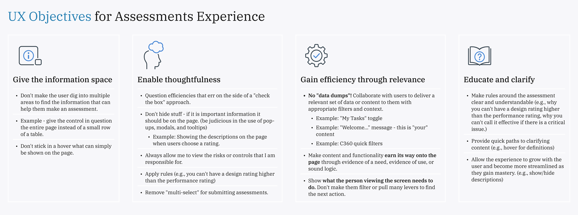
The development of the suite of applications anchored on the UX design.
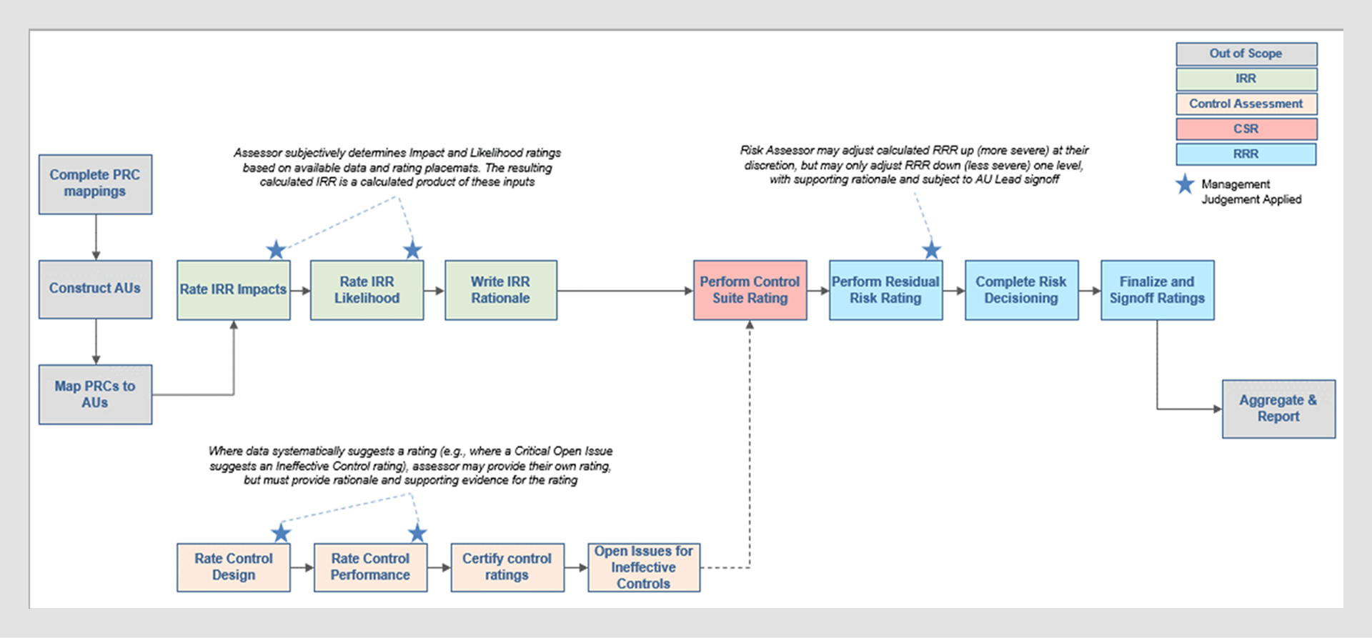
Risk Assessment process flow.
• Risk Assessor (needs clarity, fast completion)
• Program Facilitator/PMO (oversees and proxies for teams)
• 2LOD Reviewer (validates, raises issues)
• Exec/Owner, Central Risk/Compliance Officer
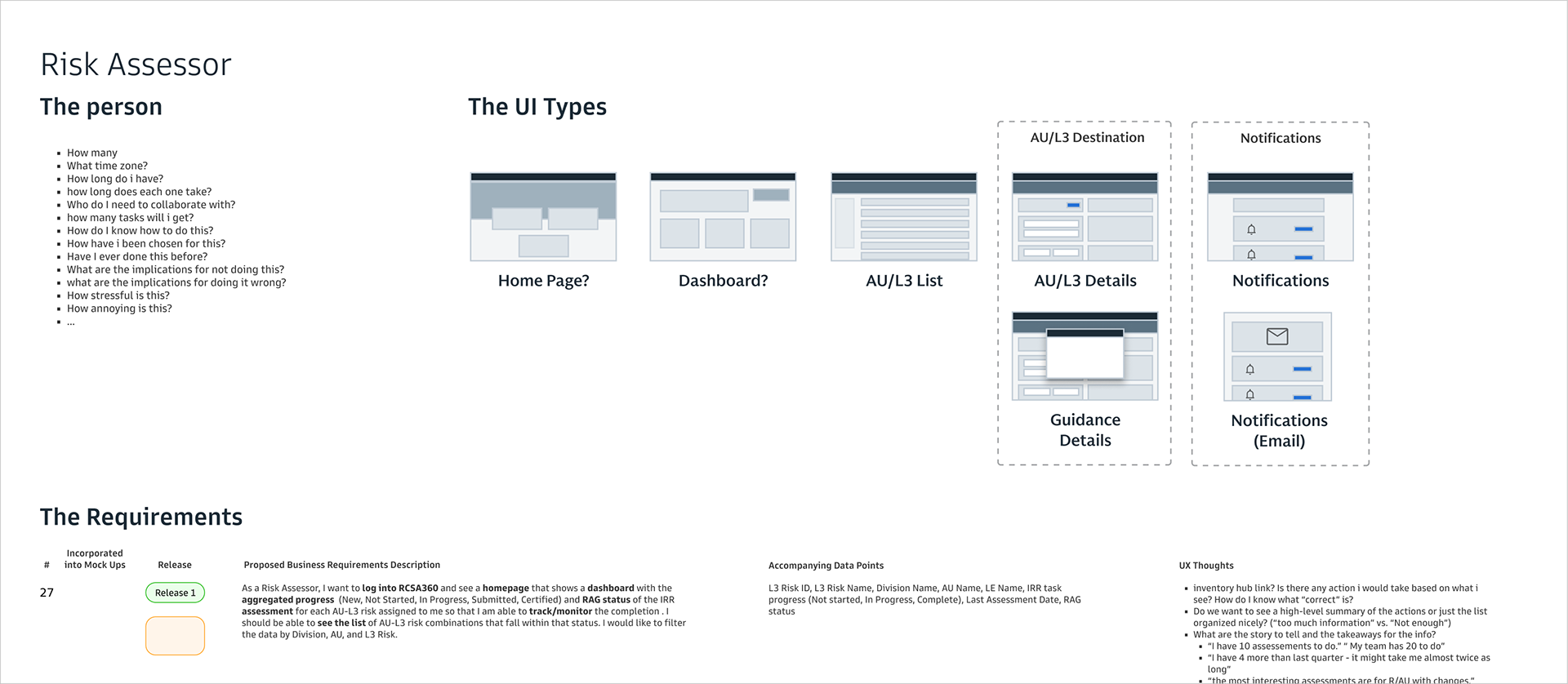
Sample of detailed personas, envisioned screen types and detailed requirements in formation.
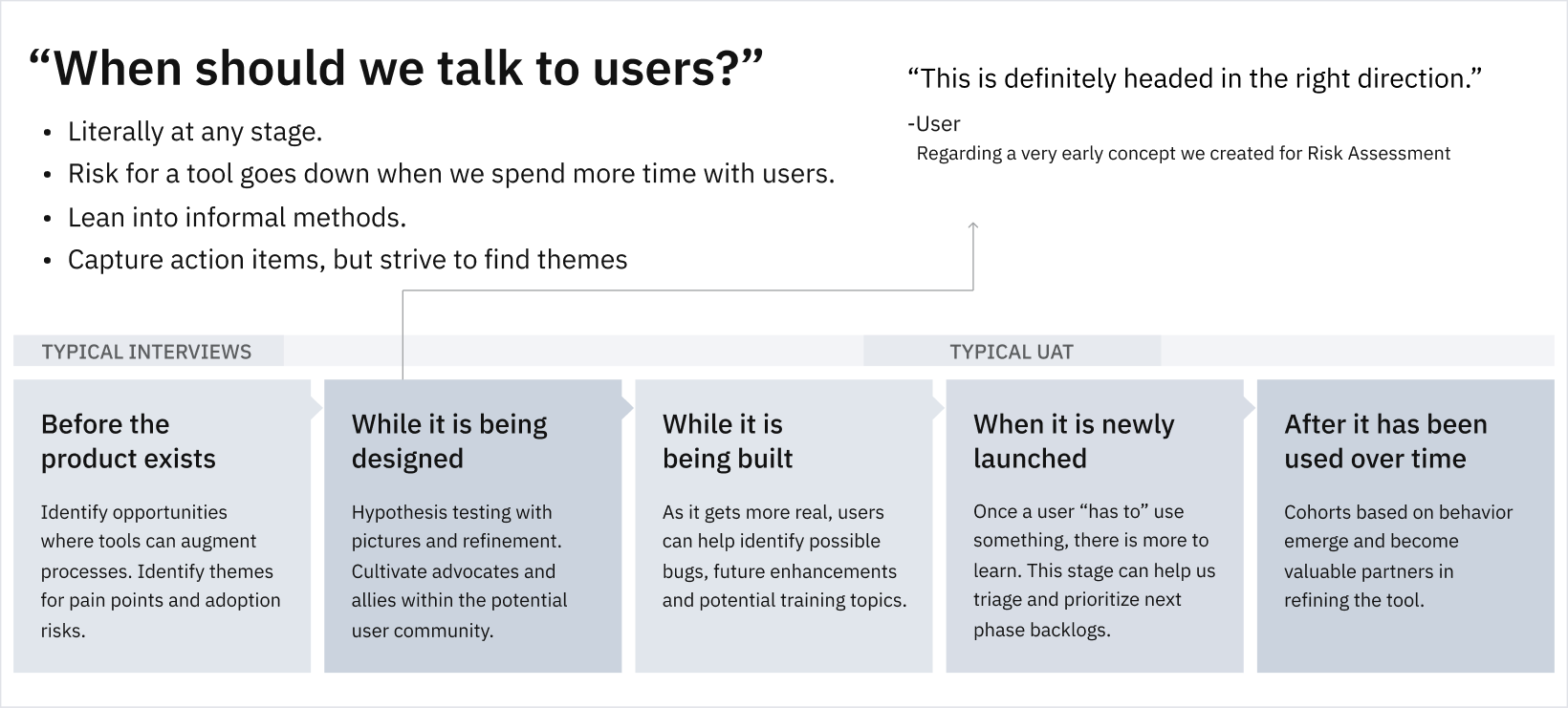
• We developed these based on 20+ interviews/sessions with users of the current experience and evaluation of the existing experiences.
• They manifest themselves throughout the experience✨
Main threads of UI/UX work

Key explored areas and approaches:
• Form and reference information display
• Risk-centric versus AU-centric navigation
• contextual guidance without hindering flow
• Rating scale interaction
Some early wireframes
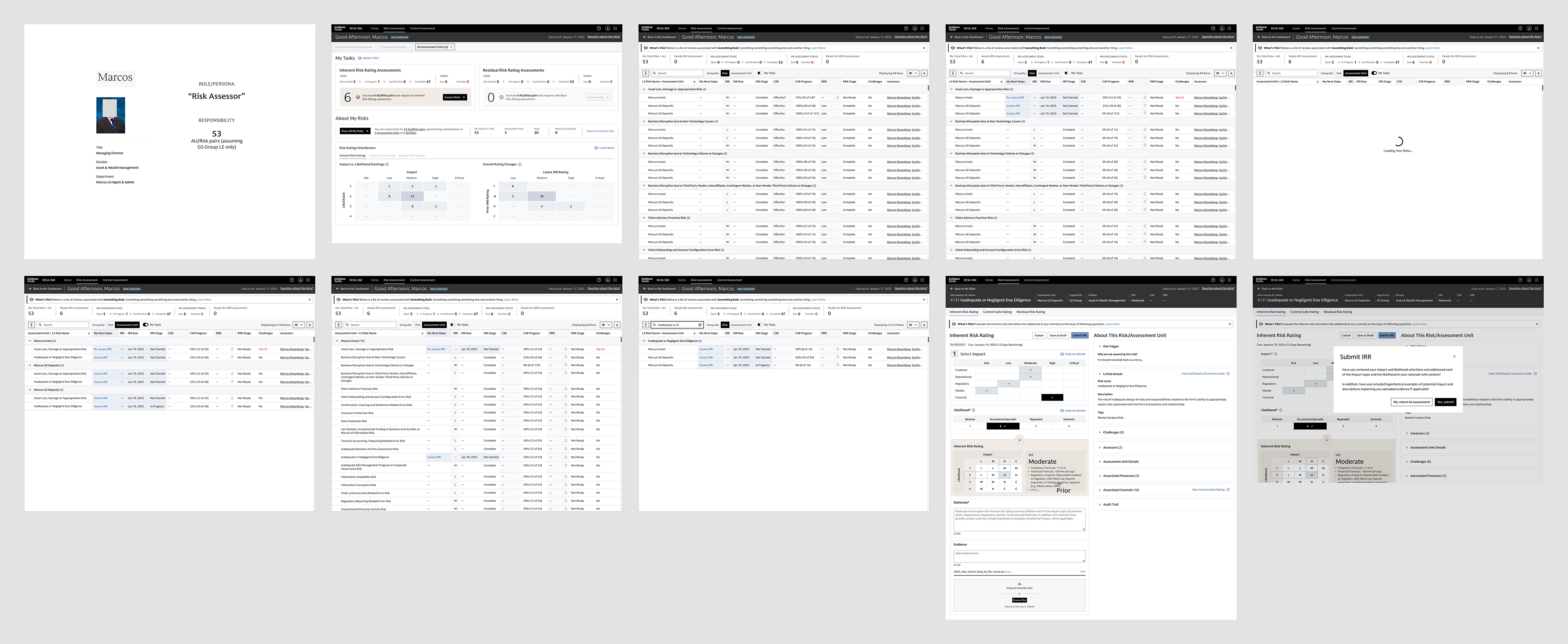
Sample user flow mapping demonstrating key tasks such as IRR assessment completion and proxy submission
• Only the IRR module was prioritized for this initial release, ensuring alignment on requirements and timeline.
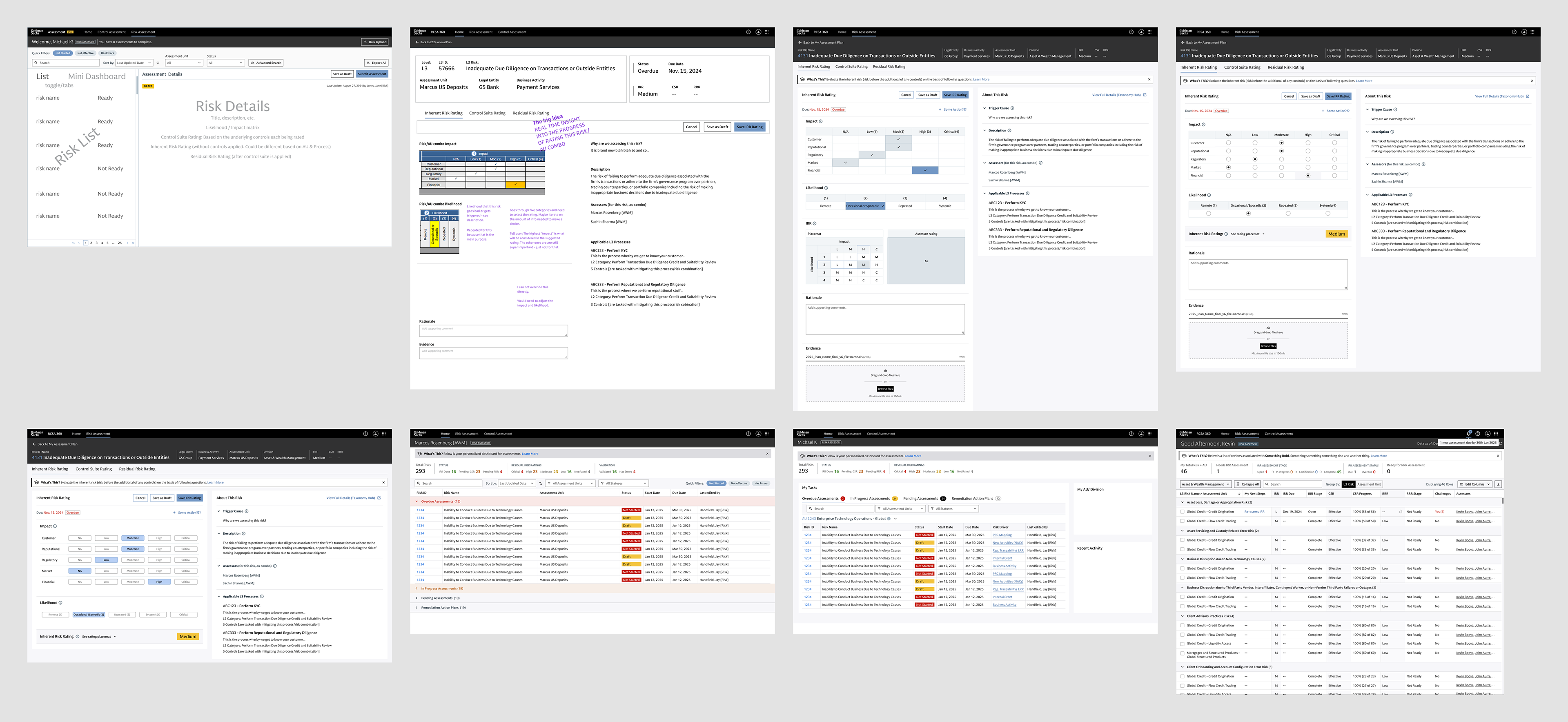
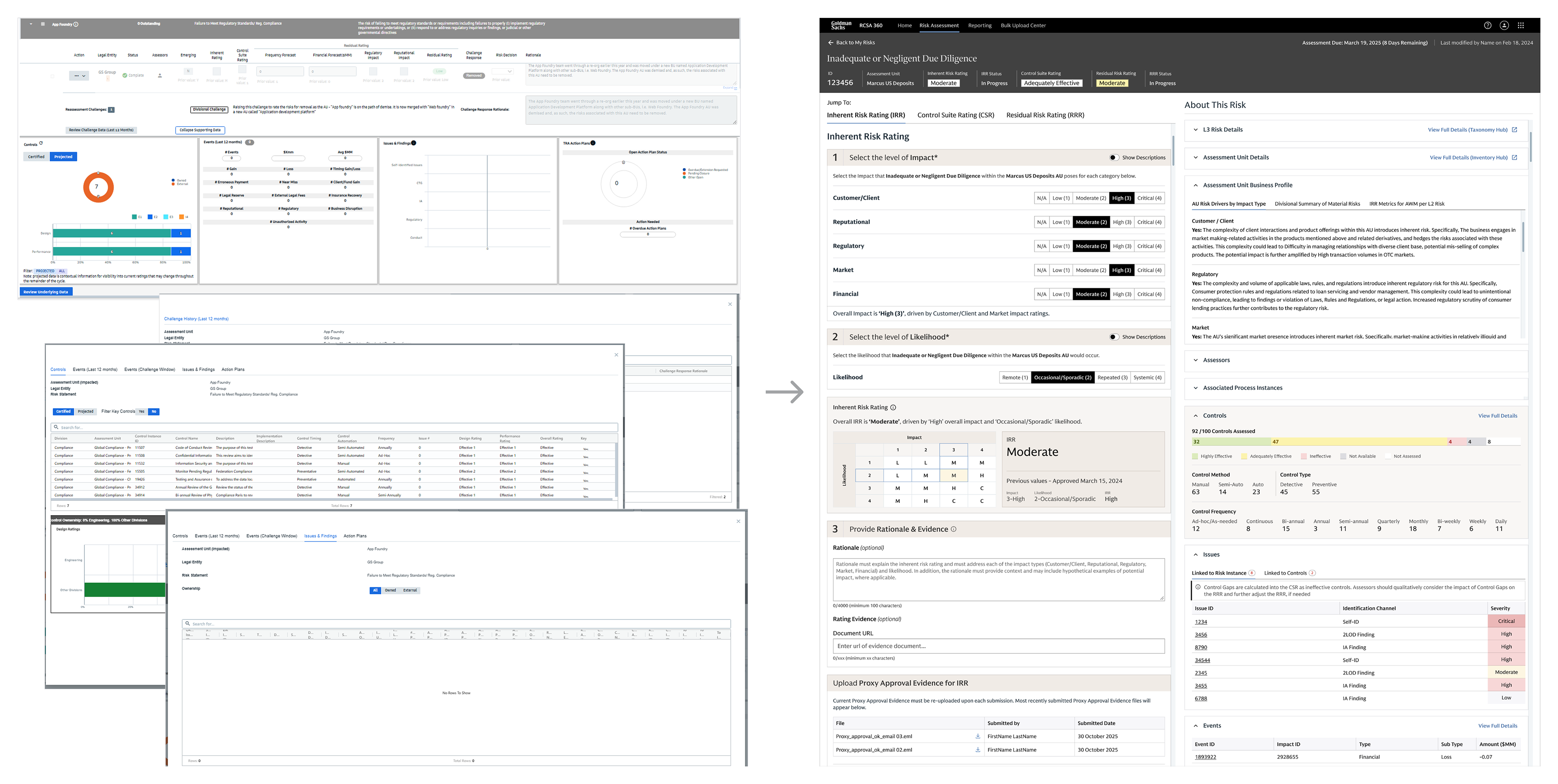
• 🎨 Color coding was applied minimally, highlighting only truly critical ratings. This preserves the clarity and impact of colors, avoiding visual overload and maintaining clear meaning for users.
• The rating scale underwent a revision to improve user comprehension and accuracy in risk assessment.
• 👁️ Show/hide description toggles were incorporated to give users control over detail visibility—supporting both quick scanning and in-depth review as needed.
• These design decisions were shaped by ongoing feedback from representative end users and leads, aiming to deliver a module that is both focused and adaptable to evolving requirements.
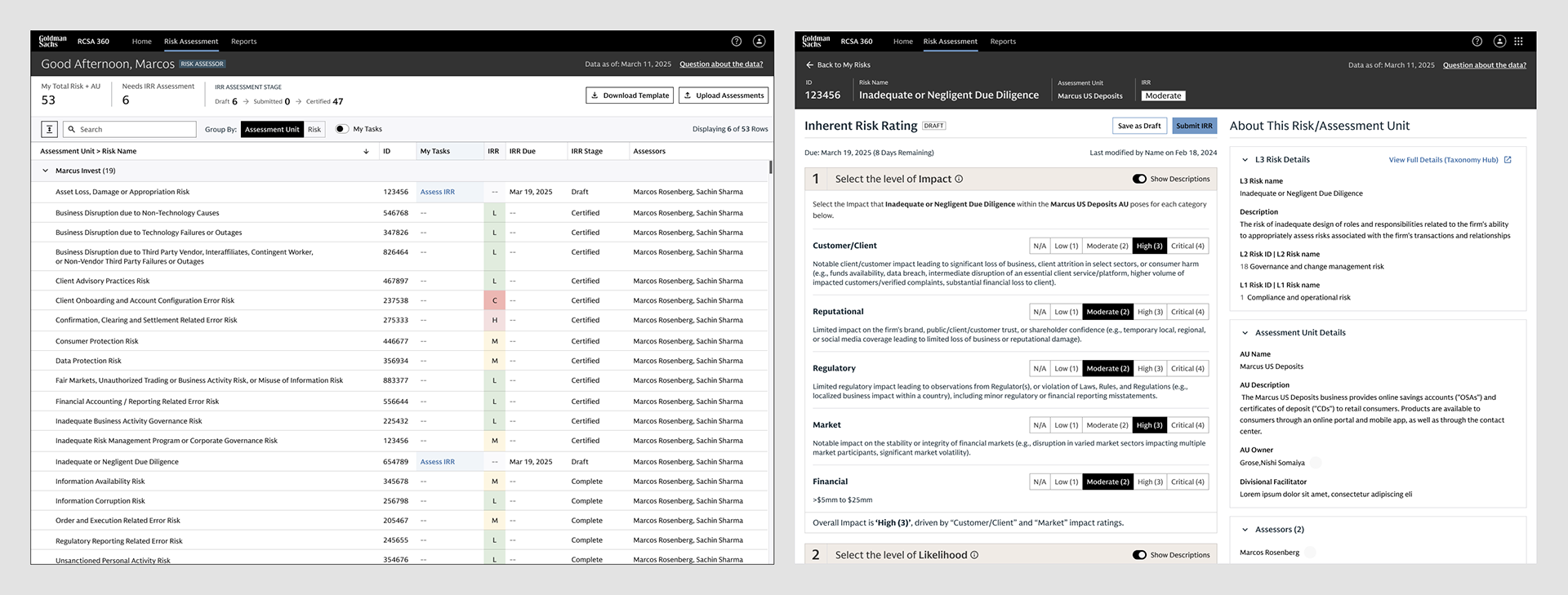
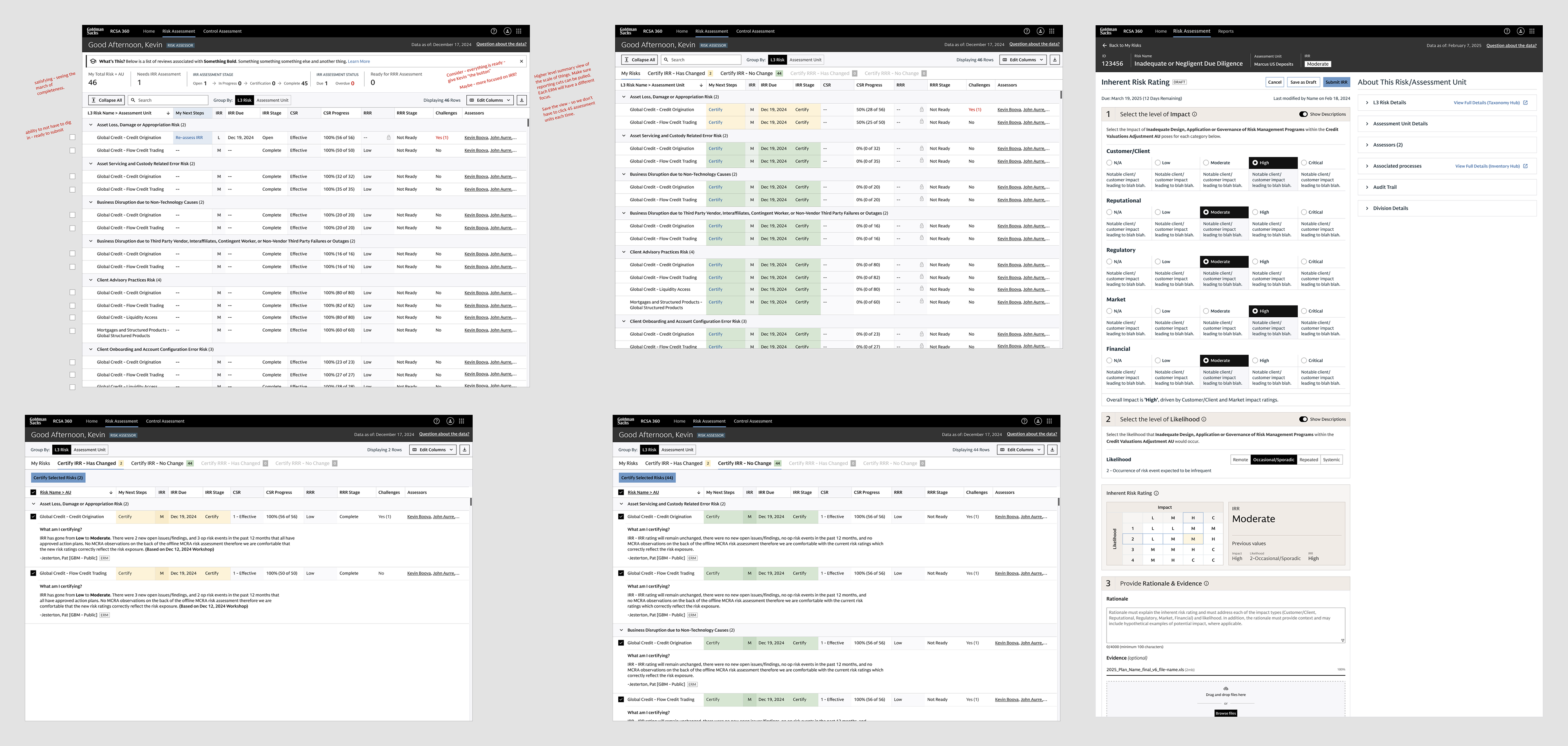
Screens from Release 1 focusing on the Inherent Risk Rating (IRR)
Concept explorations presenting innovative designs inspired by real user data and behavioral insights.
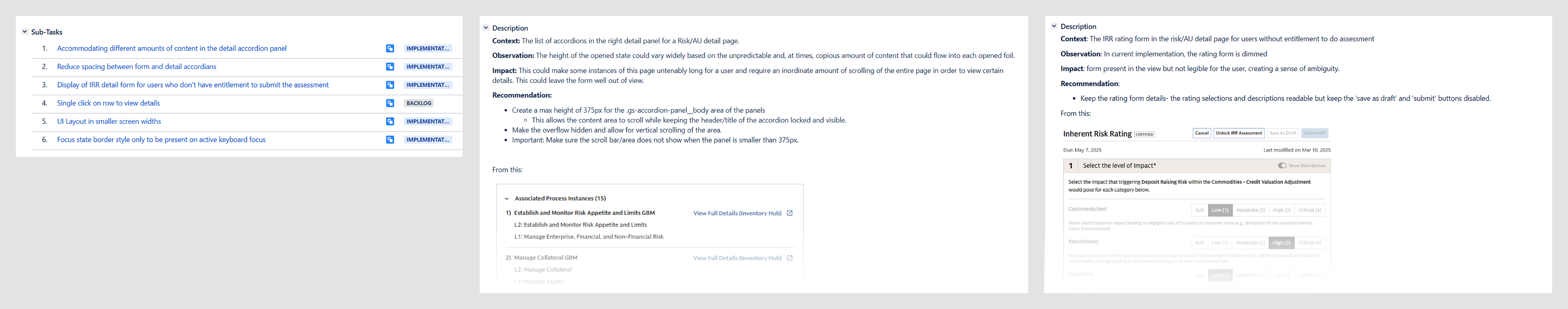
Sample of usability and UAT testing observation documentation.
• “1, 2, 3” in response to “What do I need to do?” feedback from users
• Consolidated mosaic of information instead of modal windows and tooltips
• Transparency of the placemat logic
• Revised rating scale design
• Show/hide descriptions
• tabs to easily move between IRR, CSR and RRR
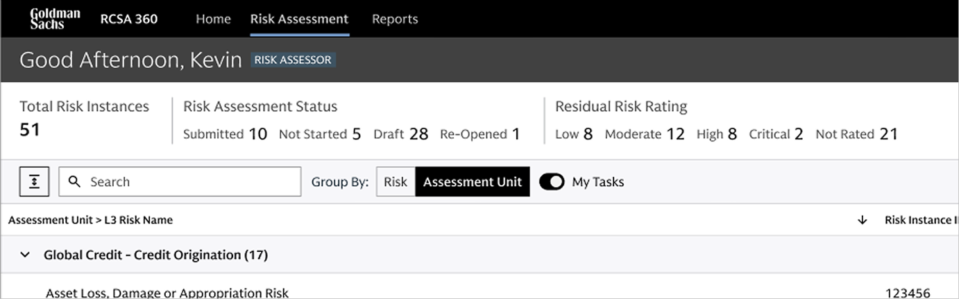
• Narrows the list of instances to only those that require the logged-in user’s attention.
• Provides a single button with flexible back-end rule sets (preferring simplicity over complex filters or interactions). Filters are available as well.
• Has the potential for saving and defaulting to more personalized attributes in the future (such as saved searches, etc.)

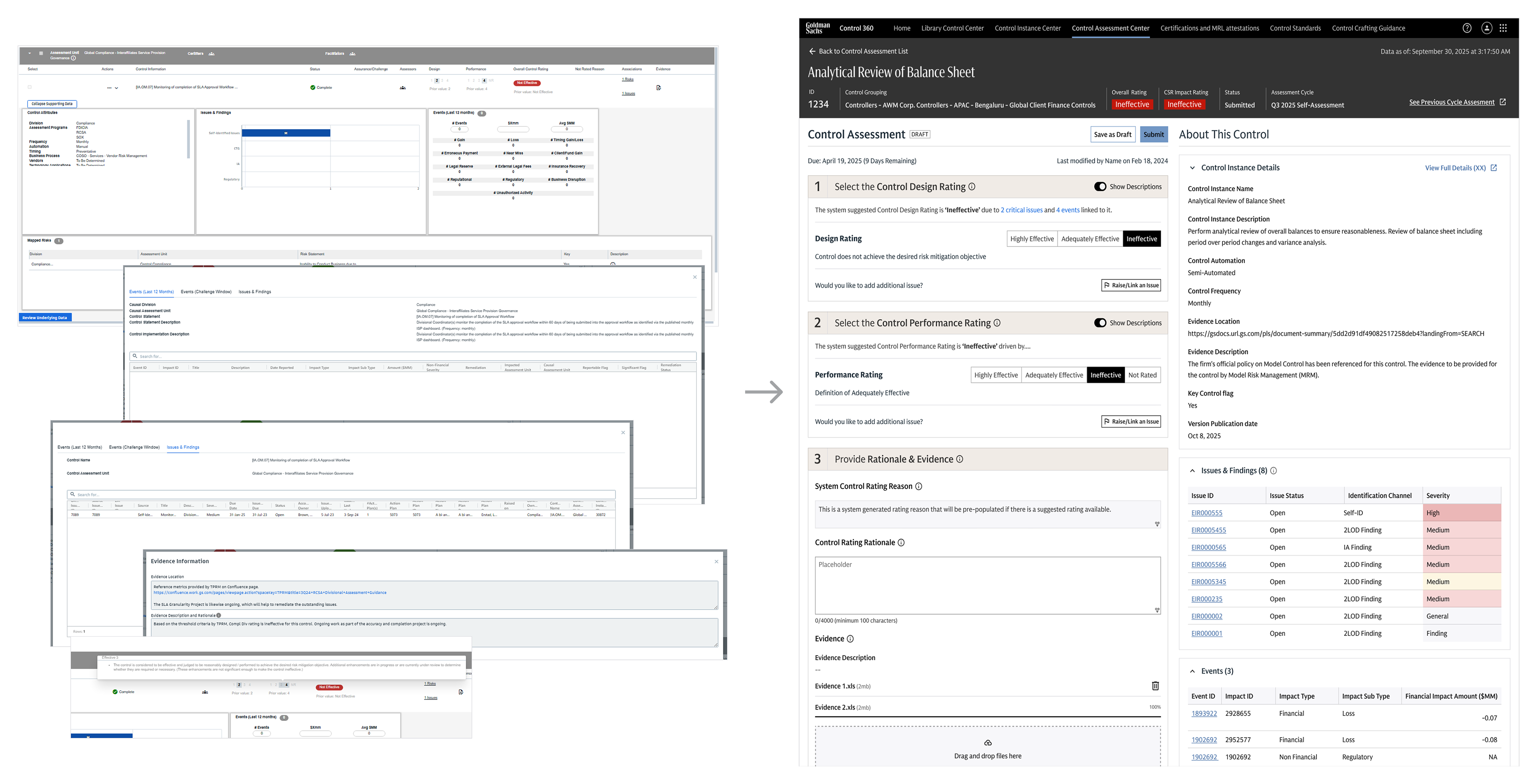
• “1, 2, 3” in response to “What do I need to do?” feedback from users
• Consolidated mosaic of information instead of modal windows and tooltips
• Transparency of the placemat logic
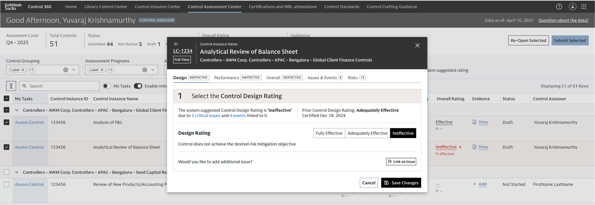
• Addresses user desire to submit ratings within the context of the dashboard.
• Allows users to interact with individual cells related to ratings.
• Sets context in the header – based on feedback that modals to the effect of "they lack the context of what I am looking at".
• What's Included: The most salient and critical modules that appear in the full detail view of the instance.
• Has a link in the header to the detailed view if more information ends up being necessary

Control Grouping Certification screen
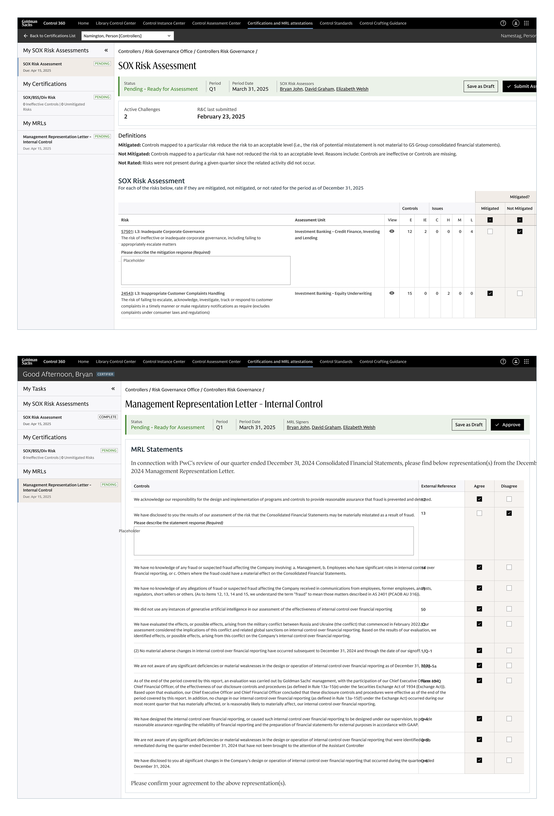
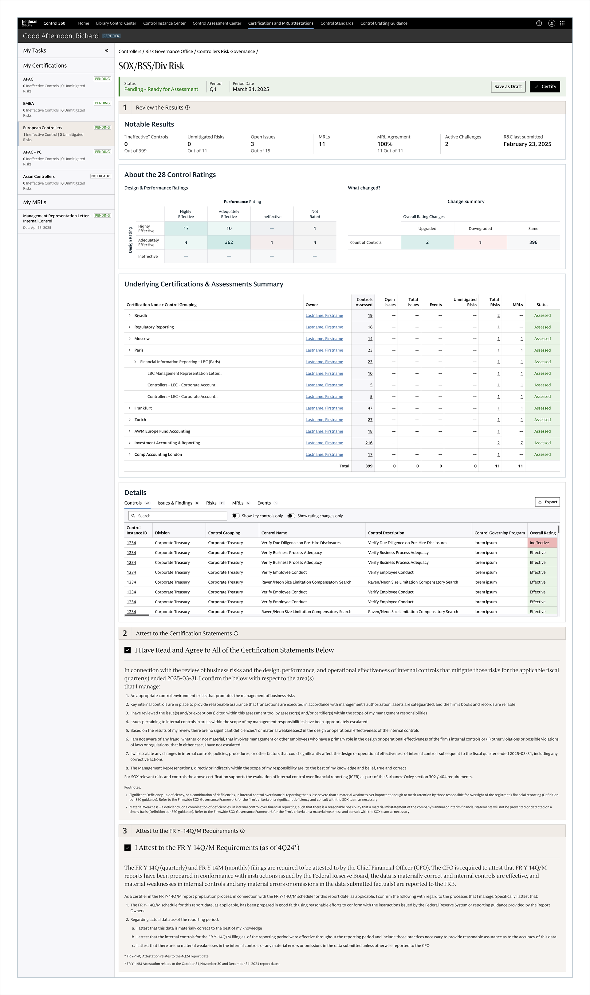
SOX Risk assessment and Management Representation Letter (MRL) screens.

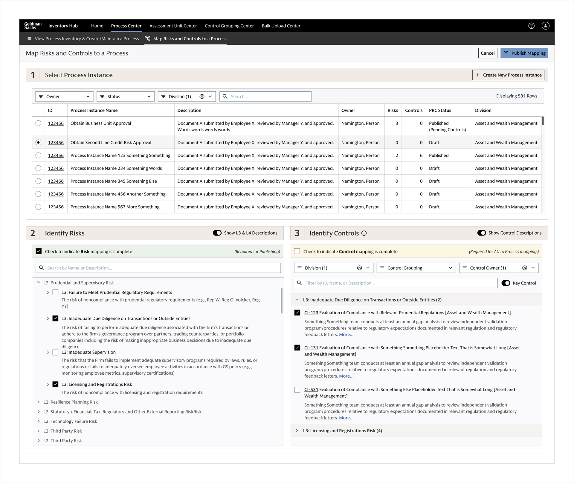
Process-Risk-Control Mapping screen
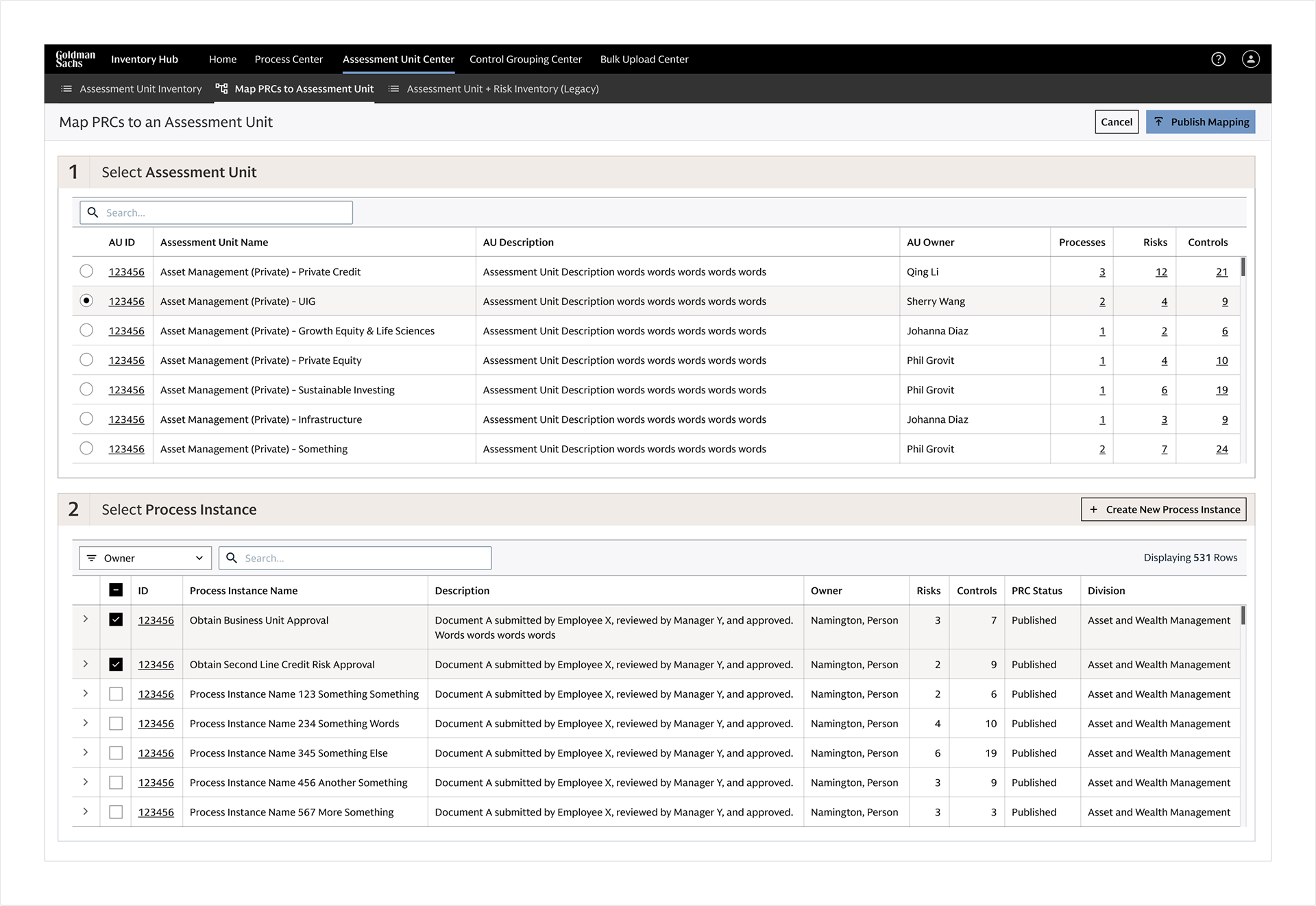
Assessment Unit to Process Instance mapping screen